- JamesProvost
- Posts: 174
- Joined: Mon Dec 14, 2009 8:03 pm
- Location: Toronto, Canada
- Contact: Website
Re: New Work
Really slick, as always abrown. Very clear with great lighting and overall feel!
Re: New Work
Really Nice abrown! Maybe the best 3D feeling I have ever seen.
Re: New Work
wow, incredible work brown! I would love to see more.
- JamesProvost
- Posts: 174
- Joined: Mon Dec 14, 2009 8:03 pm
- Location: Toronto, Canada
- Contact: Website
Re: New Work
Nice! I have a friend that's crazy about rotaries and RX-7s, I'll have to show him these.
Re: New Work
Checking in to see how the community is over here? A few new styles up in Motorcycle art:
http://www.hatchillustrations.com/KLIM- ... ustrations
http://www.hatchillustrations.com/ICON-Cloverleaf-Knee
http://www.hatchillustrations.com/KLIM- ... ustrations
http://www.hatchillustrations.com/ICON-Cloverleaf-Knee
- Don Cheke
- Posts: 83
- Joined: Fri Oct 08, 2010 3:01 pm
- Location: Saskatoon, SK Canada
- Contact: Website
Re: New Work
I saw a brochure a while back when looking for easy-close gas cylinders and came a cross a brochure with a nice looking cutaway. I decided I would try and mimic it with TurboCAD. The cutaway cylinder in my post was created and rendered in TurboCAD. I created the background and added the text in Photoshop. The render itself received very little post work, I just sharpened it a smidgen and added the drop shadow. The company name used here is fictitious, it is one I use when adding a company logo to graphics enhances the final look. I hope that you like it.


Don
Visit: Textual Creations
Visit: Textual Creations
Re: New Work
Very nice Don, What if you made the cylinder gas and the background a bit different in color?
Jim
Jim
-
JuanCal123
- Posts: 56
- Joined: Fri Jun 27, 2014 5:38 pm
- Location: All of USA, CAnada, Europe
- Contact: Website
Re: New Work
love it Don. Good job
- JamesProvost
- Posts: 174
- Joined: Mon Dec 14, 2009 8:03 pm
- Location: Toronto, Canada
- Contact: Website
New Site

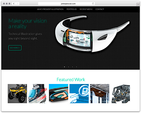
I've redesigned my portfolio website and posted some new work. I'd love it if you guys had a look and let me know what you think. Check it out at JamesProvost.com
I'm still working through some bugs in Internet Explorer... If you're using IE, knock it off, you're making yours and everyone else's life difficult