Illustrator: Patterns where the repeat isn't so noticeable..
Posted: Sun Feb 05, 2017 5:55 am
Hey all,
It's been ages since I posted here, but every once in awhile I need some advice. I have an architectural front elevation that I am drawing in color...very detailed. I am working on the roof now. One of the things I am running into is creating a pattern that looks good for the roof shingles. Everything that I come up with has a very noticeable repeat to it. It's not so bad if you drop the pattern into a small shape, but if you drop it into a big shape, the repeat becomes very noticeable. Also, I hate creating "patterns" in Illustrator, and really wish there was someone out there that sold them in various styles...like a large set of architectural roof patterns would be nice.
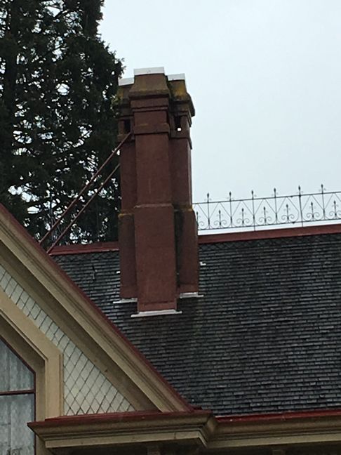
The problem with this pattern is that it appears on the real house that the shingles alternate in shade, but it's super sporadic....no pattern at all. Which is why I'm kinda not sure what to do with this.
Anyway, here is a pic of the roof:

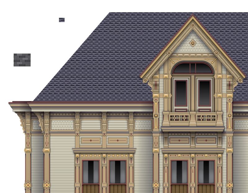
And here is my drawing... I'm actually not too bothered with what I came up with, but if you zoom in, it's obvious the pattern is not right, but at the level it's sitting at right now, it doesn't look bad. Ignore the spots/lines that look emphasized (dark)...this is just from reducing on the screen and screen capture affecting it's look. I am going to add transparent-to-black fades, multiplied over these shingles just to give it some depth.

Any advice for making this look really nice?
It's been ages since I posted here, but every once in awhile I need some advice. I have an architectural front elevation that I am drawing in color...very detailed. I am working on the roof now. One of the things I am running into is creating a pattern that looks good for the roof shingles. Everything that I come up with has a very noticeable repeat to it. It's not so bad if you drop the pattern into a small shape, but if you drop it into a big shape, the repeat becomes very noticeable. Also, I hate creating "patterns" in Illustrator, and really wish there was someone out there that sold them in various styles...like a large set of architectural roof patterns would be nice.
The problem with this pattern is that it appears on the real house that the shingles alternate in shade, but it's super sporadic....no pattern at all. Which is why I'm kinda not sure what to do with this.
Anyway, here is a pic of the roof:

And here is my drawing... I'm actually not too bothered with what I came up with, but if you zoom in, it's obvious the pattern is not right, but at the level it's sitting at right now, it doesn't look bad. Ignore the spots/lines that look emphasized (dark)...this is just from reducing on the screen and screen capture affecting it's look. I am going to add transparent-to-black fades, multiplied over these shingles just to give it some depth.

Any advice for making this look really nice?