Embrace the Future

Cannot Predict Now

If only we could look into the magic 8 ball and know in an instant what the future of technical illustration will be.  I know some have seen it develop from the strictly traditional execution of the past to the now multi-functional digital aspects of today.

Yesterday evening, I attended the graduate show for the Bachelor of Applied Arts in Illustration program held by the 2014 class of Sheridan College students, my alma mater school.  It’s interesting to reflect back on where I used to once be, starting out as a professional after completing my degree, with no idea what the future would hold.  To now be able to see how far a career can progress, just by getting out there and doing.

Doing what? Creating, designing, marketing a skill set, keeping current with ever-changing trends and always new and improving software programs, creating and never ceasing to ask questions about how better to visualize information not only from a technical standpoint, but from a perspective where any viewer just “gets it” in one look.

This led me to ponder how the educational institutions play into what’s really going on in our industry and how this shapes the future as we professionals know it.  Sheridan College in particular when I attended educated students in the Technical and Scientific Illustration stream with a focused vision on what types of illustrations you could be creating out in the world.  Now, this stream is no longer going to exist, as they move towards a more University style approach, allowing students to choose which courses they want to explore.  The courses that were previously within the niche of the technical and scientific stream will still be available, however as a student, you would not be getting the end-to-end experience as I once had to hone the skill set in this ever-evolving field.

We have to ask: Are the educational institutions shaping the technical illustration industry properly, if not at all? Have they looked into the Magic 8 ball and know the answer, or are they assuming they know what the future will hold?

I believe there is still a successful career to be had in Technical Illustration, as the work I do daily reflects the need that clients still have.  So, I should be jumping for joy that major competition is being cut out, right? I think not.  The biggest reason I love competition is that is makes me better at what I do.  It pushes me creatively to do more and go further.  So, the real loss to the industry would be a lack of competition to keep those of us that have been doing this for years “on our toes”.

On the other hand, I know that technology is a driving force to how clients hire, whether freelance or in-house and that the other side of the coin, as a professional you always have to be improving upon the foundation of skills that an initial education brought.  A continual growth in knowledge of software, now even more into 3D modeling and animation, web design or even design of info graphics will allow for a more well-rounded approach for dealing with any and all clients that come along, now or in the future.

Sometimes it’s a challenge to get a pulse on an industry when we work in our own little bubbles, more now with online media.  But some of the indication of that pulse has to come from the education that future Illustrators would be receiving.

Inevitably, from where I stand today and where I stood years ago when I graduated from Sheridan, I choose to embrace the future.  If we don’t, we’ll be left behind.  The future may change, but there will always be Technical Illustration.  It may just be executed differently down the road.

A big Congratulations! goes out to the 2014 class of Sheridan Illustration students.  Good luck and embrace your future!  If you are in the greater Toronto area and want to check out the up-and-coming talent of illustrators, the illustration show is on until Friday, April 11, 2014 at 9pm.  You can find more information on http://sheridanillustration.com/

What do you see where you live? Is there a large school nearby that teaches the Technical Illustration skill set if you were to get into the field? Or has a program that you knew previously existed been pushed to the wayside?

Have you been in the industry so long and have a different take on where things are headed?

Audi A7 Paper Model

If you’re looking for some inspiration, I stumbled across this amazing paper model creation of an Audi A7 by graphic designer Taras Lesko.

The time-lapse video shows from start to finish his process in building the large scale Audi A7 completely out of paper.  It’s quite impressive!

httpvhd://www.youtube.com/watch?v=AXnhc6ZzPbM&

If you want to see more from Taras Lesko, on his website under Personal Work he also has another video of the creation of the Forza 3 Audi R8.  Enjoy!

Great Inspiration

Every week I get an email update from The Little Chimp Society, an illustration news website where members can log on and post tidbits about exciting projects they have been working on.

Typically the work is more editorial/fine arts in style, but today I was inspired by a great magazine cover that delves into the realm of technical illustration.

Guitar Aficianado Cover

Guitar Aficionado Cover

MDI Digital has created this cover for Guitar Aficionado magazine.  This piece has been selected as a finalist in the American Society of Magazine Editors Best Cover of the Year Awards as well.

Cudos to those over at MDI Digital who worked on this amazing cover!  If you want to see more work created by this company, check out MDI Digital‘s website.

Toyota Safety Ads

We all know that Toyota in the passed year has had many issues with the safety of their vehicles.  I came across the following advertisement (among others) that they now have playing to help get back consumer confidence in their vehicles.

httpvhd://www.youtube.com/watch?v=M3PBQEKc4w4

If you would like to see a full version of the advertisement, visit http://www.toyota.com/safety/videos/safety-features.html#

It’s great to see the use of technical illustrations in any media form and for large corporations as it brings exposure to our specialized art form.  BUT, does the use of the exploded views in this advertisement work?

I think not.  There are so many other ways that I could think of to utilize a tech illustration to show how Toyota has improved their vehicles to ensure safety.  Perhaps showing the specific mechanical technologies (ie. braking system) that have been improved and how they affect vehicle performance when stopping.

In the longer version of the ad they address the 5 accident avoidance technologies with an exploded view of each (ie. anti-lock brake system). Unfortunately, I find the use of the technical illustrations in this advertisement reflect a more “wallpaper” effect than being useful in supporting Toyota’s case for change in safety measures.

What do you think?  Do you have other ideas of how Toyota could win back consumer confidence by using technical illustrations?

Texture Tutorials

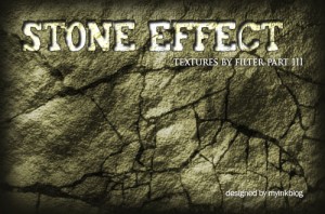
While working on a recent freelance job, I stumbled upon a great website,  MY Ink BLOG, with some realistic texture tutorials for grass, wood, stone and water.  Andrew Houle, the creator of the site uses various filters in each of these tutorials to achieve the desired results.

Specifically, the following are the texture tutorials:

Creating a Realistic Water Texture in Photoshop

Water Tutorial

Creating a Realistic Wood Texture Using Photoshop

wood-effect

Creating a Realistic Stone Texture Using Photoshop

stone-texture

Create an Awesome Grass Texture in Photoshop

grass-texture

The site has a great selection of Photoshop tutorials as well as so many other resources for Illustrators and Designers, that could be valuable in future.  Make sure you check it out!

Do you know any good websites for creating textures or have any “tricks” you use to save time on your illustrations?

TED Talks

Self promotion is one of the most challenging marketing tools as a freelance technical illustrator.  First, you need to have a great idea, then illustrate it well and find time to stop procrastinating and get it done!

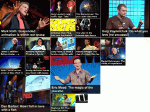
I find that inspiration for new illustration ideas can be found through so many different resources.  One of my favorite ways to gain inspiration for working on promotional pieces is through TED.com.

TED Talks

TED Talks

TED (Technology, Entertainment and Design) brings experts in these three areas together in a yearly conference to spread their ideas and innovations.  The conference allows innovative speakers a limited amount of time to passionately discuss their area of expertise.

The website TED.com has great videos that are an inspiration to the work that I do.  From a technological standpoint, certain speakers make me question many things and how they work in the world today.   I always find inspiration to illustrate new technologies, or new ways to look at design.  I enjoy listening to the speakers as I work on my illustrations.

Categories on TED.com include technology, entertainment, design, business science, culture, arts and global issues.  Some speakers are humorous, some serious.  But all of them have an inspirational message if you are open to it!

What are some websites that you use to find inspiration to motivate you?

Reference This

Creating and maintaining a library of reference images is a very valuable resource for a Technical Illustrator.

Auto Show Inspiration

Auto Show Inspiration

Last weekend I had a great opportunity to spend some time photographing and sketching new reference materials for a library of images that I have created. I attended the 2010 Canadian International Auto Show in Toronto, which is still running until February 21st. I also went out to see the Body Worlds Exhibit at the Ontario Science Centre which hosted a sketch night, allowing artists to draw the numerous pieces on display.

Both were extremely different types of shows, however both related to the work that I do as a technical illustrator – specifically from a reference-building standpoint.

At the Auto Show I was able to take 350+ images of all types of vehicles.  However, at Body Worlds all I could create for new reference were drawings that I did there, and it allowed me to view the subject matter closer than I would if I just snapped a photo.  Photos and drawings are great reference resources!

There are many great benefits to creating and maintaining one’s own reference library:

  • It makes you get out and explore new technologies, gathering information and becoming knowledgeable in many fields where you may not already have much knowledge.
  • It provides inspiration for future pieces of work, whether for personal promotional pieces or for client directed illustrations.
  • You set up an easily accessible resource base for yourself that is all your own.
  • Great high-res reference photos of technologies can be more valuable that lo-res reference viewed online or images supplied to you by clients, as you also decide what vantage point the photos are taken at.  This is extremely advantageous when dealing with major detailed pieces.
  • Seeing something up close and personal always helps us understand the components better.

I always believe that the best reference material is the actual thing, but when you can’t get it, controlling your own reference photography is the next best alternative.

Do you keep a reference file? What do you include and how do you organize it? Let us know in the comments!