Harry Campbell’s Technical Inspirations

© Harry Campbell

© Harry Campbell

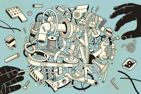
The work of award winning editorial illustrator Harry Campbell is infused with a technical illustration aesthetic. A nod to the highly complex and industrialized world we live in, he makes use of bold structural lineart, axonometric drawing systems, parts explosions, and cutaways to communicate ideas.

For his latest work for The Wall Street Journal, he shares a bit about his process and inspiration:

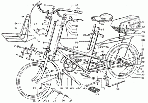
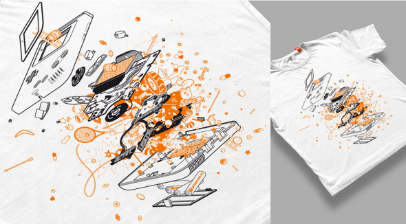
[…] Just in case anybody is wondering about whether my mechanical objects are traced or taken from other drawings. Generally not, I just start drawing. I do look at reference like vaccum tubes, things like that. During this project I was thinking I need to start gathering a bin of junk to pull from. I do love exploded views of ordinary objects. Here’s one of my favorites.

Harry Campbell's Inspiration

Harry Campbell's Inspiration

See more of Mr. Campbell’s work on Drawger or his rep, Gerald & Cullen Rapp.
Adobe Illustrator Gripes & Feature Wishlist

I’m going to have the ear of 3-4 developers from Adobe’s Illustrator team sometime in the next few days. They want to know what makes our life difficult, and what would make it easier. What are your gripes, pain points, repetitive stress injuries? What is your dream feature? What are you accomplishing with plug-ins that should really be built in?

Let me know in the comments, or by editing the fancy Google Doc after the jump.

Read More

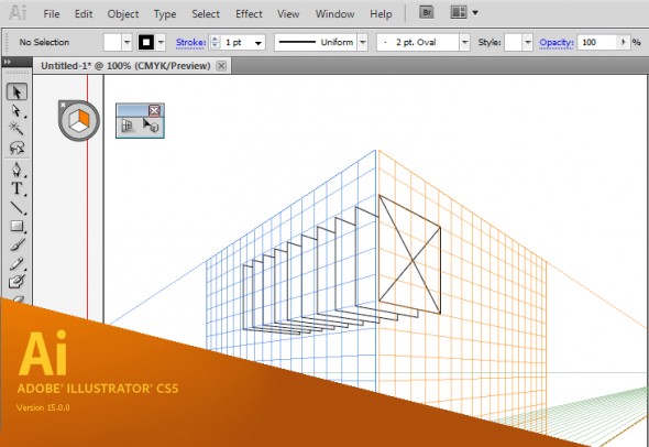
Illustrator CS5 – Perspective Grid

Adobe Illustrator CS5 - Perspective Grid

Adobe Illustrator CS5 - Perspective Grid

It’s that time of the year when we’re blessed/cursed with another release of Adobe’s Creative Suite software and the inevitable question of whether or not to upgrade. For those of you teetering on the edge, here’s the push you may need to break out the credit card.

Brand new to  Illustrator CS5 is an embedded perspective grid and all the accompanying tools you’ll need to streamline your perspective drawing work flow. I was lucky to be part of the beta testing for this tool, along with fellow TechnicalIllustrators.org contributor Cody Walker, and I have to say I’m really pleased with how it turned out.

Anil Ahuja of Adobe has posted a tutorial that shows most of the features of the perspective grid. Have a look at it here. Check out the PDF at the bottom – it goes into more detail regarding how the tools are used. A sample of the file is there as well, but you’ll need a copy of CS5 to open it.

The grids come in default one-point, two-point and three-point perspectives, but you can tweak everything – vanishing points, origin, grid size, the height of the horizon and much more. When the grid is active, the shape tools all conform to a plane (chosen by you with the 1, 2 and 3 keys). Once objects are on the grid they can be copied and moved perpendicularly through the space as well.

However, for me the true power of this tools comes from the ability to transfer flat orthographic drawings directly to the grid. The only drawback is that raster images are not supported – only vector shapes can be applied to the grid.

The new tools will not obsolete or undermine our abilities as technical illustrators. Rather, as Anil states:

“…please understand that Perspective Drawing in Adobe Illustrator CS5 is NOT a 3-D environment. It is an extension of traditional perspective drawing technique. An artist will have a capability to define a perspective grid (one-point, two-point or three point), define a relative scale, move the grid planes and draw objects directly in perspective or attach flat art onto them by dragging with the new Perspective Selection tool.”

Also, all the old quirks of working with a grid are still there – so don’t throw out your techie toolkit just yet!

I highly recommend downloading and trying out the new version of Adobe Illustrator cs5. A 30-day trial is available on Adobe’s site.

Great Inspiration

Every week I get an email update from The Little Chimp Society, an illustration news website where members can log on and post tidbits about exciting projects they have been working on.

Typically the work is more editorial/fine arts in style, but today I was inspired by a great magazine cover that delves into the realm of technical illustration.

Guitar Aficianado Cover

Guitar Aficionado Cover

MDI Digital has created this cover for Guitar Aficionado magazine.  This piece has been selected as a finalist in the American Society of Magazine Editors Best Cover of the Year Awards as well.

Cudos to those over at MDI Digital who worked on this amazing cover!  If you want to see more work created by this company, check out MDI Digital‘s website.

Super Quick 2d Rendering Tutorial

I’ve been asked once or twice how I create some of my images. Here’s a quick rundown on how I did this illustration.

This tutorial is not aimed at making something look great but really to get the job done with a quick deadline. I’m not a great illustrator but I can get shit done fast and still make them look reasonably good. Sometimes that’s all the job requires.

m3a

It’s not overly detailed or even that good but it only took an hour and it’s going to be pretty small in the final image.

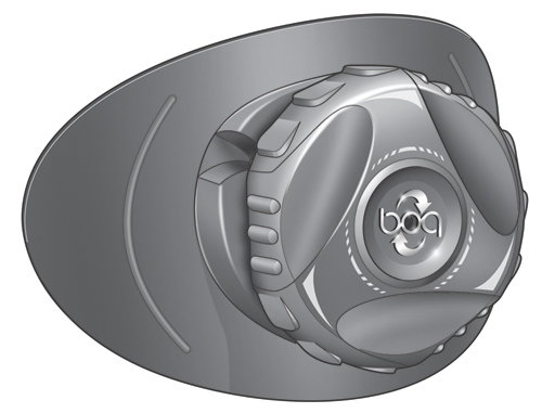
MidPowerM3Boot

So here we go!

Read More

Things you wish you would have learned long ago

I’ve been using illustrator now since oh version 1.4 or something and I think it’s crazy how I’m still always learning on it. For example, for some silly ass reason I never bothered to really get used to setting up symbol libraries and custom user profiles. Finally after all this time I set up a user profile with custom swatches and symbols that I use every time I start up a new document. What a time saver.

symbols

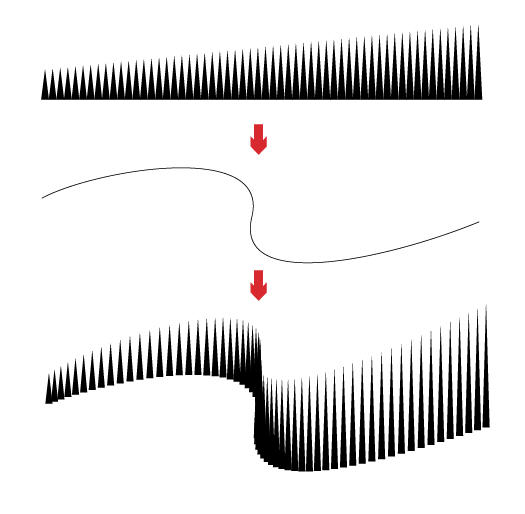
And then I find this gem in Computer Arts latest edition. Here’s a tip from Luke O’Neil on blending paths. Now I’ve used blending paths quite a bit but I had no idea you could shape them to a custom spline.

tip

05___ Creating blends between two objects is easy in illustrator. You draw 2 objects and go to Object>Blend>Make or, alternatively, specify the number of steps you’d like in the options box. It’s also possible to change the direction of the blend by simply drawing a path and, with the blend and path selected, going to Object>Blend>Replace Spine.

How about you, anything you recently discovered that you are kicking yourself in the ass for not using earlier?

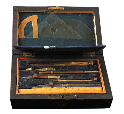
Antique Drafting Instruments

drafting instruments 1

Antique Drafting Instruments

“During the booming years throughout the revolutionary period of industrial productivity the apprentice trained skilled draughtsman was at the peak of his profession, regarded as being a person of professional status. The employment opportunities within this field of occupation were then enormous, as also was the stress factor of the job, there was always a ‘deadline’ for the drawings to be finished, which usually was the day before the draughtsman had be given the job.”

One part of that sounds familiar…

Full post at Fountain Pen Emporium

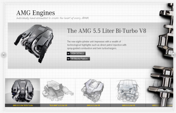
Mercedes-AMG Website

Mercedes-AMG

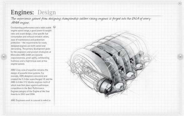
Mercedes-AMG’s Official Global Website is infused with a technical illustration aesthetic that underscores the company’s eighty-plus years of automotive design and innovation.

Mercedes-AMG

Mercedes-AMG

Toyota Safety Ads

We all know that Toyota in the passed year has had many issues with the safety of their vehicles.  I came across the following advertisement (among others) that they now have playing to help get back consumer confidence in their vehicles.

httpvhd://www.youtube.com/watch?v=M3PBQEKc4w4

If you would like to see a full version of the advertisement, visit http://www.toyota.com/safety/videos/safety-features.html#

It’s great to see the use of technical illustrations in any media form and for large corporations as it brings exposure to our specialized art form.  BUT, does the use of the exploded views in this advertisement work?

I think not.  There are so many other ways that I could think of to utilize a tech illustration to show how Toyota has improved their vehicles to ensure safety.  Perhaps showing the specific mechanical technologies (ie. braking system) that have been improved and how they affect vehicle performance when stopping.

In the longer version of the ad they address the 5 accident avoidance technologies with an exploded view of each (ie. anti-lock brake system). Unfortunately, I find the use of the technical illustrations in this advertisement reflect a more “wallpaper” effect than being useful in supporting Toyota’s case for change in safety measures.

What do you think?  Do you have other ideas of how Toyota could win back consumer confidence by using technical illustrations?