ICON6 Illustration Conference Wrap Up

Icon6 Logo

It has been two weeks since the ICON Illustration Conference in Pasadena (previously), and it was a blast. I’ve been so busy catching up on work that I haven’t had the time for a debriefing. Sooo:

The Future of Publishing

With the majority of attendees dependent on work from magazines and newspapers, the unofficial theme of the conference was The Future of Publishing. The opening keynote set the tone (video in two parts, here and here). In short, publishing isn’t dead, it’s just changing and paying customers are demanding richer experiences.

By now, all newspapers and magazines have websites, and some release editions for Apple’s iPad. While a static image looks just as beautiful onscreen as it does in print, animation and interactivity unlock the full potential of these technologies and deliver more immersive experiences for readers. Every illustrator doesn’t need to become a classical animator, but new opportunities will certainly open up for those with the skills to bring some motion or interactivity to their images.

This was cause for much trepidation.

Business Practices

There were some great presentations on contract literacy, price negotiation, branding, marketing and the Orphan Works Act. The showstopper though, was the introduction of a rights management system called PLUS (Picture Licensing Universal System).

PLUS is a non-profit coalition of publishers and industry associations. The system combines metadata embedded invisibly into images with a third party database that would keep track of the copyrights associated with each image. This plugs into a publisher’s asset management system and informs them of the printing rights they own for a particular image, the duration of these rights, and how to contact the creator for additional rights. The system also includes a reverse image search (similar to TinEye) to locate the origin of an image without metadata. Neat stuff.

Social

ICON went beyond social drinking; Social media, viral videos, blogging, microblogging, linking in, flickring, tumbling, buzzwords abound. I’m not sure that anyone’s made any sense of it all, but it’s nice that illustrators can finally be solitary and isolated and social at the same time.

In Conclusion

Though not specifically for technical illustrators, I had a great time at ICON. I met some great people (hey Troy, Jude, Gary, Edel, Carl, Brian, Jennifer, Jeremy, Rod, Topher, Chloé, Jeehyun, Chris, Chris & Chris and anyone I’ve forgotten) and learned a thing or two. But mostly, got really excited about what I do and the possibilities out there.

Check out Escape From Illustration Island for extended coverage, interviews and videos!

Texture Tutorials

While working on a recent freelance job, I stumbled upon a great website,  MY Ink BLOG, with some realistic texture tutorials for grass, wood, stone and water.  Andrew Houle, the creator of the site uses various filters in each of these tutorials to achieve the desired results.

Specifically, the following are the texture tutorials:

Creating a Realistic Water Texture in Photoshop

Water Tutorial

Creating a Realistic Wood Texture Using Photoshop

wood-effect

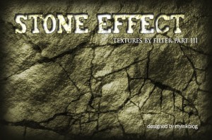
Creating a Realistic Stone Texture Using Photoshop

stone-texture

Create an Awesome Grass Texture in Photoshop

grass-texture

The site has a great selection of Photoshop tutorials as well as so many other resources for Illustrators and Designers, that could be valuable in future.  Make sure you check it out!

Do you know any good websites for creating textures or have any “tricks” you use to save time on your illustrations?

Jameson Simpson

Illustrator Jameson Simpson creates colourful lineart illustrations for a broad range of magazines and advertising clients. When appropriate, he infuses humour into his instructional style which makes for a witty, more engaging image.

Jameson Simpson - Clover

Tell us a little about yourself. What’s your background?
I’m currently living in Grass Valley, California. I tend to move a lot. I’ve been here 2 years. I never technically studied Illustration but I did study fine art and both my parents were artists so I grew up with that. I painted professionally for a couple of years before transitioning to Illustration. I’ve been Illustrating for maybe 12 year now.

What’s your work situation? Do you have an agent or are you self-represented?
I’m a freelancer. I have no agent. I’ve considered it a couple times but it always ends up feeling like it’s going to be limiting.

Software of choice?
Adobe Illustrator

Jameson Simpson - Rigamorole

Favourite clients or types of project? Subject matter?
I like larger projects I can sink my teeth into. Agency projects tend to be more like that. Humor is very good also. Because of the nature of Infographics, things can get a bit dry at times. Anything with a bit of lightness and humor poking fun at the genre is good with me, especially when I’m given free reign to throw in a little of the bizarre.

Jameson Simpson - Rigamorole

Jameson Simpson - Rigamorole

Any advice for illustrators just starting out?
Advice? Hm. My experience was that putting together a really nice promo card or promotional package is a good start. Then just put yourself out and see what happens. I’ve seen in myself and others in the field that it can be an overwhelming task promoting oneself. In the end though, it’s preconceptions that make things complicated for us. Better to be a man or woman of action and just throw oneself into it (both the work and the promotion) and magic can happen. I always loved that quote by Goethe (which may or may not historically be his words, nevertheless):

“Until one is committed, there is hesitancy, the chance to draw back, always ineffectiveness concerning all acts of initiative and creation. There is one elementary truth, the ignorance of which kills countless ideas and splendid plans; that the moment one definitely commits oneself, then providence moves too. All sorts of things occur to help one that would never otherwise have occurred. A whole stream of events issues from the decision raising in one’s favor all manner of unforeseen events, meetings and material assistance which no one could have dreamed would have come their way. Whatever you can do or dream you can, begin it. Boldness has genius, power and magic in it. Begin it now!”

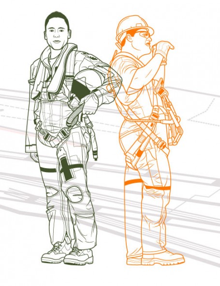
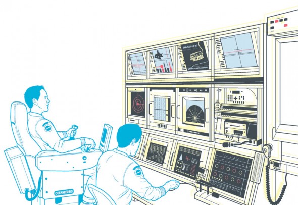
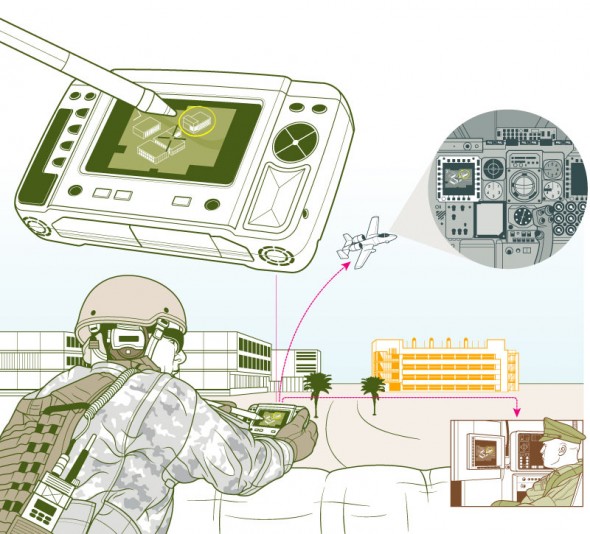
Jameson Simpson - Military

All images © Jameson Simpson. You can find his work at http://www.jamesonsimpson.com/

Illustration Challenge

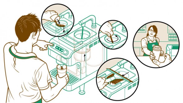
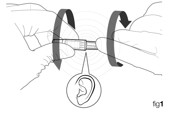
Most of the stuff I do involves having to make illustrations for instructions that speak clearly and can have no text at all. The obvious reason for this are so that there will be no need for translations into multiple languages. One thing I come across all the time is the need for an icon or symbol that describes something making a sound or a click. I’ve tried a variety of things from an ear to a speaker to some silly lines indicating a noise. I would rather not go so far as to add music notes. What do you think would be a good icon or symbol to use? Draw one up if you would like, it might be fun.

TwoFer_fig1

Critique Request!

Steven Howards writes in….

This is my portfolio link, http://www.swhowardillustration.blogspot.com

I’ve been studying illustration at the Academy of Art University in San Francisco and have only recently developed a desire to pursue technical illustration. I know there is much that I need to do and work on, but any comments, critiques, and help is very much appreciated!

Here’s my critique, you do very nice work, keep drawing your butt off. If a chump like me can make it as a Technical Illustrator you surely can. One suggestion, get yourself a real website with a quality domain name, not that blogspot business. If you want to go the free route here are some suggestions.

Thanks for sending that in.

Any advice for Steven?


Kevin Hulsey

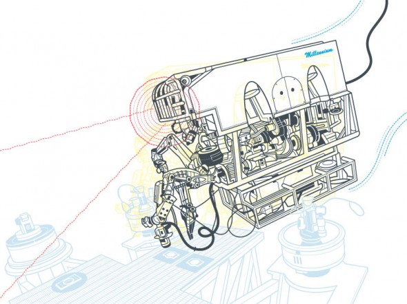
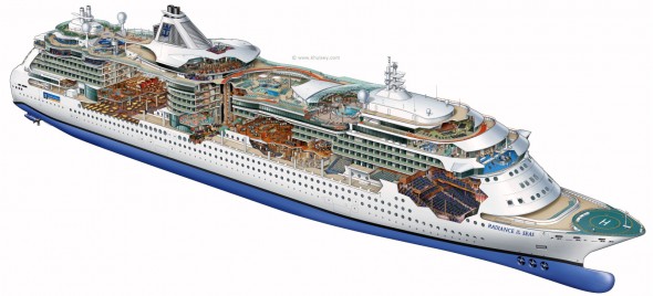
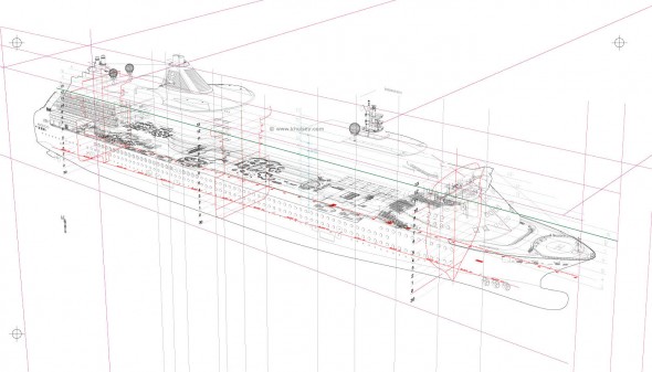
Kevin Hulsey - Radiance of the Seas Cutaway Illustration

Kevin Hulsey - Radiance of the Sea Process

“Any subject-matter is no more, or less, complicated than any other if you break it into small enough sections. A big, complex object like a car, plane or ship is just 30 or 40 small illustrations that happen to occupy the same space.”

The career of technical illustrator extraordinaire Kevin Hulsey is nothing short of prolific. His client list reads like a roll call of the world’s major transportation, technology, manufacturing and entertainment companies. His work has been recognized with numerous awards from Belding, Best in the West, Communication Arts Magazine, and the Art Directors Club Of Los Angeles. He began his trade with an airbrush in hand, then traded it in for a Wacom tablet and made the leap to digital media. And his website is an abundant source of inspiration, with illustrations of mind-boggling complexity and accuracy and myriad resources, articles and tutorials.

This all keeps Mr. Hulsey rather busy—unfortunately for us too busy for an interview. However, with his permission, I’ve collected some links to images, resources, and an interview he did with another site:

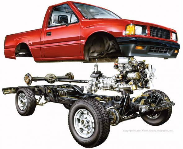
Kevin Hulsey - Pickup Truck Cutaway

Pickup Truck Cutaway – Copyright © 2010 Kevin Hulsey Illustration, Inc. All rights reserved.

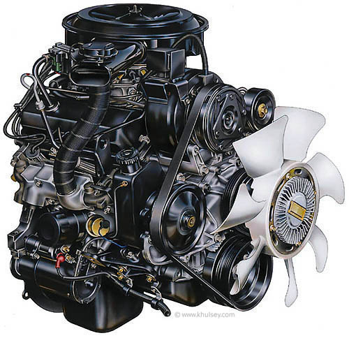
Kevin Hulsey - Automobile Motor Illustration

Motor Illustration – Copyright © 2010 Kevin Hulsey Illustration, Inc. All rights reserved.

“Even after nearly thirty years, and thousands of illustrations, it is still fun to see your work on a billboard or in a magazine, particularly when you aren’t expecting it.”

Big thanks to Mr. Hulsey for sharing his time and work with us, and all the amazing resources on his site!

Update: Wacom case-study on Mr. Hulsey. (now on Internet Archive)

All images copyright © 2010 Kevin Hulsey Illustration, Inc. All rights reserved.

Oil Spill Illustration Roundup

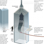
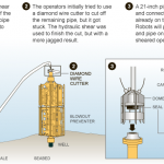
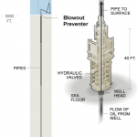
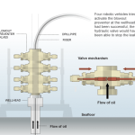
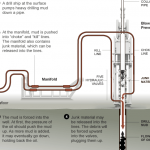
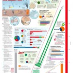
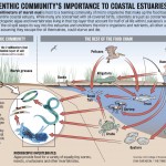
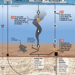
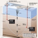
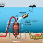
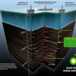
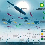
The biggest news story of the past two months is highly technical and happening beneath 5,000 feet of water. These obstacles make technical illustration the obvious medium for telling the story. Collected here are illustrations and graphics from various sources, showing their visual approach to communicating the information. (Mouseover for source, click for larger version)

The New York Times‘ illustrations are well designed and executed in a graphic style typical for newspapers. Black lines delineate the key information, both a visual strategy and a production consideration (black prints well on grainy paper in fast presses, since it’s a single plate). Deep-red lines and arrows call the eye’s attention to important details. Light colour tones provide additional information such as material, dimension/shading, or simply visual separation. A variety of views are used, elevations, isometrics, perspectives, whatever suits the content. Nice stuff here.

Infographic World‘s ambitious graphic attempts to tell the entire story, relying heavily on text, but ends up feeling cluttered, unfocused and disorganized. The individual illustrations feel underdeveloped.

NOLA/Times-Picayune‘s graphics are similar in style to The Times’, but with a much thicker line weight which makes me think they might have appeared smaller in print. The multitude of arrows really get in the way of the information. A bit heavy handed.

The Economist is a weekly news magazine, but the illustration doesn’t have much to show for the extra time (to be fair, there’s no telling what sort of turnaround time the illustrator was given).

BP employs slick [no pun intended] 3D renderings to communicate the company’s repair efforts and give the impression of openness and transparency. I have two problems with this. First, they feel expensive. I imagine BP already had a 3D model library of all their equipment for planning and presentation purposes, so this may very well be the most cost-effective visual solution for them. But the impression these polished 3D renderings give is that they’re spending a lot on visuals, when they should be devoting all their resources to the repair and cleanup process.

Secondly, 3D renderings feel like constructed illusions rather than explanatory depictions of their efforts. Maybe it’s my bias towards illustration since both are just as artifical (ie. not photographs or videos), but I find The Times’ illustrations more trustworthy than BP’s 3D world.

Sources

The New York Times. “Methods That Have Been Tried to Stop the Leaking Oil”
Infographic World. “Crude Awakening”
NOLA.com. “Oil Spill Graphics”
The Economist. “Mudslinging”
Unified Command for the BP Oil Spill. “Graphics”
BP. “Gulf of Mexico Response”

Have you seen any additional illustrations of the Gulf of Mexico oil spill? Let us know in the comments!

Illustration Podcasts

Illustration Podcasts

Sometimes freelancing can be like solitary confinement. Big projects, tight deadlines, (and if you’re in the Pacific Northwest, terrible weather) can all keep you locked up in the home studio. To ward off cabin fever I like to listen to a small selection of podcasts, some illustration-related, some business-related and others general interest to stay current with the rest of the world.

Sadly, I haven’t found a technical illustration podcast, but here’s my playlist:

Illustration Related:

Escape From Illustration Island: The Podcast
In-depth interviews with illustrators, artists’ representatives and art directors. Companion to Escape From Illustration Island, a resource portal and illustration community.

Big Illustration Party Time
A conversational podcast about the ins and outs of freelance illustration and cartooning.

Hawk and Squirrel
A brand new podcast searching for its voice. As manic and entertaining as its hosts (and friends of mine), Chad Covino, Juan Solon and Nimit Malavia.

Freelance and Business Related:

Freelance Radio
Official podcast of FreelanceSwitch.com covering work and life issues of freelancers.

General Interest:

The Monocle Weekly
A mix of discussions, interviews and field reports on world events and culture.

Stuff You Should Know
Official podcast of HowStuffWorks.com, explains how everyday things and not-so-everyday things work.

Have any podcasts to recommend, illustration-related or otherwise? Let us know in the comments!

The Future of Technical Illustration

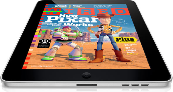
Wired Magazine on iPad

For those of us who work with publishers of magazines, newspapers and books, the past few years have been trepidatious. The future of the printed page looks uncertain. There’s much speculation that this business model or that device will save the industry. And as much as we techies may fall in love with each new gadget, they have been looked at as a threat, or at least an unknown variable in our careers.

But through all this, I’ve taken comfort in two facts. First, that we live in a visual society. For this reason, the pixel pushers, the vector tweakers, the pen sketchers, and more importantly the visual thinkers will always be in demand. Secondly, the environment around us grows more complex every day. We specialize in distilling complexity into more comprehensive, communicative forms.

I feel our skillset will remain relevant and in demand, but it is crucial to stay informed about prevailing technologies and mediums, and to constantly update our workflows to be able to deliver our product in whatever packaging consumers demand.

Threats or opportunities? What are your thoughts?

Home Appliance Energy Use – Infographics

GE: Home Appliance Energy Use

GE: Home Appliance Energy Use

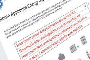
General Electric has posted an interesting infographic that illustrates how much energy certain home appliances use. Leafing through the interactive site yields all sorts of information that the typical consumer may be unaware of.

It’s a good example of an infographic that cleanly communicates a complex and obscure issue – in fact, it’s so simple that I found myself mystified as to why I hadn’t seen something like it sooner. Enigmatic concepts like kilowatt hours can be hard to describe, but putting them into a real world context can firmly solidify their meaning in the audience’s mind.

What might be the most interesting bit of information is that a coffee maker requires roughly an equal amount of energy as a new washing machine…

You can check it out on GE’s site here.