Wrapping Patterns Around Cylinders

Wrapping Patterns Around Cylinders

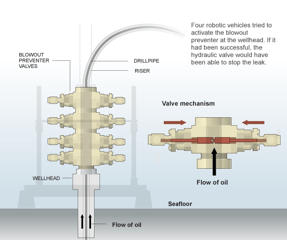
Brett wrote in looking for a way to accomplish a diamond grip pattern wrapping around a cylinder, like the one shown above. It’s easy enough to trace a photo, but what if you didn’t have one, or it wasn’t at the right angle?

The technique I’d use is similar to mapping a label to a can.

Wrapping Patterns Around Cylinders

1. Create the artwork you’ll need. The diamond pattern matches the angle and density of the original. The black circle is the same diameter as the reference part, and is filled with no stroke.

Wrapping Patterns Around Cylinders

2. Make the pattern a symbol. Drag the pattern into the Symbols palette.

Wrapping Patterns Around Cylinders

3. Extrude the circle. Go to Effects > 3D > Extrude & Bevel. Click the Surface dropdown at the bottom and select Wireframe. This will help you orient the cylinder to the desired angle. I usually start by entering 0° for all the rotation angles, then rotating one axis at a time by grabbing the edges of the preview cube.

You may need to reposition your cylinder to line up better with a reference image. To do this, Click OK, move the cylinder as needed, then open your Appearance pallete and double click on the 3D Extrude & Bevel item. You may need to turn Preview back on.

When you’re happy with your geometry, click Map Art…

Wrapping Patterns Around Cylinders

4. Map Art. Click through the Surfaces to find the rectangular side surface. Then select your pattern from the Symbol drop down. Next, select Scale To Fit at the bottom and check off Invisible Geometry. Click OK.

Wrapping Patterns Around Cylinders

5. Change Surface to Flat Shading. Click OK. You can now edit the artwork as needed by going to Object > Expand Appearance. In my example, I changed the yellow fill to white, then drew the rest of the lineart on another layer.

Have a common problem in Illustrator? Let us know in the comments, or email it to suggest@technicalillustrators.org!

Oil Spill Illustration Roundup

The biggest news story of the past two months is highly technical and happening beneath 5,000 feet of water. These obstacles make technical illustration the obvious medium for telling the story. Collected here are illustrations and graphics from various sources, showing their visual approach to communicating the information. (Mouseover for source, click for larger version)

The New York Times‘ illustrations are well designed and executed in a graphic style typical for newspapers. Black lines delineate the key information, both a visual strategy and a production consideration (black prints well on grainy paper in fast presses, since it’s a single plate). Deep-red lines and arrows call the eye’s attention to important details. Light colour tones provide additional information such as material, dimension/shading, or simply visual separation. A variety of views are used, elevations, isometrics, perspectives, whatever suits the content. Nice stuff here.

Infographic World‘s ambitious graphic attempts to tell the entire story, relying heavily on text, but ends up feeling cluttered, unfocused and disorganized. The individual illustrations feel underdeveloped.

NOLA/Times-Picayune‘s graphics are similar in style to The Times’, but with a much thicker line weight which makes me think they might have appeared smaller in print. The multitude of arrows really get in the way of the information. A bit heavy handed.

The Economist is a weekly news magazine, but the illustration doesn’t have much to show for the extra time (to be fair, there’s no telling what sort of turnaround time the illustrator was given).

BP employs slick [no pun intended] 3D renderings to communicate the company’s repair efforts and give the impression of openness and transparency. I have two problems with this. First, they feel expensive. I imagine BP already had a 3D model library of all their equipment for planning and presentation purposes, so this may very well be the most cost-effective visual solution for them. But the impression these polished 3D renderings give is that they’re spending a lot on visuals, when they should be devoting all their resources to the repair and cleanup process.

Secondly, 3D renderings feel like constructed illusions rather than explanatory depictions of their efforts. Maybe it’s my bias towards illustration since both are just as artifical (ie. not photographs or videos), but I find The Times’ illustrations more trustworthy than BP’s 3D world.

Sources

The New York Times. “Methods That Have Been Tried to Stop the Leaking Oil”
Infographic World. “Crude Awakening”
NOLA.com. “Oil Spill Graphics”
The Economist. “Mudslinging”
Unified Command for the BP Oil Spill. “Graphics”
BP. “Gulf of Mexico Response”

Have you seen any additional illustrations of the Gulf of Mexico oil spill? Let us know in the comments!

Autodesk Design Viz Showreel

httpvhd://www.youtube.com/watch?v=6vOtaUB88XI
Lots to look at in this selection of some of the year’s best 3DS Max and Maya work, as selected by developer Autodesk.

The-Blueprints.com

Orthographics of a Ducati Monster

Ducati Monster Orthos

The first thing you need when modeling something in 3D (or drawing in perspective from plans) is a good set of orthographics — top, front and side views. Start your search at The-Blueprints.com.

There’s a wide variety of cars, trucks, planes, trains, helicopters, motorcycles, ships and even sci-fi vehicles. Quality and size differ from one to the next, but you’re bound to find something interesting to model.

X Wing Orthos

X Wing Orthos

[via Kottke]