Isometric Action Tutorial from Astute Graphics

Isometric Action Tutorial from Astute Graphics

Iaroslav Lazunov has a great isometric illustration tutorial for Adobe Illustrator on the Astute Graphics blog.

It’s similar to the scale-shear-rotate method we’ve talked about before. You start by drawing straight-on orthographic views of the top, front and side of the object, then distort each onto their respective isometric planes.

What’s cool about this technique is that it uses Graphic Styles to apply the distortion. This way the artwork stays dynamic, meaning you can edit the straight-on flat projections to update the isometric version. They also use Astute Graphics’ Phantasm plugin to apply shading to each plane at the same time.

This technique would be really handy if you had to create a large detailed locator map, especially if you might have to change the design of elements down the road.

Full disclosure: As a beta tester for Astute Graphics I receive complimentary products.

Isometric Illustration Libraries

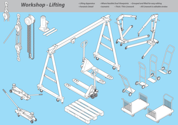
Isometric Illustration Library - Workshop Lifting

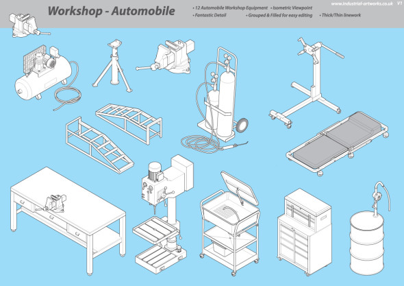
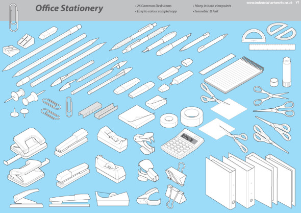
Matt Jennings has been hard at work adding to his stock technical illustration component libraries [previously]. New libraries include Workshop – Lifting, Workshop – Automobile and Office Stationery. The illustrations look well constructed, have great line quality, and are super affordable at £7.50 to £10.00 ($12 to $15 USD). If you have a relevant project, these could save you a huge amount of time.

Isometric Illustration Library -  Auto Workshop  Isometric Illustration Library - Office Objects

Industrial Artworks Technical Libraries

Chris Philpot

Open any magazine on the newsstand and inside you’ll likely find an illustration by Chris Philpot. He creates humorous how-tos, conceptual illustrations, infographics and animations for some of the biggest and best, including TimeWired, Popular Science, Outside and Men’s Health .

I got in touch with Chris to ask him a few questions about his work, how he got his start in illustration, and what the future may hold.

Chris Philpot - City of the Future

What’s your background? How did you find your way into illustration?

I wanted to be an illustrator in high school but read articles from practicing illustrators predicting the demise of the profession. I decided I should get a degree in design to ensure a more stable income. That lead me to a job as an editorial art director for about 12 years. While I grew to enjoy design, I still really wanted to illustrate so I started freelancing on the side. Five years of moonlighting gave me enough of a base to make the switch. It was a scary transition, but my wife was incredibly supportive. I’ve been illustrating full time for the last six years. It’s been great. I make more money, have more autonomy and am much more fulfilled creatively.

Chris Philpot - Visual Quiz for Esquire

What are your favorite subjects or types of project?

A technical approach is surprisingly versatile. You can add a subtle joke to dry stories. You can take irreverent or taboo stories and make them presentable to polite society. You can take a really funny story and the art can play the role of the straight man. I read a lot of Gary Larson cartoons growing up and would turn every job into a one-panel Far Side cartoon if I could. My favorite types of projects involve subjects that are fun to draw like monsters, robots and octopuses.

Chris Philpot - Oculus Rift for TIME

Your style is really consistent, how important is that? How did you develop your aesthetic?

The consistency comes from a few places. Mostly, I need to produce a lot of work to meet my income requirements each month so the volume dictates a certain formula. I try to improve with each job. If a new technique works, I add it to the list of best practices. I’ve also found that art directors are coming to me for the work they see in my portfolio. If I send something too different they often direct me back to the look and feel of my portfolio (I still send in variations if I think they’re better.) I also use a lot of 3-D models for reference. That definitely adds to the consistency, especially in the proportions of people. I’m pretty lanky so using myself as reference wasn’t working out.

Chris Philpot - Humvee

What’s your process for a typical assignment? What hardware and software do you use?

I take the brief from the client and request any missing information like story details, budget and schedule. I try to get as close as possible to a final draft by the sketch deadline. It puts the art directors and editors at ease and I think everyone is more inclined to approve things. Revisions hurt profits and the end of the time line breeds a revise-happy anxiety. This is sometimes unavoidable of course.

Regarding software, I use a lot of inexpensive models from Daz3d and Turbosquid for reference when I can and trace the renderings out of Poser or Blender with Illustrator. For hardware, I buy a top-of-the-line iMac every 4 years and use a Wacom intuos4. The tablet was the single best addition to my work flow. I’m not sure how I ever drew with a mouse.

Animation started in Flash but is now done exclusively with After Effects.

What challenges have you faced in your career? What opportunities do you see for the future?

Transitioning from a full-time job to full-time freelancer was a challenge. I worked a lot before going to the office, during lunch breaks and after I got home. Now my biggest issue is working from home with three kids. I love being available for them and I need to be productive so it’s a balancing act sometimes.

There are always opportunities for illustrators to pitch or generate their own content. When the iPad came out, everyone in the editorial world started experimenting with video for the app version of their magazines. I’ve always toyed with motion so it was a good opportunity to try something. The business etiquette series for Entrepreneur magazine (written by Esquire Articles Editor Ross McCammon) was supposed to be a simple illustration with some movement. I asked if I could take on the larger sidebar and to their credit they let me try. Once the longer video was approved they agreed to a fee I proposed. I asked a friend and former coworker Tyrrell Cummings if he would help me with the storyboards. It came together nicely and we’ve done a one-to-two minute short video each month for the last three years.

Chris Philpot - Speed Data for Car and Driver

You’ve worked with some of the biggest and best clients. Any tips for illustrators starting out?

It was uncomfortable at first, but I put myself out there with an online portfolio and 4 x 6 postcards. I was turned down by representatives so I had to go it alone. The initial images were primitive. I did jobs for friends and for the in-flight magazine I worked for at the time. That gave me enough of a portfolio on which to build.

If you’re starting out, just keep producing the work you’re excited about and make it visible. Keep updating it. The days add up, and if you stay active you’ll get somewhere. I didn’t enjoy instant gratification but I did get eventual gratification.


Chris’ work can be found at ChrisPhilpot.com

Isometric Cutaway Infographic Walkthrough

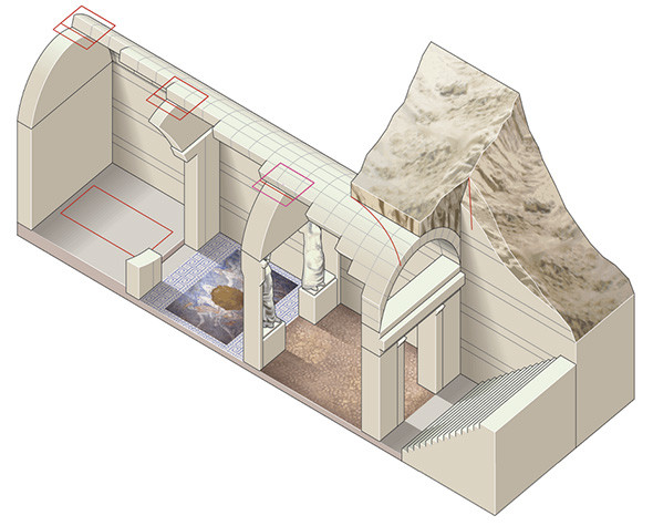
Isometric Cutaway Infographic Tutorial

Ninian Carter has put together another a great step-by-step of his isometric illustration process, this time of a tomb dating back to the era of Alexander the Great. Like his isometric aircraft illustration, he makes great use of the Scale-Shear-Rotate technique. The Live Traced textures really bring this one to life!

The illustrated elements were then taken into Adobe Edge to add some animation and interactivity.

Thanks for sharing, Ninian!

Cutaways on Tumblr

Subaru Levorg Cutaway
CUTAWAYS on Tumblr is just that—and endlessly-scrolling gallery of automotive cutaways and ghosted illustrations. Some are new, some old, some good, some bad, but still quite an impressive collection. Sadly, most are missing credit to their respective creators.

Honda S2000 Cutaway Illustration

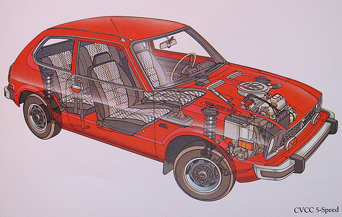
Honda Civic CVCC Cutaway Illustration

McLaren F1 Owner’s Manual

Mark Roberts, Design Operations Manager at McLaren, reflects on his technical illustration work for the owner’s manual for the revolutionary McLaren F1.

It’s really inspiring to see a company take it beyond technical documentation to something of a brand statement or a collector’s item. Something you’d put on a shelf or frame rather than leave in the glove box.

(via Clint Ford)

Adobe Updates Mobile App Lineup

Drawing made with Adobe Illustrator Line on iPad

Drawing made with Adobe Illustrator Line on iPad

At its Adobe MAX conference today, the company has announced new features for its iPhone and iPad app offering. Potentially of interest to tech illustrators are:

  • Illustrator Line Create vector sketches freehand or with the help of a selection of shape guides and axonometric, isometric, or two-point perspective grids. Work can be brought into Illustrator CC or Photoshop CC via Creative Cloud.  [Video]
  • Shape CC Auto-traces photos captured with your device’s camera, creating vector artwork for use in Photoshop CC, Illustrator CC or Illustrator Draw. [Video]
  • Color CC Generate color palettes from photos, then mix, edit and sync via Adobe Color service. [Video]

All apps are free, but require a registration for a free Creative Cloud membership.

Do you use mobile apps in your creative process? Does professional work require a desktop? Sound off in the comments!

Some Perspective on Perspective Drawing

What we see versus what we think we see

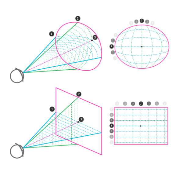
If you’re struggling to learn perspective drawing, or even if you use it every day but never thought about it too deeply, I suggest you read Live Perspective: A New Approach to Depth in Drawing over on TutsPlus.

It starts off with the fundamentals of sight, perception and experience, and goes on to tie together phenomenon such as distortion, parallax, peripheral vision, depth of field and the limits of linear perspective into a sort of unified idea about visually communicating three dimensional space.

Autodesk Sketchbook Pro 7

Sketchbook Pro has been around for almost 10 years and is popular amongst comic, character and concept artists, but its latest release has a toolset that might be of interest to technical illustrators. While it’s a pixel-based application, as opposed to vector, I think it could still be handy for sketching roughs and even looser-styled finals.

httpvh://www.youtube.com/watch?v=r96G15n08Y4

Perspective Guides

These guides let you quickly and intuitively lay down lines converging on one, two, three or even five vanishing points. The tool gives you constant feedback as to where your cursor is positioned in space, and when you draw, it constrains your line to the appropriate heading. This looks like it would be very useful in the planning stages of an illustration, enabling you to quickly sketch in a variety perspectives.

Ruler & French Curves

The Ruler tool allows you to stroke a straight line in any direction. This works similar to Photoshop’s constrain modifier (Shift key) while using the Brush tool, but works in any direction. The French Curves shows an overlay of a variety of arcs and curves which can also be used to constrain a brush stroke. These tools would help add detail to a sketch once you’ve established the overall perspective.

Ellipse

Photoshop and Illustrator may have ellipse tools, but the one in Sketchbook Pro includes a minor axis guideline and displays the rotation and degree of the ellipse for added precision.

Everything Else

Other notable tools include the Symmetry mode that mirrors your drawing along a vertical and/or horizontal axis, Free Transform which is handy for distorting textures, patterns, shadows or repeating features into perspective, and Flipbook which enables frame-by-frame animation.

httpvh://www.youtube.com/watch?v=VgU61K2cjuc

httpvh://www.youtube.com/watch?v=ngLhGySVYLQ

Sketchbook Pro is US $65, or via subscription for $25/year or $2.99/mo.