How to Illustrate a Building in Isometric

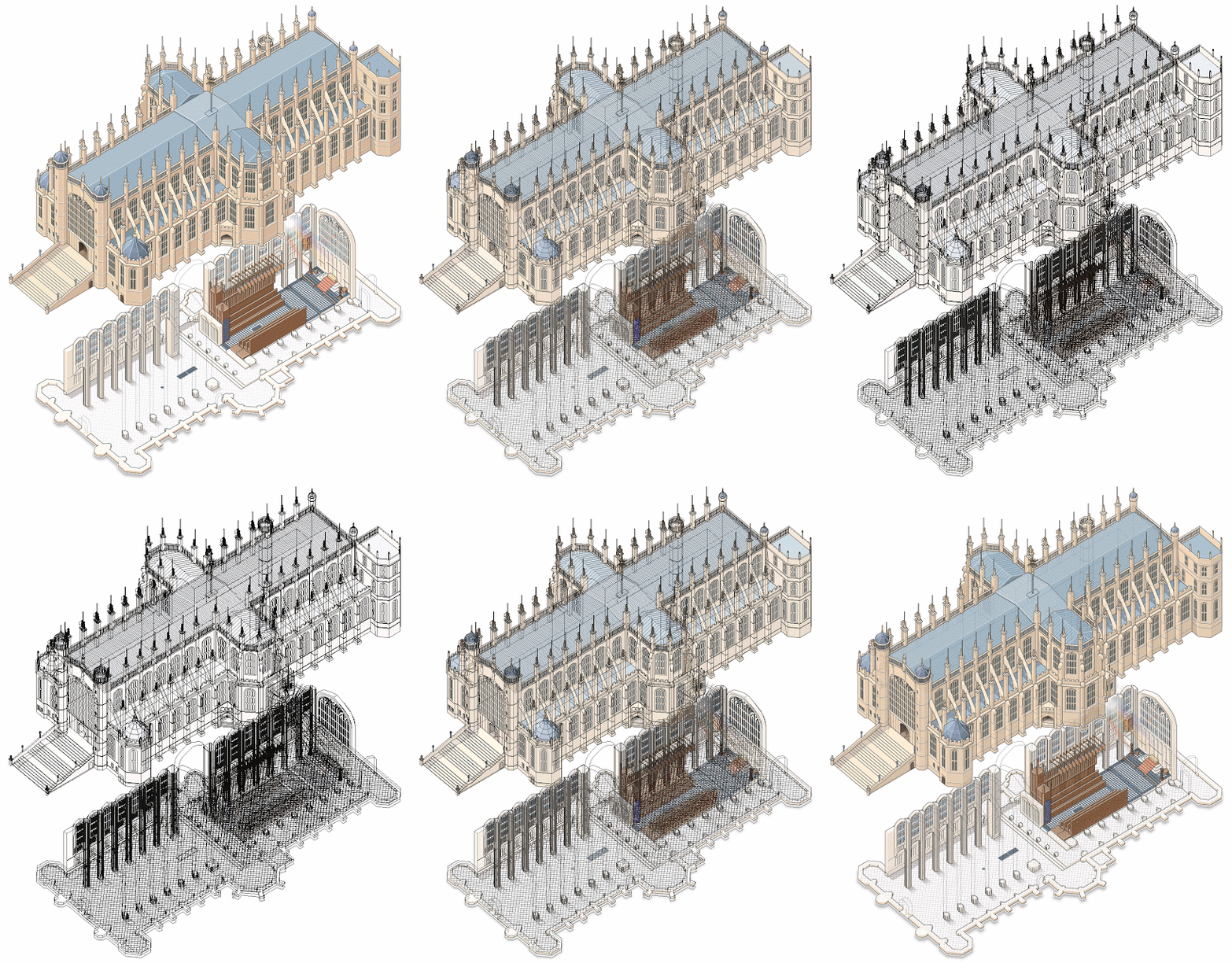
Infographic artist Ninian Carter, who previously shared with us his process for illustrating a smartphone, an ancient tomb, and a water bomber, has posted 100+ screenshots showing his process for illustrating St George’s Chapel on the grounds of Windsor Castle in Adobe Illustrator.

To create it, he relied on satellite imagery, copies of old plans, 360° panoramic photos and various tourist photos.

Check it out here.

Great work, Ninian!

George Retseck

George Retseck is a Philadelphia-based technical illustrator with nearly 40 years of experience. He works with magazines such as Scientific American, Popular Mechanics, The Scientist, Bicycle Quarterly, as well as companies in the science, medicine and technology fields.

He works in a variety of styles, but I especially enjoy the line quality and attention to detail in his retro pen-and-ink style. It almost makes me want to dig out my old, stubborn, finicky technical fountain pens.

Read More

Learn Engineering on YouTube

YouTube channel Learn Engineering is a great series of videos explaining how everyday objects work. The 3D animations of different gears, motors, coils and fields are clear and really help illustrate the easy-to-understand script.

Uniqlo HeatTech Fabric Video

This Uniqlo promo video is a great example of combining technical information with beautiful and engaging visuals, highlighting otherwise invisible features and demonstrating their benefits to the customer.

In a market where branding is often just a graphic silkscreened on a generic garment, Uniqlo places the emphasis on the comfort, performance, sophistication and simplicity of the product itself. Armed with that information, the customer’s decision is made easier.

John Grimwade: Infographics for the People

Illustrator, designer, and educator John Grimwade has started a great blog on information design and data visualization called Infographics for the People.

For his posts, Grimwade pulls together contemporary infographics, historical examples and samples from his prolific career working with newspapers, magazines, books and corporate clients. From his mission statement:

I’m trying to promote infographics that engage the general public. There is a trend towards elitist visualizations, that seem like they might be designed for data geeks. Of course, visual communication is a powerful way to help people understand, but first we have to get people on our side. Be inclusive, not exclusive. And never forget that a sense of fun is an important component in getting our message across. Infographics for the People!

He critiques his old work with self-deprecating humour and encourages readers to learn from his mistakes and to think critically when creating our own work.

Infographics for the People by John Grimwade

Remie Geoffroi

Freelance illustrator Remie Geoffroi creates a wide range of work—from portraits, lifestyle, sports and business editorials to infographics, exploded diagrams, instructional illustrations and architectural drawings. What unites it all is his clean, technical use of vector artwork and a mastery of line quality.

It’s probably this combination of versatility and consistency that keeps art directors calling. Remie has worked with clients including AARP, Sports Illustrated, TIME, ESPN, Men’s Health, Martha Stewart Living and Bon Appétit, and advertising clients including American Airlines, Coca-Cola, McDonald’s, Microsoft and Volkswagen.

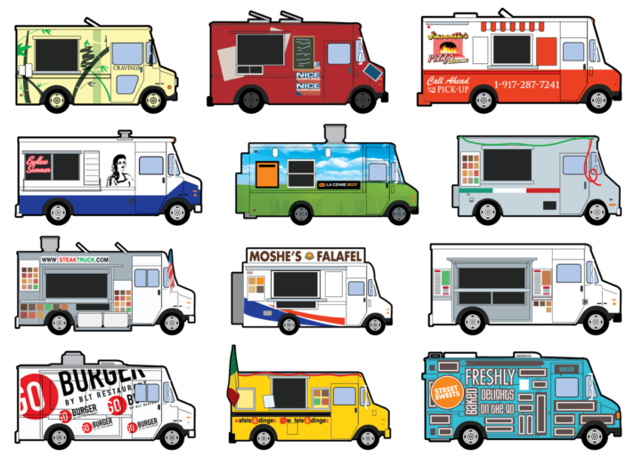
Remie Geoffroi - Food Trucks

How did you get started in illustration?

Drawing was all I ever wanted to do. Through high school I took part time jobs at an animation studio, a screen printer’s art department, etc. I went to college for graphic design because I was pretty hazy on what a career as an illustrator would look like. I ended up being hired as a clip art illustrator right out of college, and set out as a freelancer shortly afterwards.

Remie Geoffroi - Drones

What is a typical day for you as a freelance illustrator?

I regularly work with magazines (Billboard, ESPN, etc.), and occasionally advertising agencies, Sid Lee, DDB, etc. I recently illustrated “Tools of Titans” the new book from Tim Ferriss, and a book for Gold’s Gym, coming out later this year.

I have a shared studio space where I work from, or I’ll sometimes choose to work out of my home office if the weather is bad or my workload is light.

Remie Geoffroi - Nest

How do you create your illustrations?

I work almost exclusively in Adobe Illustrator. Many of my illustrations that people have assumed are raster (Photoshop) are actually vector. I like the versatility of being able to tweak the lines. I’ve developed a very streamlined, comfortable process for creating vector artwork. I appreciate being able to revisit files years later to harvest and reuse elements.

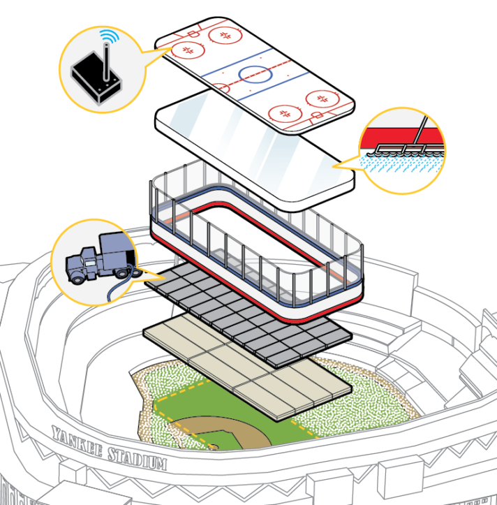
Remie Geoffroi - Stadium

You work in a range of styles, how do you choose the style for a particular project?

The assignment usually dictates the style. Art directors usually point to one example or another from my site that they’d like to see. Repeat clients don’t usually request a particular style, as they usually trust where I’ll take a particular project.

Remie Geoffroi - Retail

What challenges have you faced in your career? What opportunities do you see for the future?

Like most freelancers, workflow can ebb from time to time, and those can be nerve-wracking periods. I’ve been fortunate enough to avoid any true work droughts in my 17 years of freelancing.

I’m optimistic new opportunities will continue to appear. App development wasn’t even a thing a few years ago, and it’s become a major place for illustrators to create and find work.

Magazines were supposed to be dead years ago, and yet they continue. That said, I’ve been sad to see a few fall away recently.

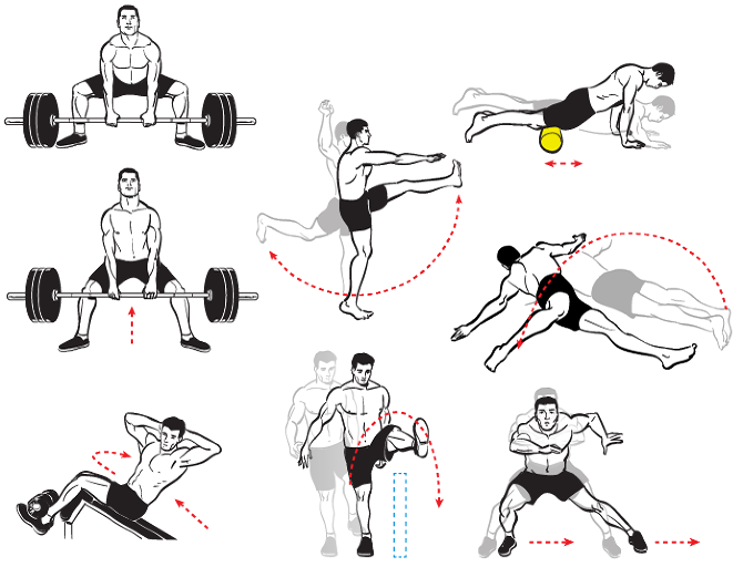
Remie Geoffroi - Exercise

Any tips for illustrators starting their careers?

A successful career as a freelance illustrator is built upon relationships. Recognize that you’re building relationships with your clients, primarily art directors. Be ready and willing to accept their criticism and make changes. Be professional and on time with your work. Be courteous and understand that there are many other illustrators out there, so your attitude can be a big factor in who wants to work with you.

Big thanks to Remie Geoffroi for his time!

SpaceX

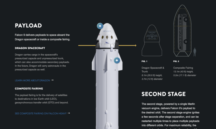
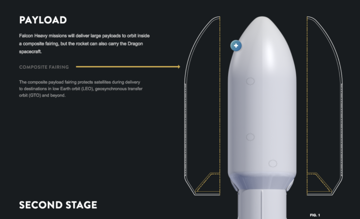
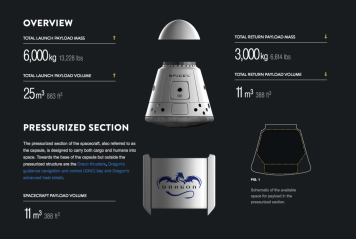
SpaceX has some great technical illustrations on their website, showcasing the design and features of their current and future spacecraft.

SpaceX Falcon 9

SpaceX Falcon Heavy

SpaceX Dragon

I especially like the use of scrolling animation on the Dragon page. It’s so simple and intuitive, using static artwork and a little bit code to create subtle movement that grabs the eye and really helps tell the story.

MacBook Redesign Video

Yesterday’s post reminded me of this video about the redesign of the Apple MacBook released last year. This one is a bit more informative in tone and has some great visualizations of otherwise invisible features, the pressure-sensitive trackpad, for example.

This really shows the selling power of information.

Microsoft Surface Studio Commercial

This promo video for the just-announced Microsoft Surface Studio really caught my eye, beyond the hardware itself and what it could do in the hands of a tech illustrator. Watch starting at 0:25 at 0.25x speed. It’s not the most informational example of technical communication, but it certainly makes you marvel at the precision and sophistication of the product’s design and assembly beyond what the consumer would normally see.