Christopher Cushman

Christopher Cushman is the illustrator behind some of Sci-Fi’s most iconic and notable cutaway illustrations.

He reached out to share some of his obsessively accurate and detailed artwork, and the story of how a chance encounter with the legendary David Kimble turned from a freelance gig, to a prolific career in Detroit’s auto industry—to illustrating vehicles from the 24th century, and some from a long, long time ago, too!

Illustrator Christopher Cushman

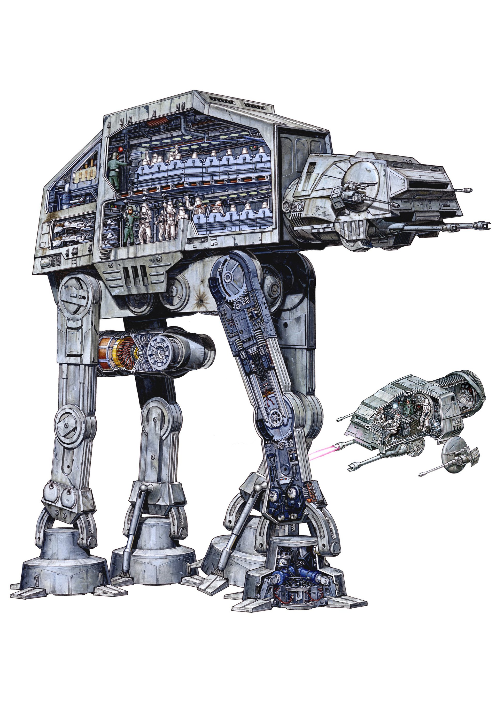
Star Wars Battle of Hoth cutaway poster by Christopher Cushman, colors by Bob Kayganich

What drew you to cutaways and technical illustration?

Sometimes I think all roads lead from Star Trek… I became interested in technical drawings when I got my first blueprint set of the Enterprise by Franz Joseph. They literally explained the entire ship deck-by-deck with hundreds of details. This was around 1975—I was 15. It was amazing to me that drawings could convey an understanding all on their own!

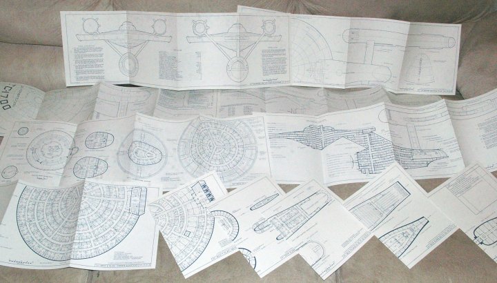
The Star Trek blueprint set illustrated by Franz Joseph

In high school I had a teacher named Mr. Moll who encouraged me to become a technical illustrator. He suggested that I enter a state wide competition, the Michigan Industrial Education Awards. This was my senior year and it was a go big or go home moment, so over summer break I wrote Boeing in Washington state to get blue prints and anything related to their 747. I received a package a week before school started and over the course of that year I drew my first cut away of a 747. It received the regional honor award, and the highest award for my school that year.

I was hooked!

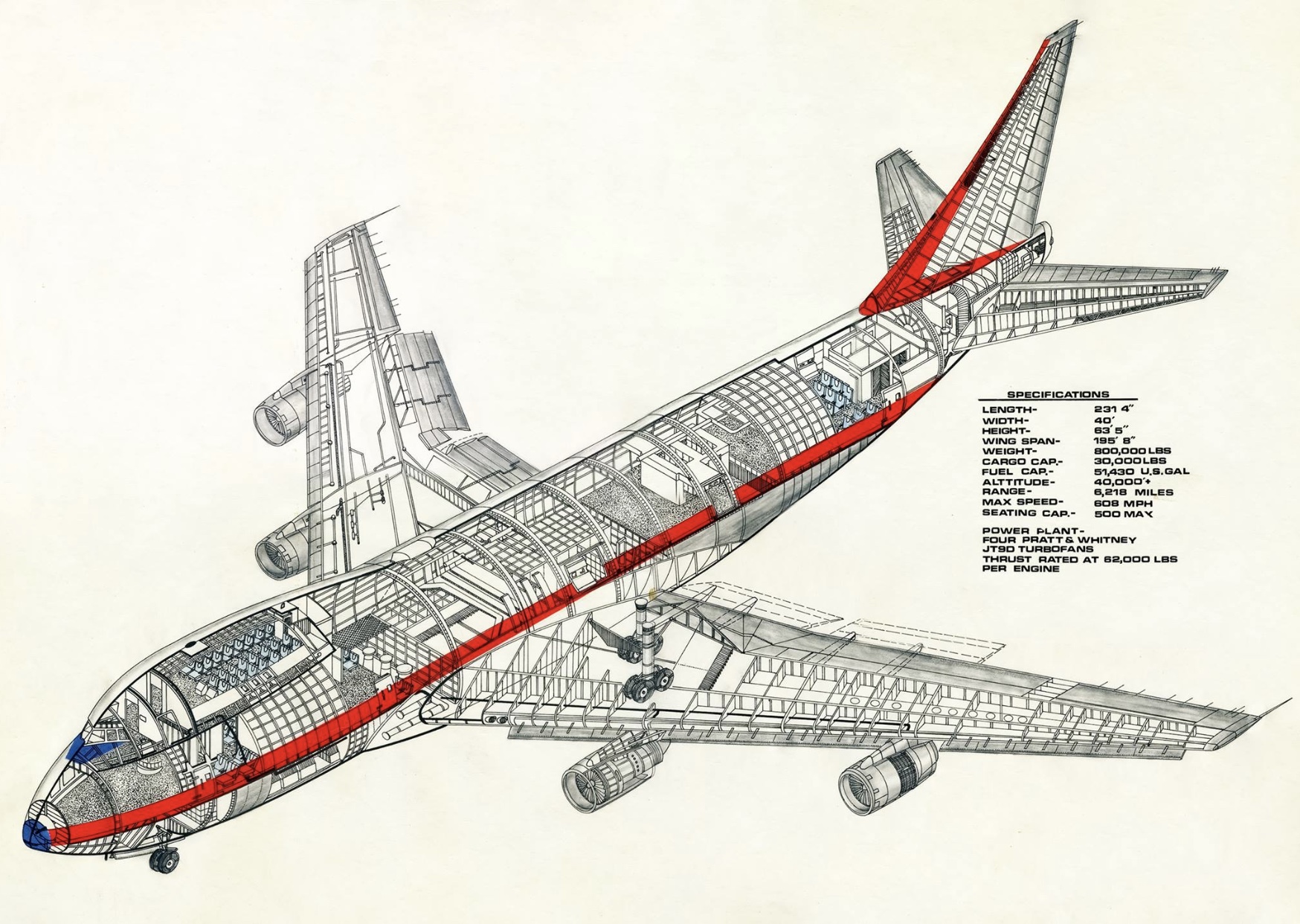
Boeing 747 Cutaway by Christopher Cushman

How did you learn the skills of technical illustration?

The following year I went to Ferris State in Big Rapids Michigan. Ferris was unique, in as much as their Technical Illustration program was the most comprehensive in the mid West, and there approach was to build skills and then teach through simulated real world experiences.

The instructors were John James and Doug Farnham, both veterans of the illustration world. Both had different teaching styles. Mr. James was inspirational and really open to a lot of ideas, while Mr. Farnham featured himself a professor and was always very critical. Between the two we were able to experience two different management styles that would be useful in the real world. While much of the training was on technical illustration, we also had classes on graphic design, drafting, engineering principals, material science etc.

In hind sight, that education really paid off for me because so much of my work deeply depended on me to be able to hold engineering conversations with many kinds of specialists, and then translate that into art that would best work for them.

How did you get your illustration career started after school?

So, post-school I bounced around a bit. I got a gig at Mid America Design in Fort Wayne, Indiana designing manuals for the military, including an upgrade ejection seat installation document used by the Indiana Air National Guard. From there, I worked my way back up into Michigan working for Zennith/Heath Kit in St. Joesph. Again, we made manuals for many Heath Kits, which were electronic kits you could buy and assemble—from the super simple all the way up to a 25-inch Zenith TV. One of the projects I was most proud of was a kit to build a personal robot called Hero.

I moved back home and began commuting to Oldsmobile engineering in Lansing, Michigan. The work was great, but the hour plus commute each way was a nightmare, so I made the big leap back to Detroit. I started working for what in the industry were called “job shops,” basically outsourced talent pools that allowed the big three to avoid having to hire themselves.

I settled at a firm called Modern Engineering, where I drew large format drawings that hung in assembly plants called “production aids.” I worked exceedingly hard, and quickly became an expert often called into meetings to explain certain production processes (thanks to that Ferris training).

In one or two meetings I had made process change suggestions that got noticed at GM, and I was seconded to work at the GM Teck Center for the BOC (Buick, Olds, Cadillac Group). My job now was to help funnel projects to the job shops and work with engineers on various challenges. For almost a year I worked directly out of the Detroit Hamtramck Assembly Plant, and was responsible for the entire production lines worth of production aids. Hundreds of drawings that would help them build the all new models of Riviera, Toronado, Eldorado and Seville’s. Towards the end of that assignment we also added the Cadillac Alante to the mix. Needless to say, when I returned back to the technical center the economy was turning and I faced going back to Modern Engineering.

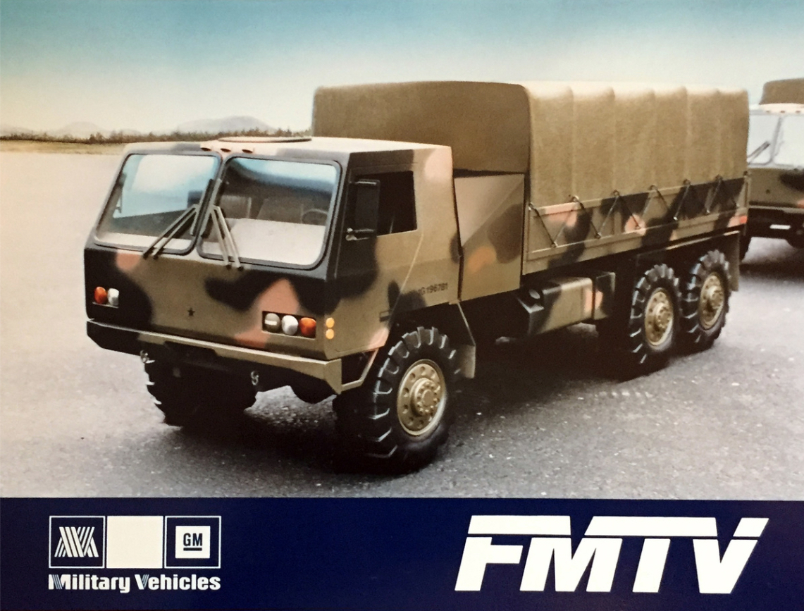
But my years of networking started to pay off and I was able to extend my journey with the GM Military Vehicles group. This was a major leg up in many ways, as the kind of work exceeded just technical illustration and included product development and design, branding, graphic design, video and display design! I quickly garnered the title of Art Director. The one thing was to leverage the opportunity into greater learning opportunities. I got the chance to see one of my concept drawings grow into scale models and then into full size working prototypes with the FMTV Tactical Vehicle Project and the HETS Heavy Equipment Transporter System.

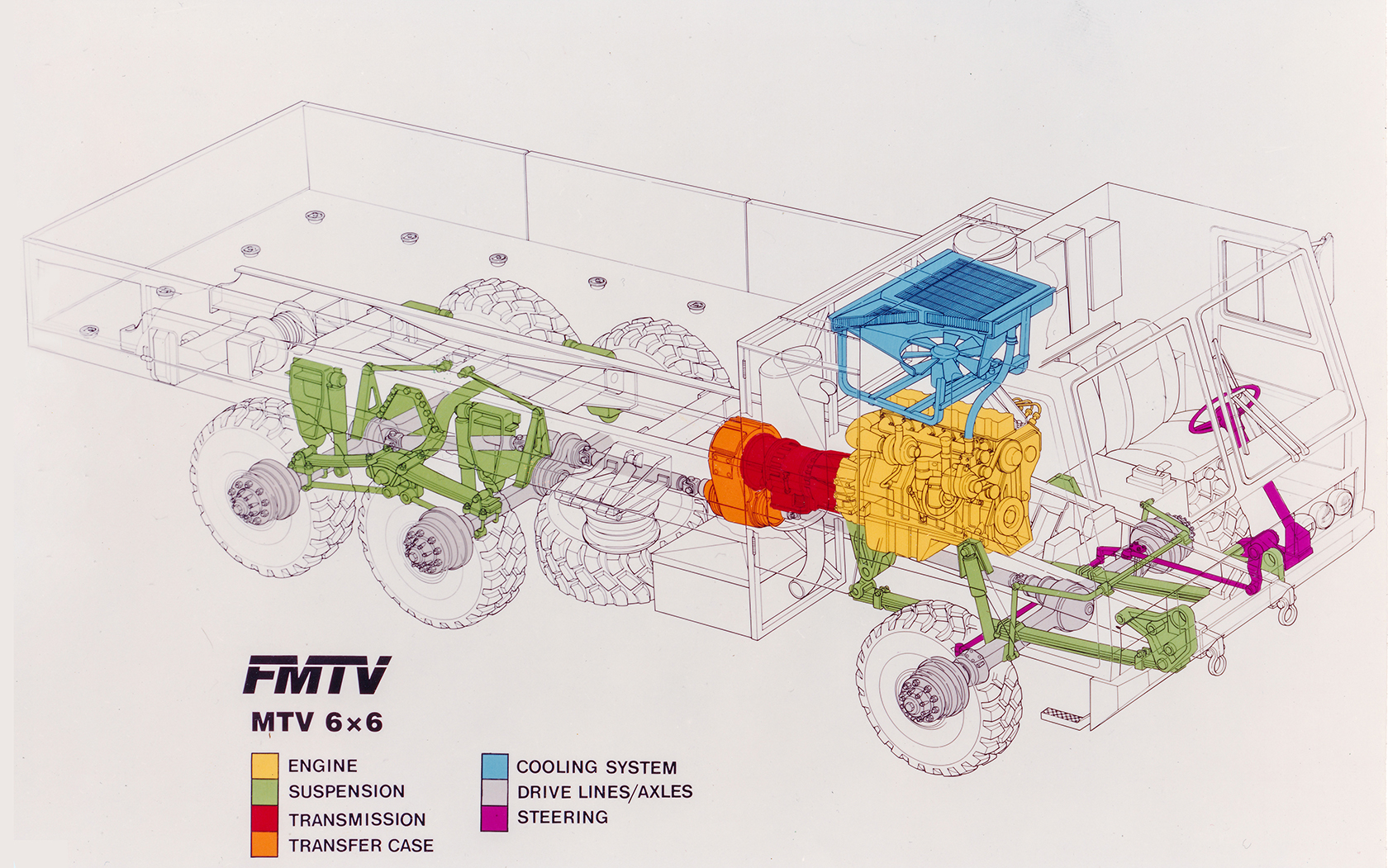
FMTV illustration by Christopher Cushman

FMTV scale model

While working at GM, you ran into David Kimble. You became friends, then began working with him. What was that relationship like?

As I previously mentioned the work I did with the BOC had me attending many meetings, one of which was at the offices at the Cadillac Fleetwood Plant on Detroit’s west side. I was waiting in the lobby when two men came in, and one of them rather loudly announced him self as being David Kimble, as if the young lady at the desk should know or care who he was.

What was lost on her was not lost on me, and I must admit I sprung up in true fan boy fashion to introduce myself, got to share what an inspiration he was, blah blah, explained that I too was an illustrator who worked at the Technical Center. He asked if I ever did freelance, and offered that he would love to see my portfolio on his visit to the tech centre the next day as he had a meeting there.

Wow, I didn’t sleep much that night. True to his word he passed by my area, which garnered a lot of attention from the fellas in my group who also held him in esteem. I showed him my work and gave him my card, and within a couple of weeks we were off to the races.

He was very direct and clear with his expectations, and I could tell immediately that he suffered no fools when it came to his work. Many, if not most of the assignments were ink tracings of his drawings. My first assignment included the drawings for the brochures for the first Acura products, the Integra and Legend.

Two assignments I got to both draw and ink, a Chevy Celebrity cutaway for the Shell Car Care book and an Impact Wrench for Ingersoll Rand, which to this date is still the most I ever made for a single drawing project. The project was received on one day and had to be shipped FedEx at the end of the next. So two day turn around and I made a cool $3000 which was a lot of money in the late 80’s.

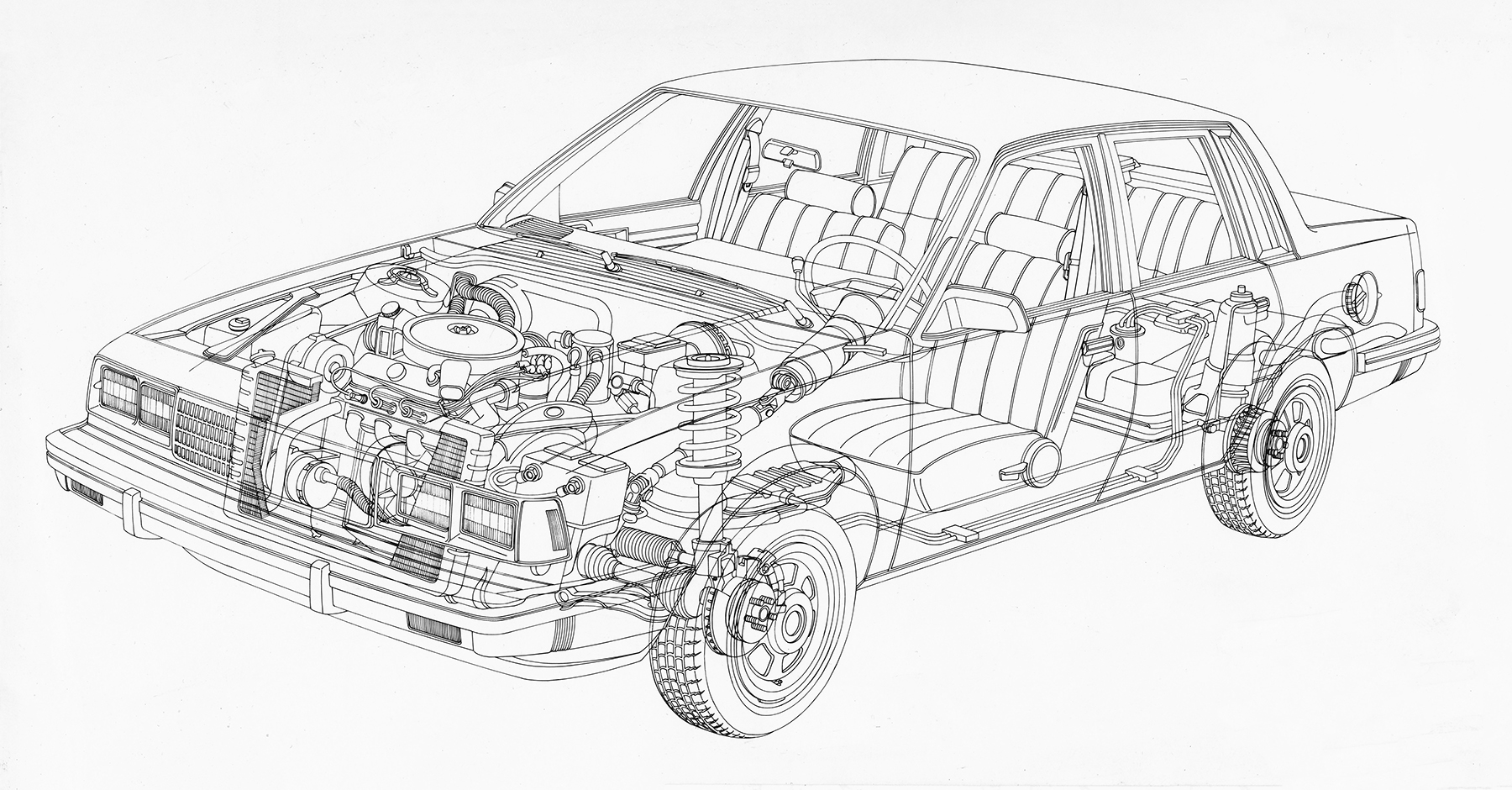
Chevrolet Celebrity cutaway lineart by Christopher Cushman

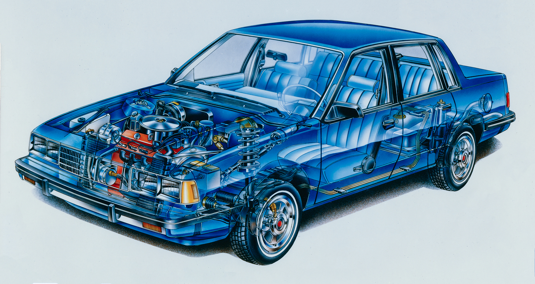
Chevrolet Celebrity cutaway illustration by Christopher Cushman and David Kimble

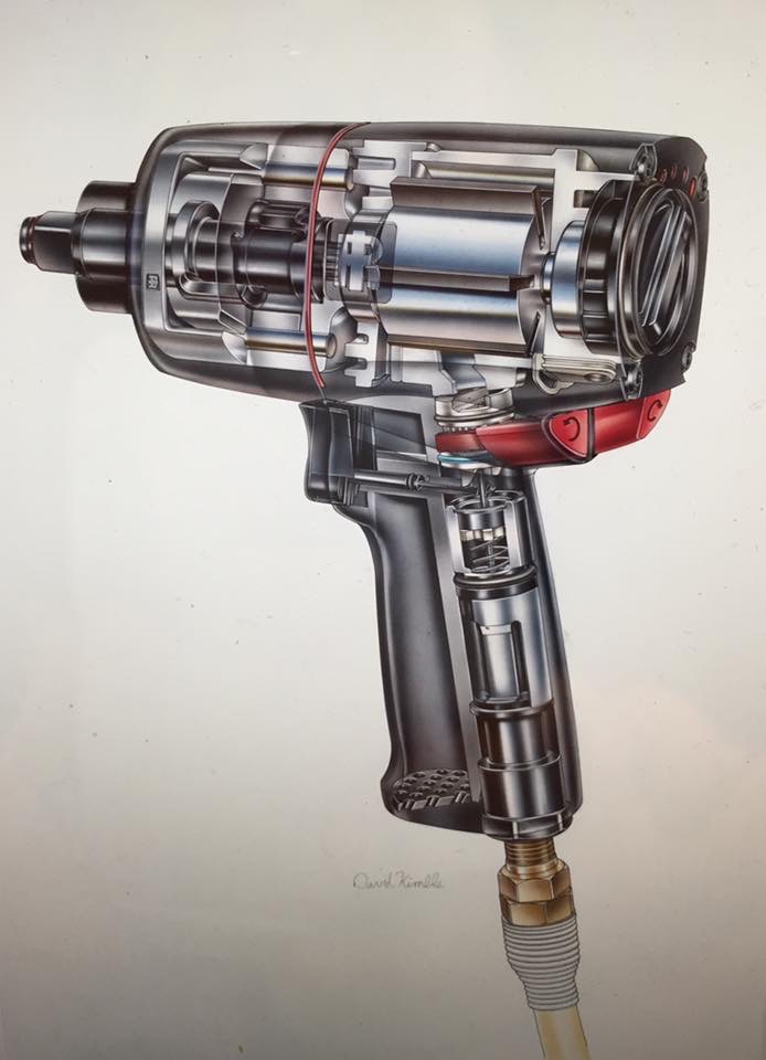
Impact wrench illustration by Christopher Cushman and David Kimble

Working for Dave was never easy. The opportunity it presented was never lost on you, and you always wanted to bring your best possible work. Deadlines were often pretty tight, so there was some stress involved. To balance that, he always paid quickly and well which was a plus, and conversations with him were alway entertaining.

The work slowed down just as my reputation in Detroit was at an all time high. I began to get calls from so many places locally to do work, and many of the conversations started with “We are looking for a Kimble-like cutaway, but we don’t have a Kimble budget…” While Dave was amazing, so were his prices, and again there was a tone of flux in the local economy which simply couldn’t afford his work. I would quickly explain that I don’t paint, and that all I could do was the drawing and line work.

At first I would do some of the simple stuff, but eventually I knew I might be competing with him for the same work. Had his work not dropped off I would have passed on it but I needed to eat and continue to build my reputation in town, so the big hits started to cross my board. Detroit Art Staff got me the Mercedes 600 SL and the new C-Class cars, Combs and Dudeck the Cadillac Seville with Northstar, Iconix the Dodge Ram with 10 cylinder Viper engine, Macnamarra and Associates the Eagle Talon and the latest Volvo.

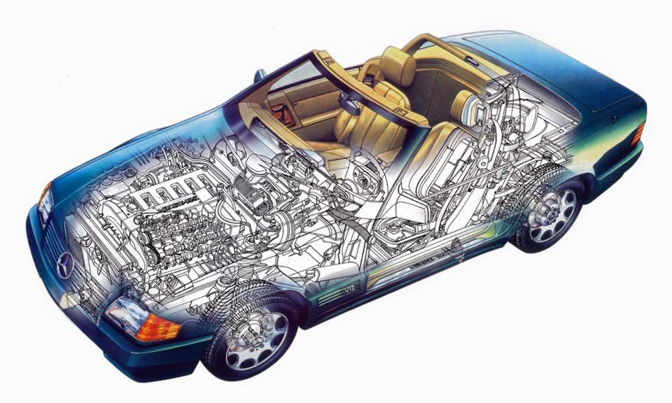
Mercedes 600SL cutaway by Christopher Cushman, colors by Detroit Art Staff


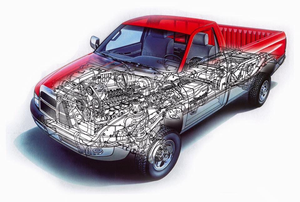
Dodge Ram cutaway by Christopher Cushman, colors by Detroit Art Staff

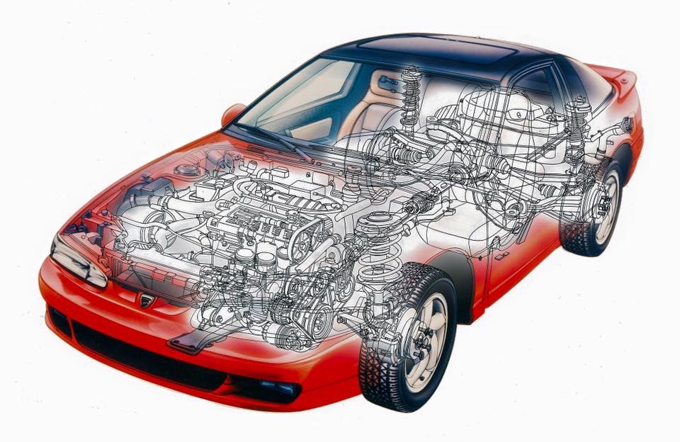
Eagle Talon cutaway by Christopher Cushman, colors by Detroit Art Staff

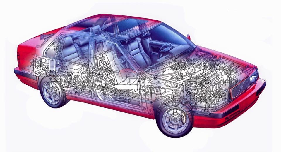
Volvo 460 cutaway illustration by Christopher Cushman, colors by Gary Richardson

Eventually the use of cutaways kinda fell of the map in vehicle marketing trading technical details for amenities and comforts.

Your work with Kimble led you to Paramount and your Star Trek work. Talk about your experience working with them.

David did the cutaway for the Star Trek: The Motion Picture, which was a massive 48-inch format poster sold in the theatres. I got my first copy at the opening of the film my first year at Ferris. In the back of my head I knew I was on the right career path! I knew one day I wanted to be involved in Star Trek! One of the first things David did for me was send me an autographed copy which still hangs to this day in my home.

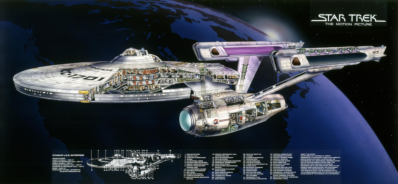
David Kimble’s cutaway poster for Star Trek: The Motion Picture

I had shown him an early concept cutaway of the Star Trek: The Next Generation Enterprise when he went through my portfolio and I asked him if he wanted to team up to complete my idea. He said that he was not interested, citing that he had a horrible experience the first time around financially, and was not interested in getting caught up with it again. He did connect me with the Paramount folks and wished me luck.

Paramount was really just wrapping its mind around merchandising when I first approached them, and sent me a list of approved poster vendors, who either didn’t see the value or wanted my drawing for a song. I ended up contacting a distributor in Michigan who contacted Paramount and set up the final deal, and in early 1993 my 52-inch poster rolled off the press in Chicago.

The process with Paramount was grueling, in as much as my drawing was submitted to the ST art department and was dissected with a red pen. I made dozens of changes, large and small, which got approved! On completion, a full sized duratrans was sent to the Smithsonian and hangs in their permanent collection.

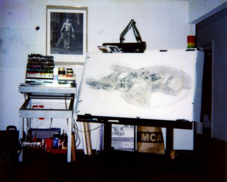
The drawing for the Enterprise D poster in progress on Chris’ desk

Star Trek Enterprise D cutaway poster by Christopher Cushman, colors by Gary Richardson

Fortunately/unfortunately the poster was such a hit that it sold hundreds of thousands of copies, and the distributor began to ghost me on my royalty payments. I had proposed a follow-on Millenium Falcon poster concept and that seemed to get ignored as well. I ended up suing them in court which gave me damages, and the added step of pain and suffering, somewhere close to $70,000. The next day I received a register mail announcing their bankruptcy, and there would be no money coming my way. This was my single worse day as an illustrator.

A couple years later while at my favorite art supply and framing store I saw a completed version of my Millenium Falcon poster concept waiting to be picked up from the framer. They explained that I was set up to become a poster but the deal fell through. Not only had they reneged on my Star Trek money, but they took my next concept to fruition and the bankruptcy stopped the printing!
The story was just getting worse by the moment.

Fortunately, I along with my brother connected with SciPubTech and the Star Wars concepts we created took new life and were completed to coincide with the original trilogy re-release! So in the end, I did prevail.

We ended up creating six new Star Trek posters and three Star Wars posters. One of which, DS9 made it into space! On May 19th, 2000 aboard the shuttle Atlantis/STS 101 an ISS construction flight! The DS9 poster returned 10 days later and hangs in the ISS program office! This amazing experience has shown me that there is no limit how far and high you can go!

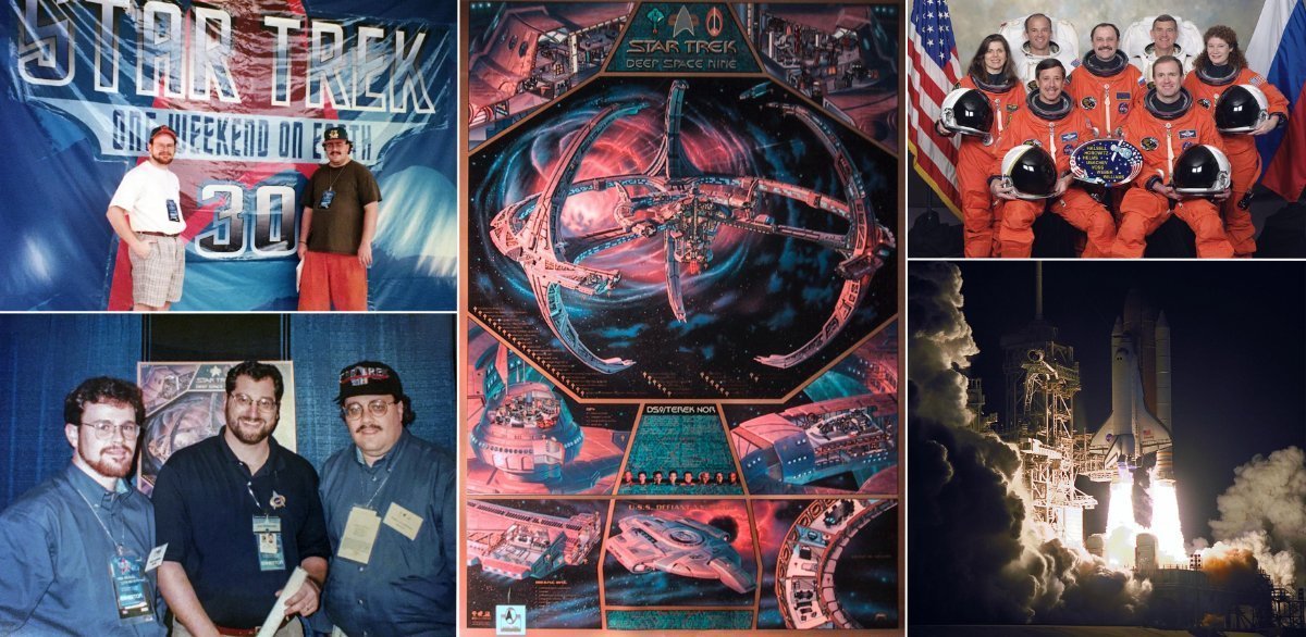
Cushman’s DS9 cutaway poster flew to space aboard space shuttle Atlantis on STS-101

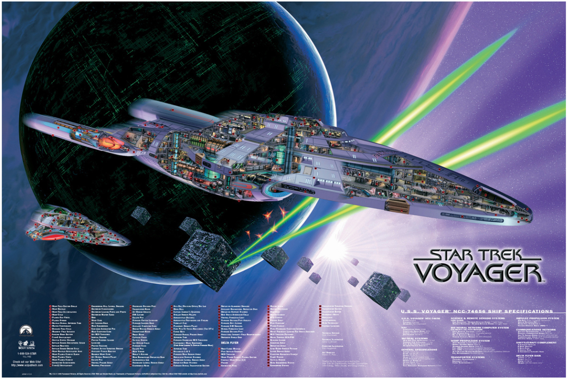
Star Trek Voyager cutaway poster by Christopher Cushman, colors by Bob Kayganich

You’ve also worked on projects in the Star Wars universe. How did that come about, and what was that like?

When we connected with SciPubTech, I showed them my Millennium Falcon cutaway and talked about the upcoming re-release of the original trilogy in the theatre. So we had a new motivation to do the work.

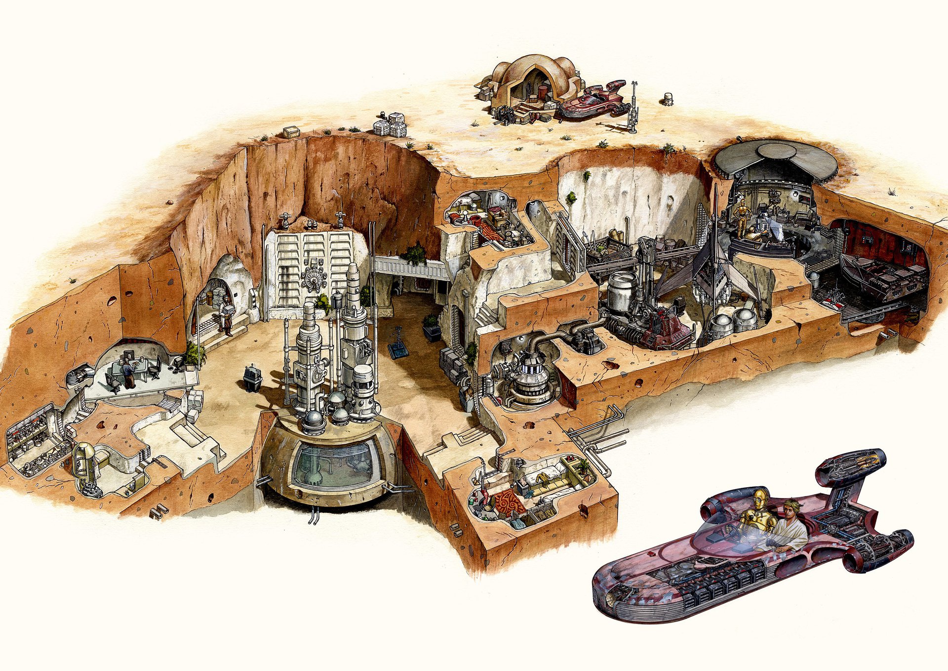
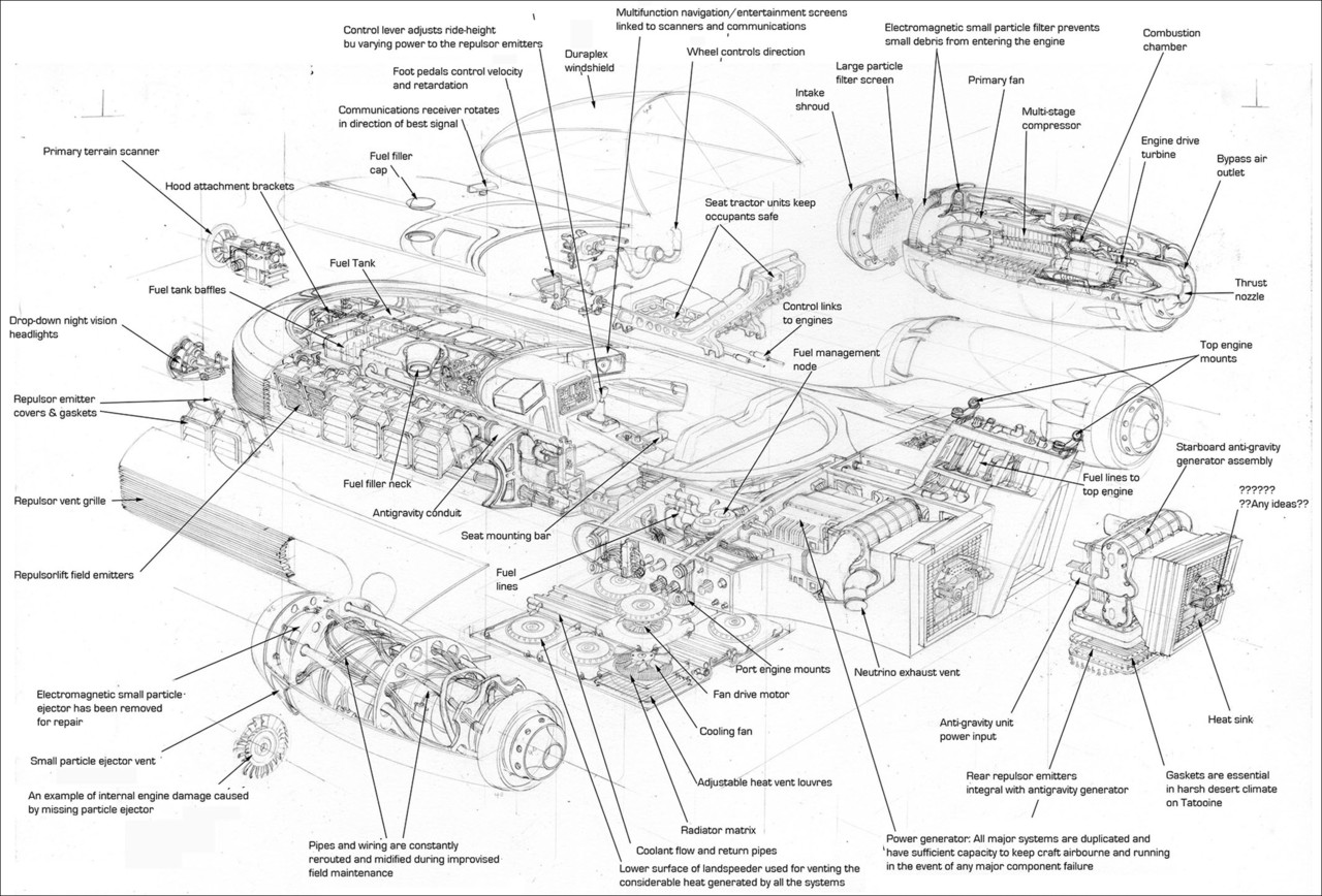
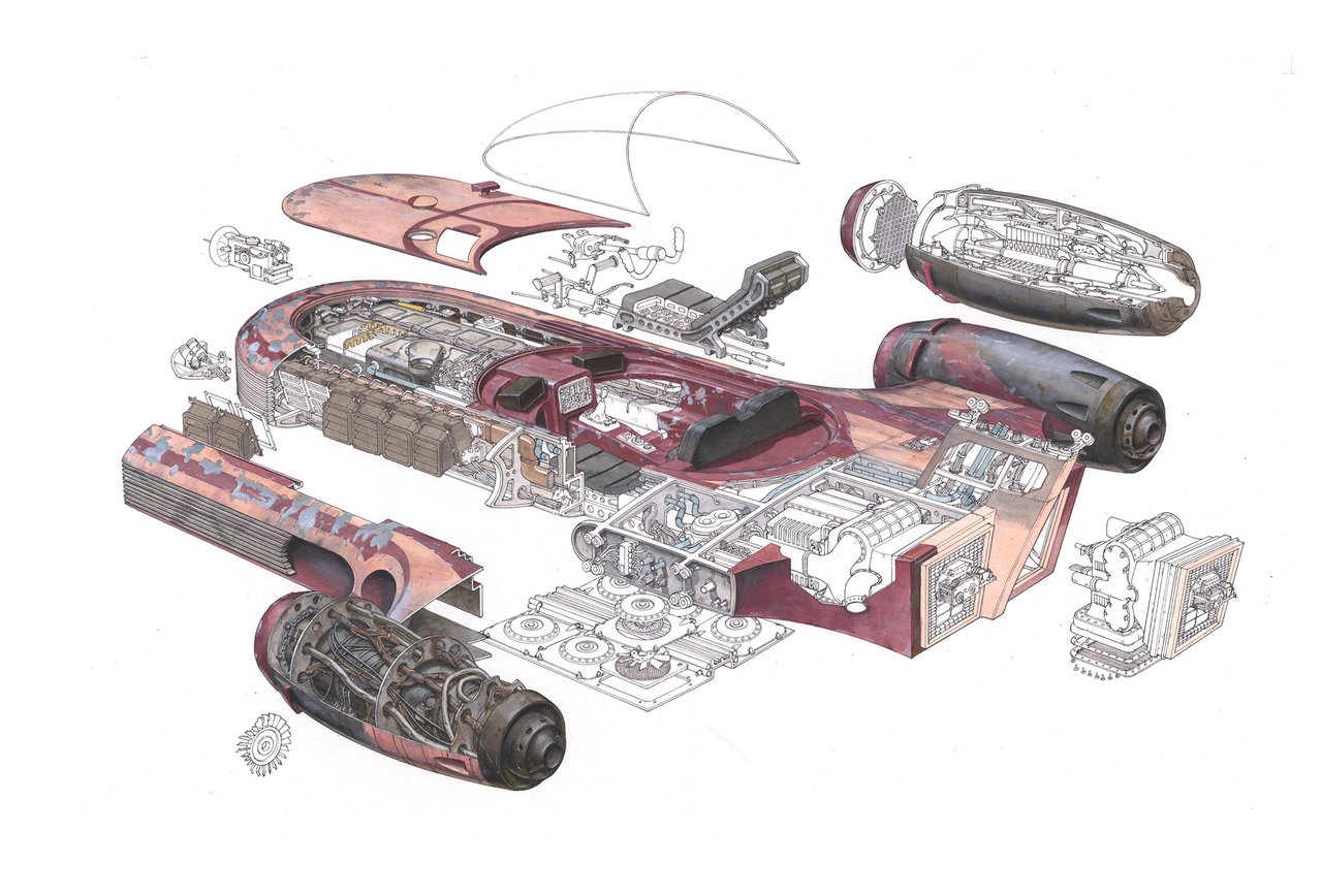
Our Star Wars posters are unbelievably accurate. Many don’t know this, but the Falcon was slightly different in each film. So my task was to forensically go in and pull them all together into one drawing! Lucas Film was great with providing archived materials for many of the ships. The one thing I am most proud of though, was that we were the first to market with official cutaways. There have been many books since with slightly different takes, but we were the first!

Millennium Falcon cutaway poster by Christopher Cushman, colors by Bob Kayganich

Your brother, Matthew Cushman, is also a technical illustrator. What’s it like collaborating with him?

He is indeed… same degree and under the same instructors for the most part, but 11 years different. His foray into Star Trek began with his final project, where he drew a cutaway of the original series Enterprise. As his big brother, I lent him all my
technical information from my collection. A version of that drawing became our first product at SciPubTech. It was a big hit!

All of the work we did up and through the SciPubTech days was done manually, pencil on paper, ink on mylar, paint on board. In that respect we worked very similarly. Where we diverge is in technique. Matt is fastidious in his pencils, crisp and very clean, if not a bit light. I am more heavy handed, darker, less clean. The ultimate test of detail came when we participated in the redesign of the Enterprise E, which we collaborated on. There were many elements to the project, and while I did the liaison with the art department, collecting the materials and Paramount licensing getting all the approvals, Matt took on the Phoenix drawing for a mini-poster. But we both did half of the Enterprise poster. I, the front saucer, and Matt the rear and engines. When we completed the final pencils, I put the two pieces together and were off by less than a millimeter! It was a most satisfying collaboration.

Today Matt is more attuned with Adobe Illustrator because of his client work. I largely stepped away from Illustration after 1998 and my move to Toronto. My final poster was of Voyager and the Delta Flyer. I got a second degree in Design and am back playing catch up in Adobe illustrator.

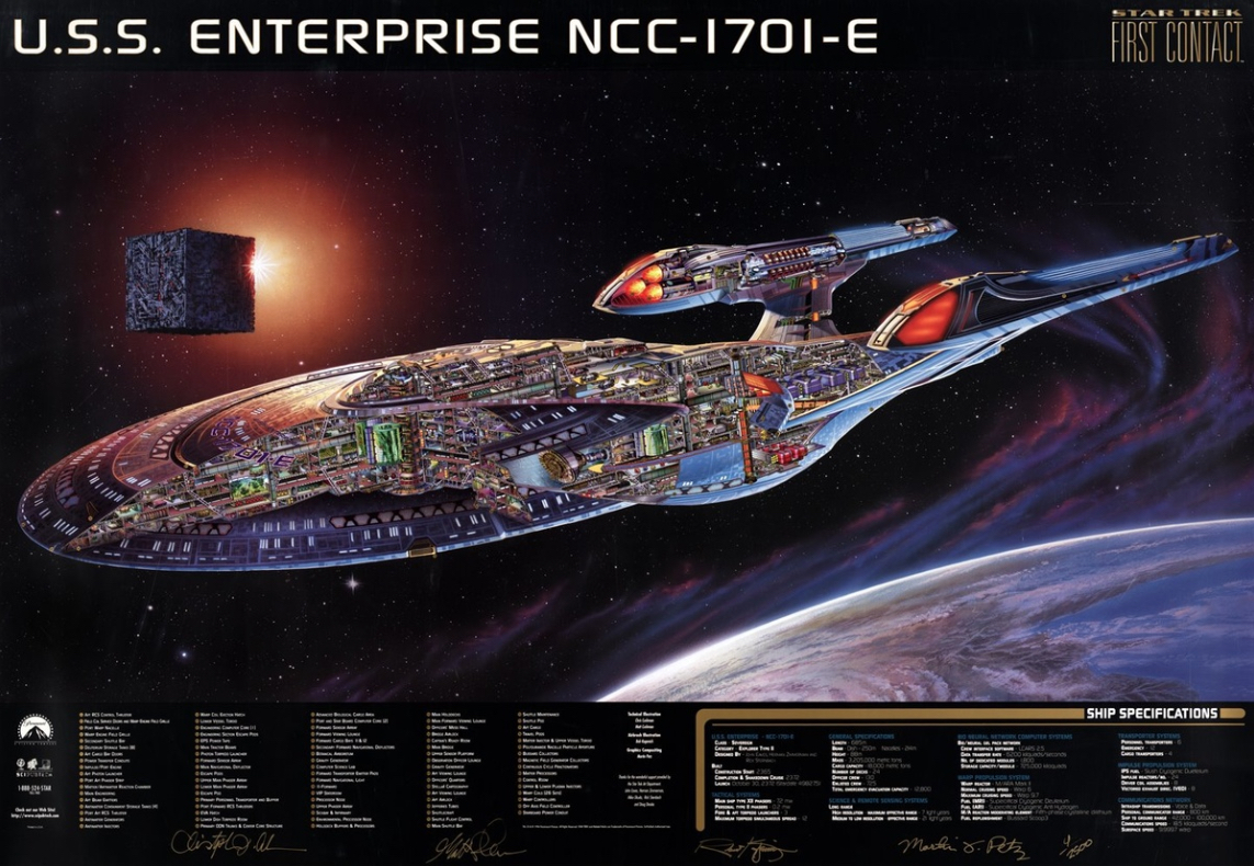
Enterprise E poster by Christopher and Matthew Cushman

What would be your dream technical illustration project?

Well, I may have already got that when I worked on the Enterprise E. Our work ran concurrent to the film production, and we were drawing things that had never been seen! My dream of working on Star Trek has kind of been fulfilled.

What are you currently working on?

There are a couple new things brewing. A series in book form for Battle Star Galactica (new version) and the ships from 2001: A Space Odessey (I have put a lot of work into the EVA Pod drawing).

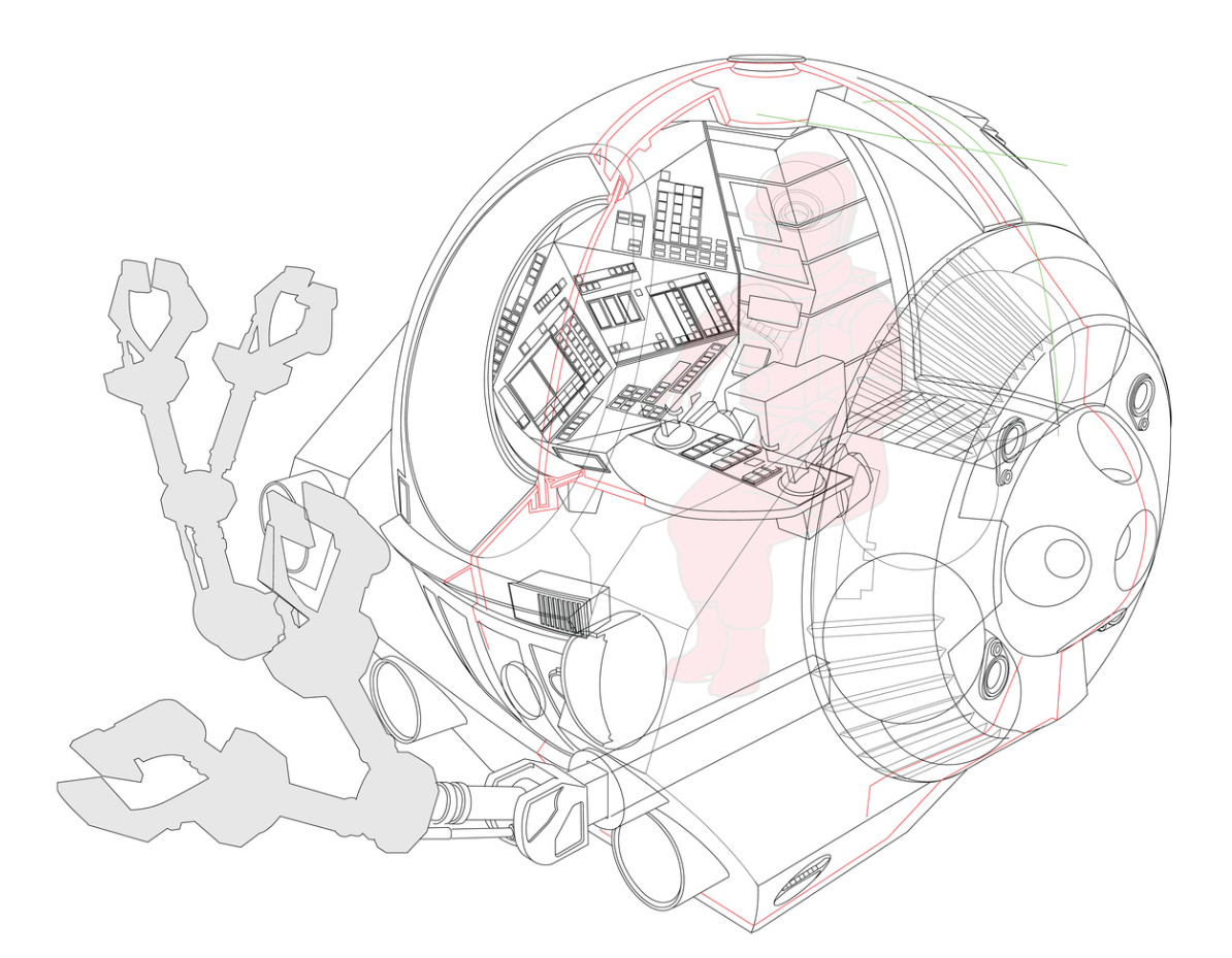
Progress on the EVA Pod cutaway illustration by Christopher Cushman

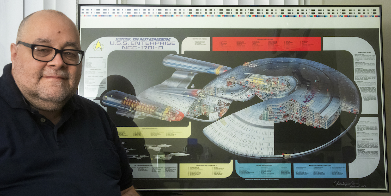
I am working on a revised Enterprise D poster. I completed the first one around 1992, or 3rd season, and I want to update it to 7th season and Star Trek Generations.

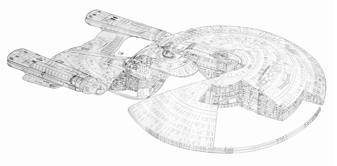
Enterprise D cutaway drawing by Christopher Cushman

What advice do you have for students or illustrators starting out?

Build it and they will come. It’s a great time to be an illustrator, but you should set aside time to draw some vanity projects. Things you might not get to do in the real world and draw them for yourself. I did with the Enterprise D and it turned into one of the greatest chapters of my life! Opened many doors and opportunities of work and meeting my heroes….

Dont wait! Just jump in!

Where can people see or buy more of your work?

You can see me on my blog and get a more detailed view of my Star Trek/Star Wars journey. SciPubTech.net still sells a few posters, but you can find others on eBay. I am currently rebuilding my Illustrator web site, coming soon.

Animagraffs by Jacob O’Neal

Jacob O’Neal is a graphic designer, 3D artist, and creator of Animagraffs, animated infographics that explain how everyday things work.

Largely self-taught, O’Neal combined his interests in design, science, and engineering with social media savvy to create viral internet content that propelled him into a career working with some of the best known brands in the world.

Read More

George Retseck

George Retseck is a Philadelphia-based technical illustrator with nearly 40 years of experience. He works with magazines such as Scientific American, Popular Mechanics, The Scientist, Bicycle Quarterly, as well as companies in the science, medicine and technology fields.

He works in a variety of styles, but I especially enjoy the line quality and attention to detail in his retro pen-and-ink style. It almost makes me want to dig out my old, stubborn, finicky technical fountain pens.

Read More

Hans Jenssen

Millenium Falcon Cutaway - Hans Jenssen

Millenium Falcon Cutaway – Hans Jenssen

Hans Jenssen is a UK-based technical illustrator with over 30 years of experience. He is perhaps best known for his collaboration with Richard Chasemore on the Star Wars Incredible Cross-Sections series of books. He continues to use traditional methods and materials, pencil, pen, gouache and acrylic paints to create his intricate, accurate and textural images. He is currently working on a new collaboration with illustrator John Mullaney about the Halo video game franchise. He was kind enough to answer a few questions for us.

What brought you to the field of technical illustration?
Simple! As a kid I loved drawing and I loved comics like Eagle and Look and Learn here in the UK which featured colour cutaway illustrations. I was always trying to copy them and create my own so becoming a technical illustrator was probably inevitable.

Cutaway Illustration by Walkden Fisher for Eagle Comics

Ferrari Testa Rossa cutaway illustration by Walkden Fisher for Eagle Comics, 1959

How did you get started with Dorling Kindersley (DK Books)?
I was represented for quite a few years by the Virgil Pomfret Illustration agency who got me my first job with DK back in the early 90s. It was a good break for both of us as DK kept me so busy all Virgil had to do for a few years was write an invoice now and again. At first I worked on a series called Look Inside Cross-Sections based on the hugely successful Stephen Biesty’s Incredible Cross-Sections. I did three titles and this was when I met Richard Chasemore who also worked on the series and with whom I later collaborated on all the Star Wars books and a very successful advertising campaign for United Technologies in the USA.

Rescue Helicopter Cutaway - Hans Jenssen

Rescue Helicopter Cutaway for the United Technologies campaign – Hans Jenssen

Any unique challenges/experiences working on the Star Wars books?
Gosh, where do I start? Star Wars, with its legions of fans was quite a prospect. When we first started, (working with author David West Reynolds who at the time had a day job at Lucasfilm) we were treading very carefully. Using old reference which clearly hadn’t been very carefully thought through and different sources which often contradicted each other created many challenges. Where there were gaps in the reference we were able to create new technology and machinery and Lucasfilm were so pleased with the results that we were soon redesigning and re-imagining other parts of ships’ interiors to try to make coherent systems which logically explained the abilities of each craft. Parts which were seen in the movies were of course drawn and painted as accurately as possible, right down to the scratches on the paint in many cases.

AT-AT - Hans Jenssen

AT-AT – Hans Jenssen

Skywalker Homestead Cutaway - Hans Jenssen


Skywalker Homestead Cutaway – Hans Jenssen

What changes or challenges have you faced in your career? What opportunities do you see for the future?
Well, of course, since I started there has been a digital revolution. I personally have never really taken to the computer as a means of creating art but I am the first to acknowledge there are plenty of super-talented digital artists out there who do incredible work. But for me, one of the things I love most about my work is the physical connection between pen and paper, pushing paint around until things look just right, and being able to look at the physical artwork and see the colours, the texture of the paint, the linework, all done by hand. That is such a huge part of the joy for me. Of course, in the old days if you made a mistake, you could be in a whole mess of trouble whereas now with modern digital retouching, no sweat! Of course my stubborn refusal to let go of traditional media does make me somewhat niche in this digital age but I still think there’s no substitute for ink and paint when creating the kind of richly textured colour illustrations I specialize in and thankfully there’s still some work out there. As long as there’s work and my eyesight holds out, I’ll keep going!

 Work-in-Progress - Hans Jenssen

Work-in-Progress – Hans Jenssen

 Work-in-Progress - Hans Jenssen

Work-in-Progress – Hans Jenssen

Do you have a dream project? Any subject matter that you’d love to illustrate?
If I could choose one thing to illustrate, it would be one (or all!) of the giant Russian civilian and military Ekranoplans from the 1960’s and ’70’s. Ever seen the “Caspian Sea Monster”? Getting reference might be a bit tricky but that would be a dream project.

MD-160 "Caspian Sea Monster"

MD-160 “Caspian Sea Monster”

Do you have any advice for new illustrators or students?
It may be a cliche, but I am always reminded of a Q&A Richard and I did in America some time ago when a young chap asked, “How did you get so lucky that you got to work on Star Wars?” Rich answered, “I’ve always found that the harder I work, the luckier I get.”

P-51 Mustang Cutaway - Hans Jenssen

P-51 Mustang Cutaway – Hans Jenssen

See more of Hans’ work at his website and be sure to check out his cutaway illustration process.

John Hartman

John Hartman is a technical and scientific illustrator who seamlessly blends traditional media with 3D and digital techniques to create  images that are fresh and contemporary, yet warm and inviting. His work can be seen regularly in Fine Woodworking, Woodcraft, Fine Home Building and more. John agreed to answer a few questions about his work and career.

John Hartman - Paslode Nail Gun

What’s your background? How did you get started in technical illustration?

It’s a long story but here it is in a nut-shell. I have always been interested in drawing and painting. My early education was in fine art. I also found technical illustrations like those in Scientific American, Popular Mechanics and Fine Woodworking inspiring and they appealed to my interest in art, science and technology. Since my school days predated the personal computer, technical illustration was being created strictly by hand. As a student I was impatient, rebellious and seeing how fastidious hand drafting and airbrush painting was I decided to go another route and become a fine artist.

I found myself living in Brooklyn, working odd jobs to pay the rent. Being a starving artist wasn’t for me so I decided to learn a trade. I also had an interest in music as well as art so I re-educated myself as a piano technician. Fast forward a few decades and I am running my own business rebuilding grand pianos. Knowing of my art background the editor of the Piano Technician’s Journal, the trade magazine for people who tune and repair pianos, asked me to come on board as their illustrator. I spent the next six years teaching myself technical illustration. Starting with traditional hand methods and eventually developing digital techniques that emulate the handmade artwork I loved in my youth.

The pianos are now gone and I am working full time as a freelance illustrator. I’ve converted part of the piano shop into my studio, and have kept the woodworking shop as my man cave. I love this work and wish I would have started earlier. There’s a lesson in this somewhere.

John Hartman - Water Tank

You work in a range of styles and subject matter. How do you choose the right aesthetic for a project?

Well I think the right aesthetic is the one that gets the job done and also appeals to me personally. I have never hidden the fact that I work digitally but my personal taste in art and illustration is rooted in traditional analog techniques. So generally I don’t want my work to look like it popped out of a computer program. I think in my case what comes off as different styles is really a result of my penchant for experimenting with a wide range of tools and methods. Typically I may blend together 3D rendering with hand drawing and a little vector work as well. I love learning new software and trying to come up with different ways to create illustrations. Sometimes I attempt to emulate a particular analogue drawing style, the results vary but I always learn something new. For me, it’s more of a challenge to stay consistent and on track. Except for my personal taste, experience, and craftsmanship the style chooses me rather than the other way around.

As you noted, I enjoy working on different subjects as well; there is nothing better than being handed a unique assignment, and doing the research can be fun as well. But I have never consciously linked a style to a particular subject except in the case of my work with Fine Woodworking Magazine where there is an established style. I do try to be consistent within a project and if the art director points me in a particular direction stylistically I make every effort to accommodate. In addition, with art directors I know well I will often discuss style issues to better integrate the illustration with the page design or create something a little different than usual. Some of my most successful work stems from collaboration with a talented art director.

John Hartman - Bench

What challenges have you faced in your career? What opportunities do you see for the future?

Projects that are complex or those that require a new skill to pull off, or have a very tight deadline have kept me awake at night. Over time I have learned to expect these sorts of challenges and I find myself looking forward to difficult projects. One challenge we technical illustrators face is keeping up with ever evolving technology, requiring practice and self education. I think learning new software is vital to staying competitive. Also I find I need to brush up on core software I already know like Photoshop and Illustrator. Since software is doing more of the heavy lifting I find I need to practice my analog skills and foundation knowledge like perspective just to keep from losing this valuable tool set.

What I see on the horizon for technical illustrators is the increased use of 3D animation. On-line video is becoming the leading media for news, education and entertainment. It may take some time but eventually publishers, advertizing agencies and businesses will seek out talented illustrators to create information based animations.

Do you have any advice for new illustrators or students?

Technical illustration is a broad field of study. It covers any illustration assignment that needs to show the viewer how something functions or how parts are interrelated. At its heart is clarity and precision, and consequently it requires more discipline and knowledge. I believe students need to work longer and harder to gain the skills needed. New illustrators and students need to know it’s going to take passion and dedication to be successful in this field.

Technical illustrators need to be able to draw well. This means being able to accurately depict the world around us with line, tone and color. Don’t expect to gain this by attending a few classes in school, it will take a lifetime of learning, and continued practice to maintain. You need to study perspective, how to render light and shade as well as color theory. Don’t expect computer programs to do this for you. If you wish to include the figure in your work you will need to study artistic anatomy as well.

Working as a technical illustrator is not a passive act, you are expected to research and understand the topics you are given. In addition you will need to solve the many technical and design issues that arise with each assignment. The artistic quality of your work is up to you. Hopefully you have a passion for fine art and can bring flair to your work that is attractive. I believe that technical illustration should be beautiful as well as useful.

John Hartman - Air-Conditioning-System


See more at Hartman Illustration.

Mark Franklin

Mark Franklin is a London-based freelance technical illustrator. During his 30-year career, he has illustrated a wide variety of subject matter for clients including Airfix, McDonalds, Tekmats, Rowe Hankins Ltd. and some of UK’s largest publishing houses.

Mark Franklin - Manned Manoevering Unit

Mark Franklin - 4D Cinema Mark Franklin - Dodge Challenger Mark Franklin - Dryer Mark Franklin - F-15 Eagle

Check out Mark’s portfolio to see the breadth of his work: Mark Franklin Arts

Clicheria

Clicheria is a Brazilian illustration studio that seamlessly blends 3D renderings with vectors and digital painting to create beautiful and communicative scenes. Be sure to check out the full size versions.

Clicheria - Product Explosion

Clicheria - Treadmill

Clicheria - Dental Filling

Clicheria - Rowing Machine

Clicheria - Water Tank

Todd Detwiler

Todd Detwilier - Gulfstream Jet

Todd Detwiler is the Design Director at Popular Science magazine and an accomplished illustrator in his own right. At PopSci he is responsible for fusing design, photography and illustration with stories of science and technology’s bleeding edge. As an illustrator he brings his technical aesthetic to the pages of TIME, ESPN and Washingtonian.

What’s your background? How did you get started in editorial design?

My junior year of college I secured an internship with Maxim magazine. It was the result of a funny letter I wrote to the then-art director David Hilton – who got a kick out of the flippant humor and gave me a call. I had interviews at Details and Rolling Stone as well, but Maxim offered me the internship and I moved from rural PA to New York the next week.

I was really at Maxim at the right time. Felix Dennis had brought his lad-mag over from the UK and it was lighting the magazine world on fire. It was there that I met people who would shape my career in magazines and illustration. I graduated a year later from Kutztown University and started working for Maxim full-time. Along with some junior design work, I was the resident icon artist and occasional spot illustrator. I was cheap (free) for the company, and I was just happy to have some work in print. It was a win-win really.

In 2005 I left Maxim and started working at Rolling Stone before being offered an attractive Art Director position with Hearst working on the development of a new Men’s Magazine. The project didn’t pan out and I started a freelance design career which took me around the publishing houses of New York and abroad until I settled down with Popular Science in 2011.

Todd Detwilier - Anatomy of a Water Park
What do you do as Design Director at Popular Science?

As the DD of Popular Science, I led the team responsible for the 2014 redesign, along with an overhaul of the logo and brand guidelines. On a day to day basis, I do all the typical art department work loads – hire illustrators, design pages for features and front of book, brainstorm photo concepts, etc. It’s a small but talented art team at Popular Science – and I give them a lot of credit for making the magazine smart and efficient.

Todd Detwilier - Anatomy of Home Delivery
What makes for a good illustration? What can illustration do that photography can’t?

The best illustration communicates an idea quickly and clearly with some personality. I would also add that the process of commissioning the illustration makes it a “good” illustration. If deadlines are met and the work matches what is expected – that makes everyone’s life easier.

Photography can be expensive. With an illustration you can build a world that is immersive at a fraction of the cost. You can also build uniformity with illustration that can be a struggle with photography if you are using pick-up art from multiple sources. Both have a place in Popular Science, and we are very conscience of the balance in every issue.

Todd Detwilier - Luggage Checkpoints
What do you think makes the technical illustration aesthetic so popular in magazines?

Well, it’s been around for awhile, hasn’t it?! I was just looking at an instruction manual from the 60s the other day that was amazingly drawn. My hat goes off to the illustrators that were so meticulous with ink and pen. It’s a lot easier with a mouse and “command+z”..

Regarding the aesthetic, I think the thick rules on the outside give the objects separation and weight, and the thin lines detail and clarity. People love exploded views because they can see what’s happening on the inside – something the PopSci reader loves. Ultimately, I think the style of illustration removes clutter and anything unnecessary to reveal the essence of the subject. It circles back to direct communication, free of any additional interpretation for the viewer.

Todd Detwilier - Car Buyers
In addition to your role at PopSci, you also moonlight as an illustrator. What drives you to illustrate?

I love illustration as much or if not more than editorial design. But what actually drives me to create illustrations is seeing the work of others. I’m constantly impressed with the level of design being generated by artists, and I can’t help but be inspired to create and learn.

Todd Detwilier - Ninja Warrior
What do you see for the future of publishing or illustration? Any advice for new illustrators or students?

The future of publishing is digital with print declining over the next 5 to 10 years. Illustrators need to be quick and consistent. I see enormous opportunity for illustrators in the digital News sphere. When breaking news happens, how fast can you turn out an editorial perspective, or even better – a comprehensive breakdown of what has happened or is happening. The world demands answers immediately and if you can act quickly, you’ll be very successful. Also, take your phone out of your pocket – that’s your new canvas – get used to it!

Popular Science - April 2014
You worked with Graham Murdoch on the Electric Racecar project for PopSci. What was that like?

He’s just the best. I’ve been working with him since the Maxim days and he has always made me look good. For the Formula E assignment I sent him a bunch of scrap art and he was able to build out the entire car based on the reference I sent along with his own research. When it came to “exploding” everything apart, I know he spent a lot of time meticulously unscrewing every bolt and washer. The result was amazing, and it set the bar high for everyone in the magazine.

Big thanks to Todd for his time. You can find his work at ToddDetwiler.com and on newsstands everywhere.

Mr. Murdoch Design & Illustration

Graham Murdoch is the man behind MMDi. Although not strictly a technical illustrator, his 3D renderings of technology and futuristic subjects for clients like Popular Science, Wired UK, Maxim and Bloomberg Markets, should win the admiration of any techie. Graham was kind enough to answer a few questions for us:

How did you get your start in illustration?
My background is graphics and it’s still part of what I do today. Four years of college then ringing bells and following up leads. It feels a LOT busier today, there sure are a lot more cars on the road!

The tools of the day were Rotring pens (there’s still some visible ink in my finger from a 0.2 Rotring that was dropped on it about 30 years ago), CS10 artboard, cow gum, spray mount, 10A scalpel blades, gouache, frisk and a Devilbiss Aerograph (which I could never do anything more than gradients and splatters with). Caught the wave of desktop publishing at just the right time. First 3D package was Alias Sketch! (yep, it came with the exclamation mark), then Bryce, onto Lightwave 3D and now MODO (formely modo) which I’ve been using pretty much from 101.

Graham Murdoch - Railgun Scramjet

What’s your favorite subject matter or type of project?
One with time, I’m slow and need lots of it. The more there is the better things get. I’m pretty good at losing it too, though.

What’s your process on a typical project?
Understand what the brief is asking for, reference, more reference, distraction, avoidance, then work, work, work. Sketching, definitely, as a real quick way of laying things out and excersing some different muscles. Hardware has always been Mac-based, from the IIcx through to today’s 27” iMac. In this room there’s also a still operational G3 running OS9, a G4 Quicksilver and a dead G5 (nice job on the motherboard Apple!).

Graham Murdoch - Formula E

 The Formula E Car you did with Popular Science is amazing. What was that project like?
The project was a dream, I have to thank the fine people at Popular Science, particularly Todd Detwiler, for letting me run with that and giving the time it needed. Finding the car’s shell with decals as a purchaseable model was such a big time saver, it meant more attention could be put into the details. As the car was still in development there was next to no reference for the under the hood stuff, so the majority of that is just artistic license. The elements are there; batteries, motor, drive train etc. they just don’t look much like that on the real car.

Graham Murdoch - Formula E Detail

What advantages does working in 3D have over 2D?
The freedom of options and the ease with which they can be realised. Camera angles, materials, lighting, the whole virtual studio thing. Being able to get a 3D print of something you’ve just made, that’s a bit like the leap TV made from black and white to colour, for me. I really should be exploring that! The disadvantage is that there are so, so many options.

The people that did this stuff with pen, brush and board, o my, un-be-(insert expletive here)-lievable!!

Graham Murdoch - Driverless Car

What do you see for the future of the medium?
The expansion of 3D printing and definitely more motion. Total absorption by digital and virtual realities. Of course, we will be assimilated.

You can find Mr. Murdoch’s work on the MMDi website and Behance.

Ryan Kirby

Ryan Kirby - Snakebot

Ryan Kirby’s career as both an illustrator/designer and wildlife artist is a balancing act. He finds stability somewhere in between solving problems for clients like Popular Science, Outdoor Life and Field and Stream, and defining his own challenges through his fine art. Ryan took the time to answer a few questions for us about his work, education and life.

What’s your background? How did you get your start in illustration?

I’ve been drawing and painting since I was in elementary school, and my goal has always been to one day paint full time. But I also knew that once I graduated college, I would need some marketable skills to buy some time before I could paint. So I studied Graphic Design and Multimedia at Bradley University in Peoria, IL and graduated in 2005. I was a farm kid, and we didn’t have access to the software and Mac computers growing up, so college was my first experience with Photoshop, Illustrator, and any real form of print and digital media. I learned to apply my drawing and fine art skills to these programs, and did fairly well in school.

Upon graduation, I headed south of the Mason Dixon to Edgefield, SC to work for the National Wild Turkey Federation as a graphic artist and illustrator. I spent roughly seven years there learning print design, magazine production and editorial illustration. Those were good years, and I learned a lot. Eventually I started freelancing and painting on the side, always pushing myself and trying to learn new programs and techniques. Soon the freelance workload became heavy, and I had to make a decision whether to launch out on my own or stay an employee of someone else. I chose the former.

I’ve been on my own for three years now, and it’s been the best decision I’ve ever made. It’s not always easy, and as a one man show you wear a lot of hats initially, but I thrive on challenge and love learning new things. Most of my clients are in the outdoor industry, and I primarily focus on print ad design, photography post-production work, illustration and wildlife art.

Ryan Kirby - Deer Anatomy

What’s your favorite subject matter or type of illustration?

The how-to hunting pieces are my favorite. I have a passion for the outdoors and really enjoy hunting and fishing. So to illustrate a hunting scenario that I’ve lived out in real life and help a magazine better communicate that concept with a reader, that’s something I enjoy tremendously. It’s one thing to enjoy the technical side and the creative process of illustrating or painting, but to actually care about the subject matter, that’s a whole new level of job fulfillment. And I feel it shows up in my work, which is why I’ve been successful in the outdoor arena.

Ryan Kirby - Target Shooting

What’s your process for a typical assignment?

Even with good scrap material and reference photos from a client, I always like to do some more research on my own. Most of my work starts the old fashioned way with pencil and paper. Once I get a rough sketch with potential, I’ll take a cell phone pic, email it to myself and from then on, it’s all digital. If I’m working in Illustrator on a technical piece, I’ll create vector art over the top of the sketch. My humorous work though is done 100% on paper and scanned in to create a digital file for the client. In this day and age, everything has to turn into a digital file at some point to send over to the client.

Ryan Kirby - ATV

What’s the relationship between your illustration work and your fine art?

There’s a dramatic difference in the way an illustration is created vs. a fine art piece, and the business side of things is run differently as well. But artistic principles like contrast, edges, focal points, composition, color, etc. apply to both fields. For example, when I want a hard edge on my subject matter in a painting, I paint a clean, hard line with contrasting values. When I want a hard edge on a vector illustration, I simply bump up the stroke width in Illustrator and choose contrasting colors. Same concept, two different ways of accomplishing it. And as with any great fine art piece or technical illustration, the more you can refine a subject down to it’s core essence, the more you simplify it, the more powerful the resulting image.

There are differences though. My illustration and graphic design work is done on a sketchpad and an iMac in my office. It’s clean, precise, orderly. My paintings are done in a separate painting studio. It’s messy, more chaotic, a little more of a mad-scientist atmosphere. In addition, the illustration and graphic design is a service industry, where I solve a client’s problems for a fee. The painting, on the other hand, is a hard good. It’s my own creation, and after I create it I have to find a way to market and sell the piece. It’s more of an entrepreneurial venture than sitting back and handling client requests.

I’ll always do a balanced workload of graphic design, illustration and fine art. But these days I’m shifting that balance to more fine art. There’s no client revising my work or limiting what I can and can’t do. I have more ownership of the creative process, and that’s important to me.

Ryan Kirby - Outdoor Life Cover Painting
Do you have any advice for illustrators just starting out?

Absolutely. As an illustrator or designer, you are in the business of solving problems. Your clients have problems that they need solutions to, and the level of problem you can solve for them will determine your level of success. For example, I’ve taken it upon myself to learn product photography and new illustration techniques, to understand branding and retail settings, and to craft powerful messages with copy and images. If something is beyond my reach, I seek advice or hire it out. The more problems you can solve effectively for your clients, the more valuable you are to them.

Also, be great to work with. Under-promise and over-deliver. Hit deadlines. Go over the top, not because someone asked you to, but simply because you wanted to see if you could do it. You can be the most talented illustrator in the world, but if you can’t hit a deadline or you’re a jerk to work with, clients will find somebody else. And always remember: emails are forwarded and what you put on Facebook lives forever.

Ryan’s illustration work can be found at RyanKirbyIllustration.com and his wildlife fine art at RyanKirbyArt.com