Todd Detwiler

Todd Detwilier - Gulfstream Jet

Todd Detwiler is the Design Director at Popular Science magazine and an accomplished illustrator in his own right. At PopSci he is responsible for fusing design, photography and illustration with stories of science and technology’s bleeding edge. As an illustrator he brings his technical aesthetic to the pages of TIME, ESPN and Washingtonian.

What’s your background? How did you get started in editorial design?

My junior year of college I secured an internship with Maxim magazine. It was the result of a funny letter I wrote to the then-art director David Hilton – who got a kick out of the flippant humor and gave me a call. I had interviews at Details and Rolling Stone as well, but Maxim offered me the internship and I moved from rural PA to New York the next week.

I was really at Maxim at the right time. Felix Dennis had brought his lad-mag over from the UK and it was lighting the magazine world on fire. It was there that I met people who would shape my career in magazines and illustration. I graduated a year later from Kutztown University and started working for Maxim full-time. Along with some junior design work, I was the resident icon artist and occasional spot illustrator. I was cheap (free) for the company, and I was just happy to have some work in print. It was a win-win really.

In 2005 I left Maxim and started working at Rolling Stone before being offered an attractive Art Director position with Hearst working on the development of a new Men’s Magazine. The project didn’t pan out and I started a freelance design career which took me around the publishing houses of New York and abroad until I settled down with Popular Science in 2011.

Todd Detwilier - Anatomy of a Water Park
What do you do as Design Director at Popular Science?

As the DD of Popular Science, I led the team responsible for the 2014 redesign, along with an overhaul of the logo and brand guidelines. On a day to day basis, I do all the typical art department work loads – hire illustrators, design pages for features and front of book, brainstorm photo concepts, etc. It’s a small but talented art team at Popular Science – and I give them a lot of credit for making the magazine smart and efficient.

Todd Detwilier - Anatomy of Home Delivery
What makes for a good illustration? What can illustration do that photography can’t?

The best illustration communicates an idea quickly and clearly with some personality. I would also add that the process of commissioning the illustration makes it a “good” illustration. If deadlines are met and the work matches what is expected – that makes everyone’s life easier.

Photography can be expensive. With an illustration you can build a world that is immersive at a fraction of the cost. You can also build uniformity with illustration that can be a struggle with photography if you are using pick-up art from multiple sources. Both have a place in Popular Science, and we are very conscience of the balance in every issue.

Todd Detwilier - Luggage Checkpoints
What do you think makes the technical illustration aesthetic so popular in magazines?

Well, it’s been around for awhile, hasn’t it?! I was just looking at an instruction manual from the 60s the other day that was amazingly drawn. My hat goes off to the illustrators that were so meticulous with ink and pen. It’s a lot easier with a mouse and “command+z”..

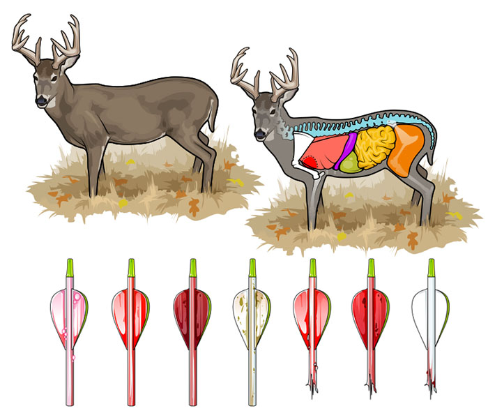
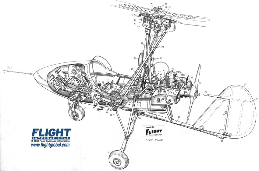
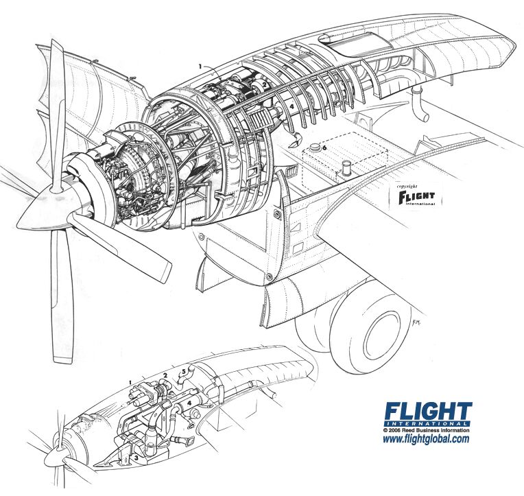
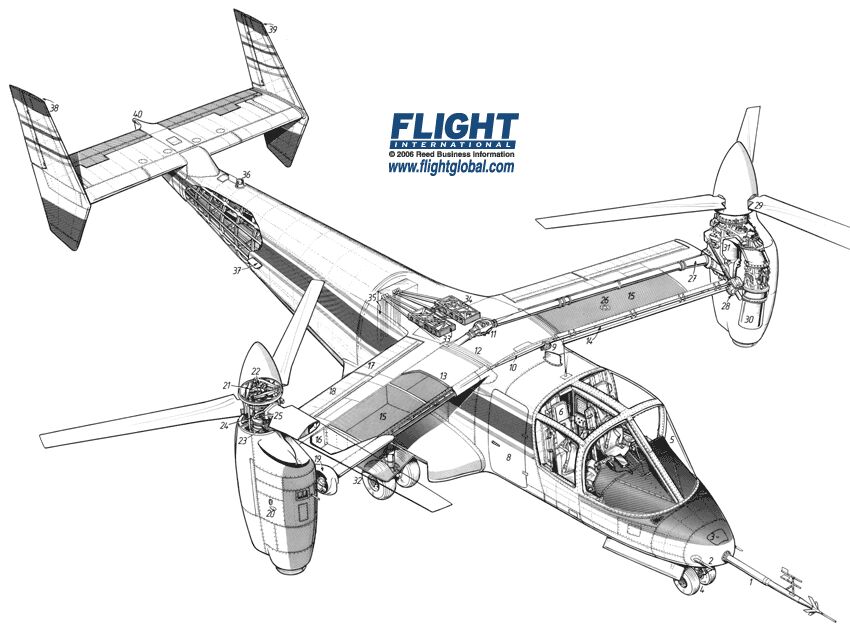
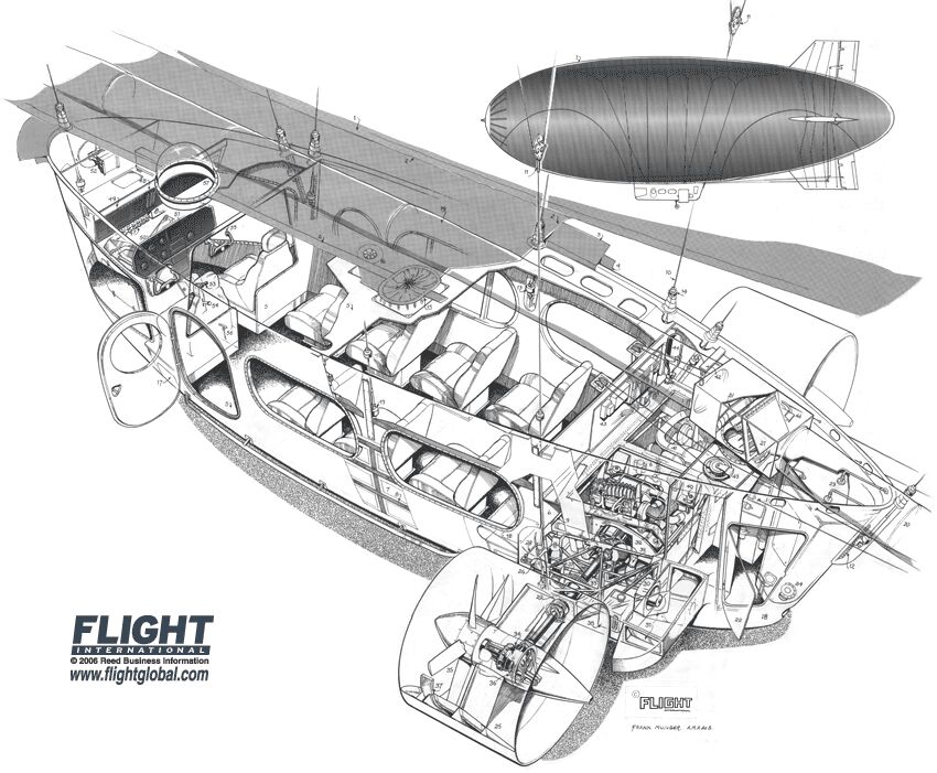
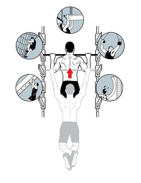
Regarding the aesthetic, I think the thick rules on the outside give the objects separation and weight, and the thin lines detail and clarity. People love exploded views because they can see what’s happening on the inside – something the PopSci reader loves. Ultimately, I think the style of illustration removes clutter and anything unnecessary to reveal the essence of the subject. It circles back to direct communication, free of any additional interpretation for the viewer.

Todd Detwilier - Car Buyers
In addition to your role at PopSci, you also moonlight as an illustrator. What drives you to illustrate?

I love illustration as much or if not more than editorial design. But what actually drives me to create illustrations is seeing the work of others. I’m constantly impressed with the level of design being generated by artists, and I can’t help but be inspired to create and learn.

Todd Detwilier - Ninja Warrior
What do you see for the future of publishing or illustration? Any advice for new illustrators or students?

The future of publishing is digital with print declining over the next 5 to 10 years. Illustrators need to be quick and consistent. I see enormous opportunity for illustrators in the digital News sphere. When breaking news happens, how fast can you turn out an editorial perspective, or even better – a comprehensive breakdown of what has happened or is happening. The world demands answers immediately and if you can act quickly, you’ll be very successful. Also, take your phone out of your pocket – that’s your new canvas – get used to it!

Popular Science - April 2014
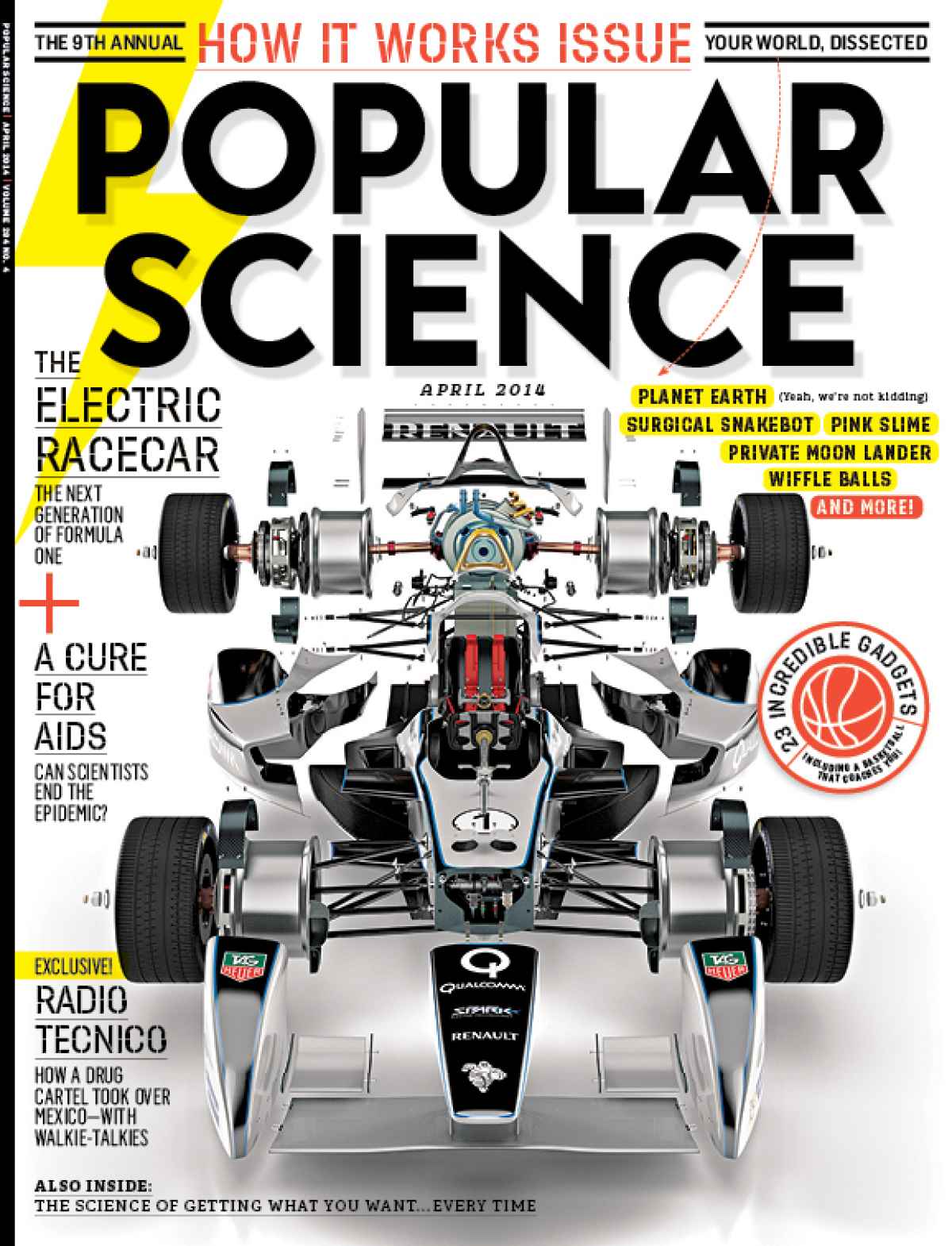
You worked with Graham Murdoch on the Electric Racecar project for PopSci. What was that like?

He’s just the best. I’ve been working with him since the Maxim days and he has always made me look good. For the Formula E assignment I sent him a bunch of scrap art and he was able to build out the entire car based on the reference I sent along with his own research. When it came to “exploding” everything apart, I know he spent a lot of time meticulously unscrewing every bolt and washer. The result was amazing, and it set the bar high for everyone in the magazine.

Big thanks to Todd for his time. You can find his work at ToddDetwiler.com and on newsstands everywhere.

Ryan Kirby

Ryan Kirby - Snakebot

Ryan Kirby’s career as both an illustrator/designer and wildlife artist is a balancing act. He finds stability somewhere in between solving problems for clients like Popular Science, Outdoor Life and Field and Stream, and defining his own challenges through his fine art. Ryan took the time to answer a few questions for us about his work, education and life.

What’s your background? How did you get your start in illustration?

I’ve been drawing and painting since I was in elementary school, and my goal has always been to one day paint full time. But I also knew that once I graduated college, I would need some marketable skills to buy some time before I could paint. So I studied Graphic Design and Multimedia at Bradley University in Peoria, IL and graduated in 2005. I was a farm kid, and we didn’t have access to the software and Mac computers growing up, so college was my first experience with Photoshop, Illustrator, and any real form of print and digital media. I learned to apply my drawing and fine art skills to these programs, and did fairly well in school.

Upon graduation, I headed south of the Mason Dixon to Edgefield, SC to work for the National Wild Turkey Federation as a graphic artist and illustrator. I spent roughly seven years there learning print design, magazine production and editorial illustration. Those were good years, and I learned a lot. Eventually I started freelancing and painting on the side, always pushing myself and trying to learn new programs and techniques. Soon the freelance workload became heavy, and I had to make a decision whether to launch out on my own or stay an employee of someone else. I chose the former.

I’ve been on my own for three years now, and it’s been the best decision I’ve ever made. It’s not always easy, and as a one man show you wear a lot of hats initially, but I thrive on challenge and love learning new things. Most of my clients are in the outdoor industry, and I primarily focus on print ad design, photography post-production work, illustration and wildlife art.

Ryan Kirby - Deer Anatomy

What’s your favorite subject matter or type of illustration?

The how-to hunting pieces are my favorite. I have a passion for the outdoors and really enjoy hunting and fishing. So to illustrate a hunting scenario that I’ve lived out in real life and help a magazine better communicate that concept with a reader, that’s something I enjoy tremendously. It’s one thing to enjoy the technical side and the creative process of illustrating or painting, but to actually care about the subject matter, that’s a whole new level of job fulfillment. And I feel it shows up in my work, which is why I’ve been successful in the outdoor arena.

Ryan Kirby - Target Shooting

What’s your process for a typical assignment?

Even with good scrap material and reference photos from a client, I always like to do some more research on my own. Most of my work starts the old fashioned way with pencil and paper. Once I get a rough sketch with potential, I’ll take a cell phone pic, email it to myself and from then on, it’s all digital. If I’m working in Illustrator on a technical piece, I’ll create vector art over the top of the sketch. My humorous work though is done 100% on paper and scanned in to create a digital file for the client. In this day and age, everything has to turn into a digital file at some point to send over to the client.

Ryan Kirby - ATV

What’s the relationship between your illustration work and your fine art?

There’s a dramatic difference in the way an illustration is created vs. a fine art piece, and the business side of things is run differently as well. But artistic principles like contrast, edges, focal points, composition, color, etc. apply to both fields. For example, when I want a hard edge on my subject matter in a painting, I paint a clean, hard line with contrasting values. When I want a hard edge on a vector illustration, I simply bump up the stroke width in Illustrator and choose contrasting colors. Same concept, two different ways of accomplishing it. And as with any great fine art piece or technical illustration, the more you can refine a subject down to it’s core essence, the more you simplify it, the more powerful the resulting image.

There are differences though. My illustration and graphic design work is done on a sketchpad and an iMac in my office. It’s clean, precise, orderly. My paintings are done in a separate painting studio. It’s messy, more chaotic, a little more of a mad-scientist atmosphere. In addition, the illustration and graphic design is a service industry, where I solve a client’s problems for a fee. The painting, on the other hand, is a hard good. It’s my own creation, and after I create it I have to find a way to market and sell the piece. It’s more of an entrepreneurial venture than sitting back and handling client requests.

I’ll always do a balanced workload of graphic design, illustration and fine art. But these days I’m shifting that balance to more fine art. There’s no client revising my work or limiting what I can and can’t do. I have more ownership of the creative process, and that’s important to me.

Ryan Kirby - Outdoor Life Cover Painting
Do you have any advice for illustrators just starting out?

Absolutely. As an illustrator or designer, you are in the business of solving problems. Your clients have problems that they need solutions to, and the level of problem you can solve for them will determine your level of success. For example, I’ve taken it upon myself to learn product photography and new illustration techniques, to understand branding and retail settings, and to craft powerful messages with copy and images. If something is beyond my reach, I seek advice or hire it out. The more problems you can solve effectively for your clients, the more valuable you are to them.

Also, be great to work with. Under-promise and over-deliver. Hit deadlines. Go over the top, not because someone asked you to, but simply because you wanted to see if you could do it. You can be the most talented illustrator in the world, but if you can’t hit a deadline or you’re a jerk to work with, clients will find somebody else. And always remember: emails are forwarded and what you put on Facebook lives forever.

Ryan’s illustration work can be found at RyanKirbyIllustration.com and his wildlife fine art at RyanKirbyArt.com

Chris Philpot

Open any magazine on the newsstand and inside you’ll likely find an illustration by Chris Philpot. He creates humorous how-tos, conceptual illustrations, infographics and animations for some of the biggest and best, including TimeWired, Popular Science, Outside and Men’s Health .

I got in touch with Chris to ask him a few questions about his work, how he got his start in illustration, and what the future may hold.

Chris Philpot - City of the Future

What’s your background? How did you find your way into illustration?

I wanted to be an illustrator in high school but read articles from practicing illustrators predicting the demise of the profession. I decided I should get a degree in design to ensure a more stable income. That lead me to a job as an editorial art director for about 12 years. While I grew to enjoy design, I still really wanted to illustrate so I started freelancing on the side. Five years of moonlighting gave me enough of a base to make the switch. It was a scary transition, but my wife was incredibly supportive. I’ve been illustrating full time for the last six years. It’s been great. I make more money, have more autonomy and am much more fulfilled creatively.

Chris Philpot - Visual Quiz for Esquire

What are your favorite subjects or types of project?

A technical approach is surprisingly versatile. You can add a subtle joke to dry stories. You can take irreverent or taboo stories and make them presentable to polite society. You can take a really funny story and the art can play the role of the straight man. I read a lot of Gary Larson cartoons growing up and would turn every job into a one-panel Far Side cartoon if I could. My favorite types of projects involve subjects that are fun to draw like monsters, robots and octopuses.

Chris Philpot - Oculus Rift for TIME

Your style is really consistent, how important is that? How did you develop your aesthetic?

The consistency comes from a few places. Mostly, I need to produce a lot of work to meet my income requirements each month so the volume dictates a certain formula. I try to improve with each job. If a new technique works, I add it to the list of best practices. I’ve also found that art directors are coming to me for the work they see in my portfolio. If I send something too different they often direct me back to the look and feel of my portfolio (I still send in variations if I think they’re better.) I also use a lot of 3-D models for reference. That definitely adds to the consistency, especially in the proportions of people. I’m pretty lanky so using myself as reference wasn’t working out.

Chris Philpot - Humvee

What’s your process for a typical assignment? What hardware and software do you use?

I take the brief from the client and request any missing information like story details, budget and schedule. I try to get as close as possible to a final draft by the sketch deadline. It puts the art directors and editors at ease and I think everyone is more inclined to approve things. Revisions hurt profits and the end of the time line breeds a revise-happy anxiety. This is sometimes unavoidable of course.

Regarding software, I use a lot of inexpensive models from Daz3d and Turbosquid for reference when I can and trace the renderings out of Poser or Blender with Illustrator. For hardware, I buy a top-of-the-line iMac every 4 years and use a Wacom intuos4. The tablet was the single best addition to my work flow. I’m not sure how I ever drew with a mouse.

Animation started in Flash but is now done exclusively with After Effects.

What challenges have you faced in your career? What opportunities do you see for the future?

Transitioning from a full-time job to full-time freelancer was a challenge. I worked a lot before going to the office, during lunch breaks and after I got home. Now my biggest issue is working from home with three kids. I love being available for them and I need to be productive so it’s a balancing act sometimes.

There are always opportunities for illustrators to pitch or generate their own content. When the iPad came out, everyone in the editorial world started experimenting with video for the app version of their magazines. I’ve always toyed with motion so it was a good opportunity to try something. The business etiquette series for Entrepreneur magazine (written by Esquire Articles Editor Ross McCammon) was supposed to be a simple illustration with some movement. I asked if I could take on the larger sidebar and to their credit they let me try. Once the longer video was approved they agreed to a fee I proposed. I asked a friend and former coworker Tyrrell Cummings if he would help me with the storyboards. It came together nicely and we’ve done a one-to-two minute short video each month for the last three years.

Chris Philpot - Speed Data for Car and Driver

You’ve worked with some of the biggest and best clients. Any tips for illustrators starting out?

It was uncomfortable at first, but I put myself out there with an online portfolio and 4 x 6 postcards. I was turned down by representatives so I had to go it alone. The initial images were primitive. I did jobs for friends and for the in-flight magazine I worked for at the time. That gave me enough of a portfolio on which to build.

If you’re starting out, just keep producing the work you’re excited about and make it visible. Keep updating it. The days add up, and if you stay active you’ll get somewhere. I didn’t enjoy instant gratification but I did get eventual gratification.


Chris’ work can be found at ChrisPhilpot.com

Oil Spill Illustration Roundup

The biggest news story of the past two months is highly technical and happening beneath 5,000 feet of water. These obstacles make technical illustration the obvious medium for telling the story. Collected here are illustrations and graphics from various sources, showing their visual approach to communicating the information. (Mouseover for source, click for larger version)

The New York Times‘ illustrations are well designed and executed in a graphic style typical for newspapers. Black lines delineate the key information, both a visual strategy and a production consideration (black prints well on grainy paper in fast presses, since it’s a single plate). Deep-red lines and arrows call the eye’s attention to important details. Light colour tones provide additional information such as material, dimension/shading, or simply visual separation. A variety of views are used, elevations, isometrics, perspectives, whatever suits the content. Nice stuff here.

Infographic World‘s ambitious graphic attempts to tell the entire story, relying heavily on text, but ends up feeling cluttered, unfocused and disorganized. The individual illustrations feel underdeveloped.

NOLA/Times-Picayune‘s graphics are similar in style to The Times’, but with a much thicker line weight which makes me think they might have appeared smaller in print. The multitude of arrows really get in the way of the information. A bit heavy handed.

The Economist is a weekly news magazine, but the illustration doesn’t have much to show for the extra time (to be fair, there’s no telling what sort of turnaround time the illustrator was given).

BP employs slick [no pun intended] 3D renderings to communicate the company’s repair efforts and give the impression of openness and transparency. I have two problems with this. First, they feel expensive. I imagine BP already had a 3D model library of all their equipment for planning and presentation purposes, so this may very well be the most cost-effective visual solution for them. But the impression these polished 3D renderings give is that they’re spending a lot on visuals, when they should be devoting all their resources to the repair and cleanup process.

Secondly, 3D renderings feel like constructed illusions rather than explanatory depictions of their efforts. Maybe it’s my bias towards illustration since both are just as artifical (ie. not photographs or videos), but I find The Times’ illustrations more trustworthy than BP’s 3D world.

Sources

The New York Times. “Methods That Have Been Tried to Stop the Leaking Oil”
Infographic World. “Crude Awakening”
NOLA.com. “Oil Spill Graphics”
The Economist. “Mudslinging”
Unified Command for the BP Oil Spill. “Graphics”
BP. “Gulf of Mexico Response”

Have you seen any additional illustrations of the Gulf of Mexico oil spill? Let us know in the comments!

The Future of Technical Illustration

Wired Magazine on iPad

For those of us who work with publishers of magazines, newspapers and books, the past few years have been trepidatious. The future of the printed page looks uncertain. There’s much speculation that this business model or that device will save the industry. And as much as we techies may fall in love with each new gadget, they have been looked at as a threat, or at least an unknown variable in our careers.

But through all this, I’ve taken comfort in two facts. First, that we live in a visual society. For this reason, the pixel pushers, the vector tweakers, the pen sketchers, and more importantly the visual thinkers will always be in demand. Secondly, the environment around us grows more complex every day. We specialize in distilling complexity into more comprehensive, communicative forms.

I feel our skillset will remain relevant and in demand, but it is crucial to stay informed about prevailing technologies and mediums, and to constantly update our workflows to be able to deliver our product in whatever packaging consumers demand.

Threats or opportunities? What are your thoughts?

Flight’s Aircraft Cutaway Archives

Autogyro Cutaway

Wallis Autogyro Cutaway

Flightglobal has scanned, digitized and made available every issue of Flight Magazine published between 1909 and 2005 – that’s 100 years of aviation history! Most notably, they have a section of the archives devoted to cutaways, where these images were found.

Some are full-color but most are linear, with exceptional control over line density and overall image balance—keep in mind that these were most likely done traditionally on vellum or illustration board with a technical pen!

Nacelle Cutaway

Rolls Royce Dart Convair Conversion Cutaway

Bell XV 15 Cutaway

Bell XV 15 Cutaway

Airbus Airship Cutaway

Airbus AD300 Airship Cutaway

Spacelab Cutaway

Spacelab Cutaway

Westland Hovercraft Cutaway

Westland Hovercraft Cutaway

Flightglobal’s Cutaway Illustration Archive

Inspiration – IL Magazine

IL - Water

IL “Intelligence in Lifestyle” is an Italian culture and style magazine published monthly by newspaper Il Sole 24 ORE. Art director Francesco Franchi works with a variety of illustrators to produce handsome and informative infographics explaining the latest issues, trends and topics.

Read More

Josh McKible

Josh McKible - Method of Exercising a Cat

Josh McKible - Method of Exercising a Cat

Tell us about your background?
I’m currently living in a suburb of Tokyo, Japan but I’m originally from Upstate NY, from a town called Newburgh thats about an hour north of NYC. I did my undergraduate studies at SUNY Purchase, I went in for painting, but came out doing sculpture. Mostly mechanical, kinetic kinds of things that tended to break down or explode (sometimes on purpose). I think that’s where my fascination with how things work started. I then went to the School of the Art Institute of Chicago for an MFA. I came out doing sculpture and kept at it for a few years, until I discovered the Mac. That gradually lead me into graphic design, first as a hobby then as a profession. I art directed a few different magazines in NYC for a few years, until I started doing illustration full-time in 2004.

Josh McKible - Car Exercises

Josh McKible - Car Exercises

Are you a freelancer or in-house?
Full-time freelance, although technically I’m an employee of my own company, MCKIBILLO, INC.

Software of choice?
Adobe Illustrator, plus Pixelmator for sketching and blocking out rough ideas. I’m on a 21.5″ iMac with a second 24″ monitor setup and a Wacom tablet. And SomaFM.org continuously streaming in the background.

Favorite clients/jobs?
The kind where I get to work in the most visually appealing way, “prettiest” for lack of a better word, but where the information is still clearly presented. I love it when a client trusts me enough to push the edges a little. I also like to inject some humor when I can and where it’s appropriate.

Josh McKible - Car Exercises

Josh McKible - Car Exercises

Any advice for illustrators just starting out?
It’s trite but true… follow your bliss, do what you love. Your style and technique will follow from your interests. I took a pretty winding path to find out what I both enjoy doing and what I’m good at. What that means in practice though is to not do anything half way…. find something and then work at it as hard as you can until you really master it.

Tell us about your Nanibird project? Where did it come from and where has it taken you?
As much as I love pushing vectors all day sometimes I just have to make stuff. And if I can collaborate with other designers, even better. NaniBird is a free papertoy I designed, but that also acts as a platform for other artists to work on. So far it has attracted about 100 submissions. Personally though, it’s been a really great outlet and has allowed me to collaborate on a number of projects that otherwise I never could have. It’s been published in 2 books already, led me to organizing a show of papertoys here in Tokyo, I designed a poster based on it for display in Shibuya station in Tokyo (Shibuya is one of the busiest transit points in the world)  and I’ve been invited to submit designs for an upcoming book of Papertoy monsters. And I just recently designed a custom NaniBird for a 40th Anniversary of Woodstock held in San Francisco. It’s led to a lot of very fun and interesting side projects. It’s also just really nice to work in a style and medium so different from my usual work.

Josh McKible - NaniBird

Josh McKible - NaniBird

Josh McKible aka MCKIBILLO’s work can be found at mckibillo.com, Drawger and Nanibird.com.