John Grimwade: Infographics for the People

Illustrator, designer, and educator John Grimwade has started a great blog on information design and data visualization called Infographics for the People.

For his posts, Grimwade pulls together contemporary infographics, historical examples and samples from his prolific career working with newspapers, magazines, books and corporate clients. From his mission statement:

I’m trying to promote infographics that engage the general public. There is a trend towards elitist visualizations, that seem like they might be designed for data geeks. Of course, visual communication is a powerful way to help people understand, but first we have to get people on our side. Be inclusive, not exclusive. And never forget that a sense of fun is an important component in getting our message across. Infographics for the People!

He critiques his old work with self-deprecating humour and encourages readers to learn from his mistakes and to think critically when creating our own work.

Infographics for the People by John Grimwade

John Hartman

John Hartman is a technical and scientific illustrator who seamlessly blends traditional media with 3D and digital techniques to create  images that are fresh and contemporary, yet warm and inviting. His work can be seen regularly in Fine Woodworking, Woodcraft, Fine Home Building and more. John agreed to answer a few questions about his work and career.

John Hartman - Paslode Nail Gun

What’s your background? How did you get started in technical illustration?

It’s a long story but here it is in a nut-shell. I have always been interested in drawing and painting. My early education was in fine art. I also found technical illustrations like those in Scientific American, Popular Mechanics and Fine Woodworking inspiring and they appealed to my interest in art, science and technology. Since my school days predated the personal computer, technical illustration was being created strictly by hand. As a student I was impatient, rebellious and seeing how fastidious hand drafting and airbrush painting was I decided to go another route and become a fine artist.

I found myself living in Brooklyn, working odd jobs to pay the rent. Being a starving artist wasn’t for me so I decided to learn a trade. I also had an interest in music as well as art so I re-educated myself as a piano technician. Fast forward a few decades and I am running my own business rebuilding grand pianos. Knowing of my art background the editor of the Piano Technician’s Journal, the trade magazine for people who tune and repair pianos, asked me to come on board as their illustrator. I spent the next six years teaching myself technical illustration. Starting with traditional hand methods and eventually developing digital techniques that emulate the handmade artwork I loved in my youth.

The pianos are now gone and I am working full time as a freelance illustrator. I’ve converted part of the piano shop into my studio, and have kept the woodworking shop as my man cave. I love this work and wish I would have started earlier. There’s a lesson in this somewhere.

John Hartman - Water Tank

You work in a range of styles and subject matter. How do you choose the right aesthetic for a project?

Well I think the right aesthetic is the one that gets the job done and also appeals to me personally. I have never hidden the fact that I work digitally but my personal taste in art and illustration is rooted in traditional analog techniques. So generally I don’t want my work to look like it popped out of a computer program. I think in my case what comes off as different styles is really a result of my penchant for experimenting with a wide range of tools and methods. Typically I may blend together 3D rendering with hand drawing and a little vector work as well. I love learning new software and trying to come up with different ways to create illustrations. Sometimes I attempt to emulate a particular analogue drawing style, the results vary but I always learn something new. For me, it’s more of a challenge to stay consistent and on track. Except for my personal taste, experience, and craftsmanship the style chooses me rather than the other way around.

As you noted, I enjoy working on different subjects as well; there is nothing better than being handed a unique assignment, and doing the research can be fun as well. But I have never consciously linked a style to a particular subject except in the case of my work with Fine Woodworking Magazine where there is an established style. I do try to be consistent within a project and if the art director points me in a particular direction stylistically I make every effort to accommodate. In addition, with art directors I know well I will often discuss style issues to better integrate the illustration with the page design or create something a little different than usual. Some of my most successful work stems from collaboration with a talented art director.

John Hartman - Bench

What challenges have you faced in your career? What opportunities do you see for the future?

Projects that are complex or those that require a new skill to pull off, or have a very tight deadline have kept me awake at night. Over time I have learned to expect these sorts of challenges and I find myself looking forward to difficult projects. One challenge we technical illustrators face is keeping up with ever evolving technology, requiring practice and self education. I think learning new software is vital to staying competitive. Also I find I need to brush up on core software I already know like Photoshop and Illustrator. Since software is doing more of the heavy lifting I find I need to practice my analog skills and foundation knowledge like perspective just to keep from losing this valuable tool set.

What I see on the horizon for technical illustrators is the increased use of 3D animation. On-line video is becoming the leading media for news, education and entertainment. It may take some time but eventually publishers, advertizing agencies and businesses will seek out talented illustrators to create information based animations.

Do you have any advice for new illustrators or students?

Technical illustration is a broad field of study. It covers any illustration assignment that needs to show the viewer how something functions or how parts are interrelated. At its heart is clarity and precision, and consequently it requires more discipline and knowledge. I believe students need to work longer and harder to gain the skills needed. New illustrators and students need to know it’s going to take passion and dedication to be successful in this field.

Technical illustrators need to be able to draw well. This means being able to accurately depict the world around us with line, tone and color. Don’t expect to gain this by attending a few classes in school, it will take a lifetime of learning, and continued practice to maintain. You need to study perspective, how to render light and shade as well as color theory. Don’t expect computer programs to do this for you. If you wish to include the figure in your work you will need to study artistic anatomy as well.

Working as a technical illustrator is not a passive act, you are expected to research and understand the topics you are given. In addition you will need to solve the many technical and design issues that arise with each assignment. The artistic quality of your work is up to you. Hopefully you have a passion for fine art and can bring flair to your work that is attractive. I believe that technical illustration should be beautiful as well as useful.

John Hartman - Air-Conditioning-System


See more at Hartman Illustration.

Vic Kulihin

Vic Kulihin - Space Shuttle

The vector illustrations of Vic Kulihin are fresh, bold and contemporary. So you might be surprised to learn that his freelance career began in 1988. Vic was kind enough to answer a few questions about how the industry has changed in that time and give a few tips on having a long and successful career.

What’s your background? How did you find your way into illustration?

I started out as an engineering major at Rutgers University, but graduated with a degree in art education (long story). After college I worked as a paste-up artist for a small ad agency, which folded not long after I started. I then found a position as a technical illustrator for Bell Laboratories. This was back in the day when we used airbrushes, technical pens, straight edges, French curves and typesetting machines. During my stint there these tools were gradually replaced with Macintosh II desktop computers using Adobe Illustrator 88 software.

After a decade I left Bell Labs to start my own freelance business. The timing was right. I was able to combine my work with being a stay-at-home dad for my baby daughter. At that time I focused on colored pencil illustration, but eventually gravitated back to the Mac and vector art.

Earlier in my career I took classes at Parsons, the School of Visual Arts and the Art Students League of New York to make up for my lack of formal art training. I still take classes periodically, but the beauty of it nowadays is that they are readily available online.

Vic Kulihin - Shelves

What is your favorite subject matter or type of project?

Although I’ve had the opportunity to draw a great variety of things, I think my favorite subject matter has always involved mechanical devices…tools, machinery, that kind of thing. I enjoy creating assembly instructions, exploded diagrams, cutaways, schematic drawings (I think I’ve always been an engineer at heart).

Vic Kulihin - Electronics

What’s your process for a typical project?

I start with a thorough discussion of the project with the client: project specs, style, number of iterations of sketches/final art, timeframe, budget, etc. When the project involves a product I ask the client to supply me with reference photographs and, whenever practical, the actual product itself. For projects involving people I will often photograph live models and/or use software like Poser or DAZ.

I currently work on a Mac Pro with a 30” Apple Cinema Display; I also have a Wacom Intuos3 tablet that I use infrequently (oddly enough I feel most comfortable wielding a mouse). Software of choice is Adobe Illustrator.

Tools like Skype and GoToMeeting have allowed me to work closely and “in person” with clients globally, something I never would have envisioned when I first started out.

You market your services in a number of illustration directories. What has been your experience with that?

I find that of all the portfolio sites I use the majority of my work comes from three directories (theispot, Directory of Illustration, Workbook) and the assignments from these have covered the gamut of illustration. The income that results from these projects generally justifies the expenditure for these sites. I also periodically do a direct mailing campaign. Recently I’ve expanded my online visibility and interactions through social media such as Behance, Twitter, Facebook and LinkedIn.

Vic Kulihin - Dirt Devil

You’ve been illustrating for 27 years, what do you think makes for a long and successful career?

The biggest challenge has been dealing with the “feast or famine” syndrome…drumming up business when things are slow, or trying to deal with the onslaught when things get very busy.

As for the future?… For some years it seemed like photographs and video were “where it’s at”. But I’ve noticed more recently a big increase in the use of illustration across media.

That’s great news for the likes of us!

National Infographic

National Infographic is a blog written by Juan Velasco, art director of the venerable National Geographic magazine.

Velasco writes in depth about the rigorous journalistic integrity, the painstaking attention to detail, and the high-level design thought that goes into producing visuals for such an esteemed publication. The graphics department spends months producing original research, consulting with experts and consultants, and digging through data to bring a story to the surface. The amount of resources at their disposal is amazing.

Far beyond geographic maps, the graphics department produces illustrations, infographics, animations, interactive modules, videos, 3d models, dioramas and photo essays on topics such as science, technology, history, culture and economics.

National Infographic. Definitely one to keep an eye on.

Wrapping Patterns Around Cylinders

Wrapping Patterns Around Cylinders

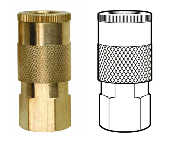
Brett wrote in looking for a way to accomplish a diamond grip pattern wrapping around a cylinder, like the one shown above. It’s easy enough to trace a photo, but what if you didn’t have one, or it wasn’t at the right angle?

The technique I’d use is similar to mapping a label to a can.

Wrapping Patterns Around Cylinders

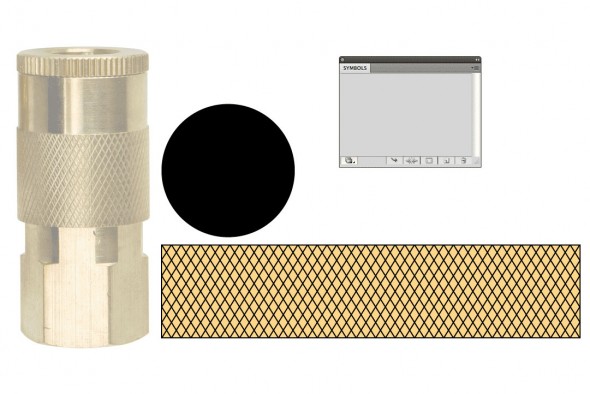
1. Create the artwork you’ll need. The diamond pattern matches the angle and density of the original. The black circle is the same diameter as the reference part, and is filled with no stroke.

Wrapping Patterns Around Cylinders

2. Make the pattern a symbol. Drag the pattern into the Symbols palette.

Wrapping Patterns Around Cylinders

3. Extrude the circle. Go to Effects > 3D > Extrude & Bevel. Click the Surface dropdown at the bottom and select Wireframe. This will help you orient the cylinder to the desired angle. I usually start by entering 0° for all the rotation angles, then rotating one axis at a time by grabbing the edges of the preview cube.

You may need to reposition your cylinder to line up better with a reference image. To do this, Click OK, move the cylinder as needed, then open your Appearance pallete and double click on the 3D Extrude & Bevel item. You may need to turn Preview back on.

When you’re happy with your geometry, click Map Art…

Wrapping Patterns Around Cylinders

4. Map Art. Click through the Surfaces to find the rectangular side surface. Then select your pattern from the Symbol drop down. Next, select Scale To Fit at the bottom and check off Invisible Geometry. Click OK.

Wrapping Patterns Around Cylinders

5. Change Surface to Flat Shading. Click OK. You can now edit the artwork as needed by going to Object > Expand Appearance. In my example, I changed the yellow fill to white, then drew the rest of the lineart on another layer.

Have a common problem in Illustrator? Let us know in the comments, or email it to suggest@technicalillustrators.org!

Shooting On-Angle Photos

Shooting On-Angle Reference Photos

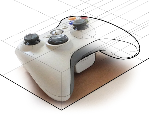
Often the most difficult and time consuming part of technical illustration is finding good reference material. While the internet serves up a limitless selection of images, finding one at an appropriate size, fidelity, viewing angle, and unambiguous copyright status, can be next to impossible.

Sometimes it’s much quicker to simply step away from your desk and go snap a photo of whatever you need. Of course, this isn’t practical if you’re drawing a submarine or a satellite, but it can help if you’re trying to fill a scene with commonplace objects.

Where it gets tricky is matching your photo reference up to the rest of the drawing. We’ve all seen drawings badly traced and assembled together from photos taken at different angles. We can recognize this because we understand perspective. So let’s apply that understanding when shooting our own photos.

Read More

Create Proper Gears & Conical Gradients

Iaroslav Lazunov has a great tutorial over on Astute Graphics’ blog on how to create proper gears in Adobe Illustrator. This tutorial makes use of the plugin VectorScribe, but the same results could be achieved with Illustrator’s default tools with some extra steps.

An important distinction is made here: Proper Gear. Most gears that show up in illustrations and icons would not work with any efficiency and some would just shred to bits. While you wouldn’t necessarily 3D print these and use them, you’ll end up with something that at least looks like it would work (unlike the failboat below).

Department of Innovation: Going Nowhere Fast

Also included in the tutorial is a way to accomplish conical gradients in Illustrator (unfortunately the technique is extremely convoluted).

Conical Gradient in Illustrator

Check out the tutorial!

Astute Graphics VectorScribe

It’s been a great summer break, but now it’s back-to-school here at TechnicalIllustrators.org.

I thought I’d share what I’ve learned using Astute Graphics’ VectorScribe plugin for Adobe Illustrator (previously) over the past few months. I’ve put together a bit of a demo video highlighting some key features of the suite that I’ve found helpful.

httpvh://www.youtube.com/watch?v=AydOgXNnQjs

This only scratches the surface—As mentioned in the video, be sure to check out Astute’s video tutorials to learn about all the features in detail. I think this package is a great, feature-rich and intuitive extension to Illustrator’s toolkit.

If you’re using VectorScribe or have tried the demo, let me know your thoughts in the comments!

Vector Scribe Illustrator Plugin

httpvh://www.youtube.com/watch?v=Y1TEqhiyZ3k

I’m excited to introduce to you a new plugin suite for Adobe Illustrator, VectorScribe by Astute Graphics.

VectorScribe fills the gaps in Illustrator’s toolbox. These tools give you intuitive yet precise control over your points, paths and shapes—without creating Effects or file incompatibilities across versions of Illustrator. VectorScribe lets you work with your vectors instead of around them.

I’ll go into detail about each tool in the suite later, but in the meantime have a look at some videos and check out the free 7 day trial.

Full disclosure: I was a volunteer beta tester for this software and received a complimentary copy.

VectorScribe by Astute Graphics – $119

Full disclosure: As a beta tester, I received a complimentary copy of this plugin.