Animagraffs by Jacob O’Neal

Jacob O’Neal is a graphic designer, 3D artist, and creator of Animagraffs, animated infographics that explain how everyday things work.

Largely self-taught, O’Neal combined his interests in design, science, and engineering with social media savvy to create viral internet content that propelled him into a career working with some of the best known brands in the world.
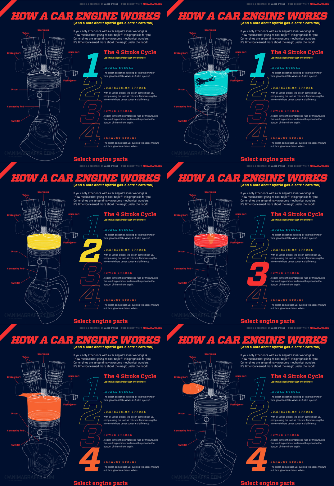
Read More

Learn Engineering on YouTube

YouTube channel Learn Engineering is a great series of videos explaining how everyday objects work. The 3D animations of different gears, motors, coils and fields are clear and really help illustrate the easy-to-understand script.

Uniqlo HeatTech Fabric Video

This Uniqlo promo video is a great example of combining technical information with beautiful and engaging visuals, highlighting otherwise invisible features and demonstrating their benefits to the customer.

In a market where branding is often just a graphic silkscreened on a generic garment, Uniqlo places the emphasis on the comfort, performance, sophistication and simplicity of the product itself. Armed with that information, the customer’s decision is made easier.

MacBook Redesign Video

Yesterday’s post reminded me of this video about the redesign of the Apple MacBook released last year. This one is a bit more informative in tone and has some great visualizations of otherwise invisible features, the pressure-sensitive trackpad, for example.

This really shows the selling power of information.

Microsoft Surface Studio Commercial

This promo video for the just-announced Microsoft Surface Studio really caught my eye, beyond the hardware itself and what it could do in the hands of a tech illustrator. Watch starting at 0:25 at 0.25x speed. It’s not the most informational example of technical communication, but it certainly makes you marvel at the precision and sophistication of the product’s design and assembly beyond what the consumer would normally see.

Chris Philpot

Open any magazine on the newsstand and inside you’ll likely find an illustration by Chris Philpot. He creates humorous how-tos, conceptual illustrations, infographics and animations for some of the biggest and best, including TimeWired, Popular Science, Outside and Men’s Health .

I got in touch with Chris to ask him a few questions about his work, how he got his start in illustration, and what the future may hold.

Chris Philpot - City of the Future

What’s your background? How did you find your way into illustration?

I wanted to be an illustrator in high school but read articles from practicing illustrators predicting the demise of the profession. I decided I should get a degree in design to ensure a more stable income. That lead me to a job as an editorial art director for about 12 years. While I grew to enjoy design, I still really wanted to illustrate so I started freelancing on the side. Five years of moonlighting gave me enough of a base to make the switch. It was a scary transition, but my wife was incredibly supportive. I’ve been illustrating full time for the last six years. It’s been great. I make more money, have more autonomy and am much more fulfilled creatively.

Chris Philpot - Visual Quiz for Esquire

What are your favorite subjects or types of project?

A technical approach is surprisingly versatile. You can add a subtle joke to dry stories. You can take irreverent or taboo stories and make them presentable to polite society. You can take a really funny story and the art can play the role of the straight man. I read a lot of Gary Larson cartoons growing up and would turn every job into a one-panel Far Side cartoon if I could. My favorite types of projects involve subjects that are fun to draw like monsters, robots and octopuses.

Chris Philpot - Oculus Rift for TIME

Your style is really consistent, how important is that? How did you develop your aesthetic?

The consistency comes from a few places. Mostly, I need to produce a lot of work to meet my income requirements each month so the volume dictates a certain formula. I try to improve with each job. If a new technique works, I add it to the list of best practices. I’ve also found that art directors are coming to me for the work they see in my portfolio. If I send something too different they often direct me back to the look and feel of my portfolio (I still send in variations if I think they’re better.) I also use a lot of 3-D models for reference. That definitely adds to the consistency, especially in the proportions of people. I’m pretty lanky so using myself as reference wasn’t working out.

Chris Philpot - Humvee

What’s your process for a typical assignment? What hardware and software do you use?

I take the brief from the client and request any missing information like story details, budget and schedule. I try to get as close as possible to a final draft by the sketch deadline. It puts the art directors and editors at ease and I think everyone is more inclined to approve things. Revisions hurt profits and the end of the time line breeds a revise-happy anxiety. This is sometimes unavoidable of course.

Regarding software, I use a lot of inexpensive models from Daz3d and Turbosquid for reference when I can and trace the renderings out of Poser or Blender with Illustrator. For hardware, I buy a top-of-the-line iMac every 4 years and use a Wacom intuos4. The tablet was the single best addition to my work flow. I’m not sure how I ever drew with a mouse.

Animation started in Flash but is now done exclusively with After Effects.

What challenges have you faced in your career? What opportunities do you see for the future?

Transitioning from a full-time job to full-time freelancer was a challenge. I worked a lot before going to the office, during lunch breaks and after I got home. Now my biggest issue is working from home with three kids. I love being available for them and I need to be productive so it’s a balancing act sometimes.

There are always opportunities for illustrators to pitch or generate their own content. When the iPad came out, everyone in the editorial world started experimenting with video for the app version of their magazines. I’ve always toyed with motion so it was a good opportunity to try something. The business etiquette series for Entrepreneur magazine (written by Esquire Articles Editor Ross McCammon) was supposed to be a simple illustration with some movement. I asked if I could take on the larger sidebar and to their credit they let me try. Once the longer video was approved they agreed to a fee I proposed. I asked a friend and former coworker Tyrrell Cummings if he would help me with the storyboards. It came together nicely and we’ve done a one-to-two minute short video each month for the last three years.

Chris Philpot - Speed Data for Car and Driver

You’ve worked with some of the biggest and best clients. Any tips for illustrators starting out?

It was uncomfortable at first, but I put myself out there with an online portfolio and 4 x 6 postcards. I was turned down by representatives so I had to go it alone. The initial images were primitive. I did jobs for friends and for the in-flight magazine I worked for at the time. That gave me enough of a portfolio on which to build.

If you’re starting out, just keep producing the work you’re excited about and make it visible. Keep updating it. The days add up, and if you stay active you’ll get somewhere. I didn’t enjoy instant gratification but I did get eventual gratification.


Chris’ work can be found at ChrisPhilpot.com

McLaren F1 Owner’s Manual

Mark Roberts, Design Operations Manager at McLaren, reflects on his technical illustration work for the owner’s manual for the revolutionary McLaren F1.

It’s really inspiring to see a company take it beyond technical documentation to something of a brand statement or a collector’s item. Something you’d put on a shelf or frame rather than leave in the glove box.

(via Clint Ford)

Autodesk Sketchbook Pro 7

Sketchbook Pro has been around for almost 10 years and is popular amongst comic, character and concept artists, but its latest release has a toolset that might be of interest to technical illustrators. While it’s a pixel-based application, as opposed to vector, I think it could still be handy for sketching roughs and even looser-styled finals.

httpvh://www.youtube.com/watch?v=r96G15n08Y4

Perspective Guides

These guides let you quickly and intuitively lay down lines converging on one, two, three or even five vanishing points. The tool gives you constant feedback as to where your cursor is positioned in space, and when you draw, it constrains your line to the appropriate heading. This looks like it would be very useful in the planning stages of an illustration, enabling you to quickly sketch in a variety perspectives.

Ruler & French Curves

The Ruler tool allows you to stroke a straight line in any direction. This works similar to Photoshop’s constrain modifier (Shift key) while using the Brush tool, but works in any direction. The French Curves shows an overlay of a variety of arcs and curves which can also be used to constrain a brush stroke. These tools would help add detail to a sketch once you’ve established the overall perspective.

Ellipse

Photoshop and Illustrator may have ellipse tools, but the one in Sketchbook Pro includes a minor axis guideline and displays the rotation and degree of the ellipse for added precision.

Everything Else

Other notable tools include the Symmetry mode that mirrors your drawing along a vertical and/or horizontal axis, Free Transform which is handy for distorting textures, patterns, shadows or repeating features into perspective, and Flipbook which enables frame-by-frame animation.

httpvh://www.youtube.com/watch?v=VgU61K2cjuc

httpvh://www.youtube.com/watch?v=ngLhGySVYLQ

Sketchbook Pro is US $65, or via subscription for $25/year or $2.99/mo.

Scott Robertson’s Free Tutorial Fridays

httpvh://www.youtube.com/watch?v=w4uJpHaHZTc

Scott Robertson is a concept artist well known for his educational books, DVDs and workshops. Every Friday he posts a free video tutorial to his YouTube page. He covers a wide variety of topics including sketching, inking, marker rendering and Photoshop painting. What I like about his videos is that they’re not strictly technical, he’s really good at explaining the thinking and process behind everything he does.