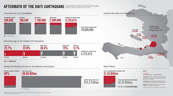
Web-magazine GOOD, well known for their Transparency infographics, recently held a contest for readers to visually communicate information about the tragic earthquake in the Republic of Haiti. The scope and content was up to the contestant, and the prize was simply recognition.
The winning entry is above. You can see all the entries at higher resolution at GOOD.
What do you think? How can technical illustrators use their talents for good? Is this philanthropic or shameless self-promotion? Let us know what you think in the comments.

There is complex information here and it’s definitely worth communicating. If an infographic helps people to understand a situation, then it’s an important first step in motivating them to help.
The work aside, I’m a bit skeptical of GOOD; they’re ostensibly philanthropic, but ad-supported and don’t seem to explicitly state that they’re not-for-profit. What this seems like is a commercial publication generating and publishing spec work in the name of some third world tragedy that will receive no direct benefit…