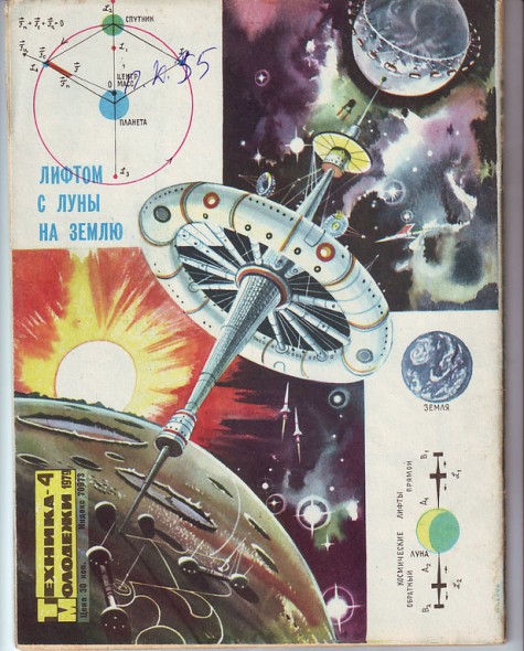
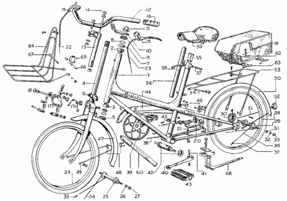
Check out this huge collection of vintage science and technical illustrations from various Russian books. Great rocket-aged inspiration. Warning: animated GIF background.
Style versus Communication
I’ve been meaning to write about style — the design and arrangement of visual elements that creates a tone or voice in an illustration, throughout a project, or across an illustrator’s entire body of work. More specifically, how style conflicts and complements with a technical illustrator’s role of visual communication.
This critique of dozens of newspapers’ adaptations of an Associated Press graphic serves as a great introduction to the topic. News graphics veteran Charles Apple dissects the minute decisions made by the various papers’ editors in the name of visual appeal, visual communication, story telling and branding.
Is technical illustration more about visual communication or style?
How do you compromise between the two?
[A Look at Tuesday’s Graphics-Heavy bin Laden Presentations]
Audi A7 Paper Model
If you’re looking for some inspiration, I stumbled across this amazing paper model creation of an Audi A7 by graphic designer Taras Lesko.
The time-lapse video shows from start to finish his process in building the large scale Audi A7 completely out of paper. It’s quite impressive!
httpvhd://www.youtube.com/watch?v=AXnhc6ZzPbM&
If you want to see more from Taras Lesko, on his website under Personal Work he also has another video of the creation of the Forza 3 Audi R8. Enjoy!
Richard Chasemore
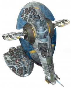
Traditionally painted cross-section of a space ship from Star Wars Episode II
There are many unique forms of technical illustration out there. Some illustrators from time to time get to expand the realm of technical illustration by depicting not only what exists in our real world and what makes it work, but get the opportunity to reveal the inner workings of fictional vehicles and worlds.
Richard Chasemore has worked for various clients throughout the years producing detailed work and is well known for his works featured in DK publishing and Lucas Books’ Star Wars: Complete Cross Sections and Star Wars: Complete Locations. I recently had the opportunity to ask him a few questions:
What is your background? What inspired/got you into the field of technical illustration?
I did a four year course in technical illustration at Bournemouth and Poole College of Art and Design. I came across the course quite by accident when I jumped on a school bus that took me to the Art College and when I saw the technical illustration department I just said to myself that’s what I want to do.
How did you start working for DK publishing? What were some of the projects that you did for them?
I was working on the See Inside series of books for DK when Hans started work on the Star Wars Project and I was brought in to help out.
What led you to produce the Star Wars Complete Locations and Complete Cross Sections books as well as later works for Indiana Jones? What was it like working for Lucas?
The locations books were incredibly hard work, but great fun as was the Indiana Jones arts. Everyone at Lucas Films were amazingly kind to us, letting Hans and I work in the art department alongside their amazing artists. We did meet Mr. Lucas and he was a really nice guy.
What is your process like?
Starting with very simple pencil works, building up to a complicated finished pencil which is then inked and painted in gouache.
What was your favorite thing you’ve worked on or best experience you’ve had so far as a technical illustrator?
I am working on Incredible Cross Sections Clone Wars at the moment which is all done in 3D and is looking amazing.
Any advice to technical illustrators just starting out?
Just keep working, day and night!
Richard’s work can be found at RichardChasemore.co.uk
Inspiration: Todd McLellan
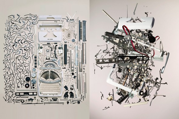
Photographer Todd McLellan takes breathtaking shots of everyday mechanical objects disassembled & painstakingly organized—and then presumably tossed into the air. Take a peak under Projects > Classic Motorcycles while you’re at it!
(via BoingBoing)
Step-by-Step Isometric Aircraft
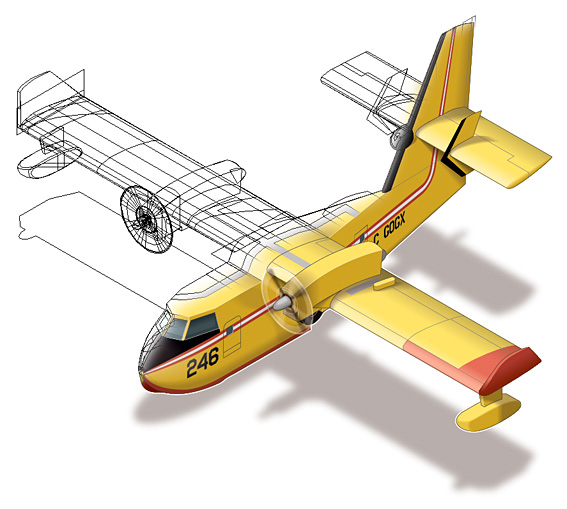
Award-winning editorial and news graphics artist Ninian Carter shares his processes for producing a complex isometric illustration of a water-bomber aircraft in Adobe Illustrator. Ninian also generously makes his Illustrator file available for download at the bottom of the page so you can open it up and explore.
By no means is this a do-as-I-do tutorial, but it looks like he uses a scale-shear-rotate method similar to Cody Walker’s Advanced Isometric Tutorial.
I’ve never seen such devotion in a droid before
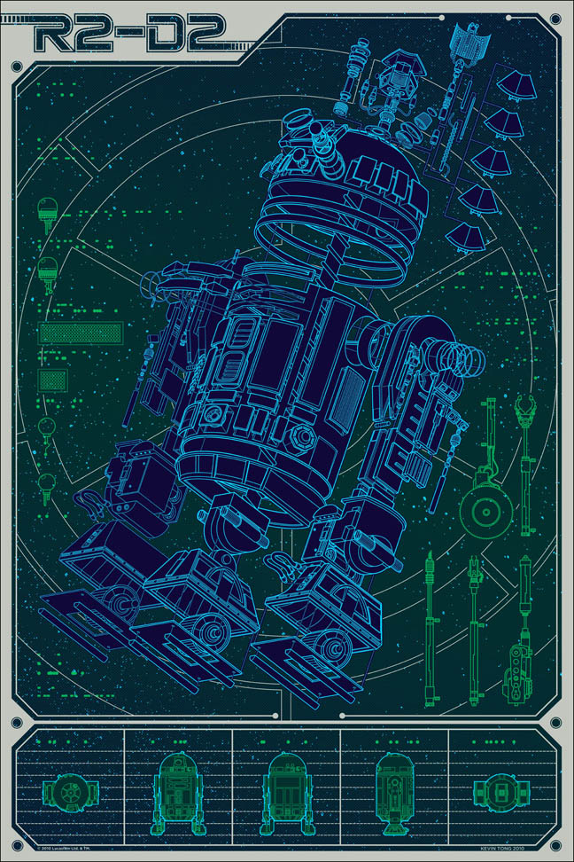
Linch Pin Droid by Kevin Tong
Illustrator Kevin Tong created this great exploded R2-D2 poster for an ongoing Star Wars Art Print series by Mondo Tees. He did a thorough post on his creative process and even made a time-lapse video showing his technique:
httpvhd://www.youtube.com/watch?v=Ta5TBGzqijk&feature=player_embedded
Linch Pin Droid goes on sale Friday.
Harry Campbell’s Technical Inspirations
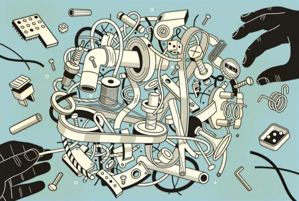
The work of award winning editorial illustrator Harry Campbell is infused with a technical illustration aesthetic. A nod to the highly complex and industrialized world we live in, he makes use of bold structural lineart, axonometric drawing systems, parts explosions, and cutaways to communicate ideas.
For his latest work for The Wall Street Journal, he shares a bit about his process and inspiration:
[…] Just in case anybody is wondering about whether my mechanical objects are traced or taken from other drawings. Generally not, I just start drawing. I do look at reference like vaccum tubes, things like that. During this project I was thinking I need to start gathering a bin of junk to pull from. I do love exploded views of ordinary objects. Here’s one of my favorites.
See more of Mr. Campbell’s work on Drawger or his rep, Gerald & Cullen Rapp.
Great Inspiration
Every week I get an email update from The Little Chimp Society, an illustration news website where members can log on and post tidbits about exciting projects they have been working on.
Typically the work is more editorial/fine arts in style, but today I was inspired by a great magazine cover that delves into the realm of technical illustration.
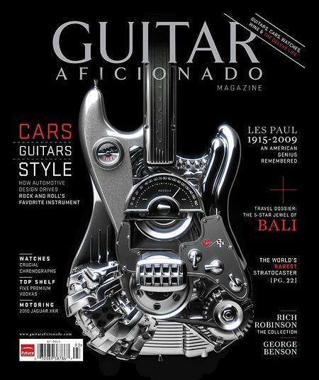
Guitar Aficionado Cover
MDI Digital has created this cover for Guitar Aficionado magazine. This piece has been selected as a finalist in the American Society of Magazine Editors Best Cover of the Year Awards as well.
Cudos to those over at MDI Digital who worked on this amazing cover! If you want to see more work created by this company, check out MDI Digital‘s website.
Mercedes-AMG Website

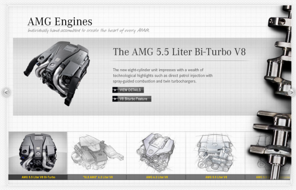
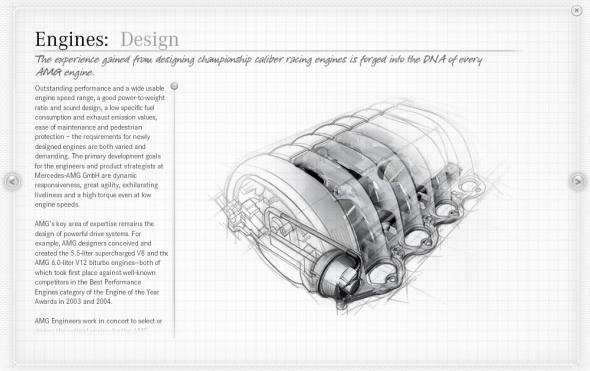
Mercedes-AMG’s Official Global Website is infused with a technical illustration aesthetic that underscores the company’s eighty-plus years of automotive design and innovation.
