Toyota Safety Ads

We all know that Toyota in the passed year has had many issues with the safety of their vehicles.  I came across the following advertisement (among others) that they now have playing to help get back consumer confidence in their vehicles.

httpvhd://www.youtube.com/watch?v=M3PBQEKc4w4

If you would like to see a full version of the advertisement, visit http://www.toyota.com/safety/videos/safety-features.html#

It’s great to see the use of technical illustrations in any media form and for large corporations as it brings exposure to our specialized art form.  BUT, does the use of the exploded views in this advertisement work?

I think not.  There are so many other ways that I could think of to utilize a tech illustration to show how Toyota has improved their vehicles to ensure safety.  Perhaps showing the specific mechanical technologies (ie. braking system) that have been improved and how they affect vehicle performance when stopping.

In the longer version of the ad they address the 5 accident avoidance technologies with an exploded view of each (ie. anti-lock brake system). Unfortunately, I find the use of the technical illustrations in this advertisement reflect a more “wallpaper” effect than being useful in supporting Toyota’s case for change in safety measures.

What do you think?  Do you have other ideas of how Toyota could win back consumer confidence by using technical illustrations?

Jameson Simpson

Illustrator Jameson Simpson creates colourful lineart illustrations for a broad range of magazines and advertising clients. When appropriate, he infuses humour into his instructional style which makes for a witty, more engaging image.

Jameson Simpson - Clover

Tell us a little about yourself. What’s your background?
I’m currently living in Grass Valley, California. I tend to move a lot. I’ve been here 2 years. I never technically studied Illustration but I did study fine art and both my parents were artists so I grew up with that. I painted professionally for a couple of years before transitioning to Illustration. I’ve been Illustrating for maybe 12 year now.

What’s your work situation? Do you have an agent or are you self-represented?
I’m a freelancer. I have no agent. I’ve considered it a couple times but it always ends up feeling like it’s going to be limiting.

Software of choice?
Adobe Illustrator

Jameson Simpson - Rigamorole

Favourite clients or types of project? Subject matter?
I like larger projects I can sink my teeth into. Agency projects tend to be more like that. Humor is very good also. Because of the nature of Infographics, things can get a bit dry at times. Anything with a bit of lightness and humor poking fun at the genre is good with me, especially when I’m given free reign to throw in a little of the bizarre.

Jameson Simpson - Rigamorole

Jameson Simpson - Rigamorole

Any advice for illustrators just starting out?
Advice? Hm. My experience was that putting together a really nice promo card or promotional package is a good start. Then just put yourself out and see what happens. I’ve seen in myself and others in the field that it can be an overwhelming task promoting oneself. In the end though, it’s preconceptions that make things complicated for us. Better to be a man or woman of action and just throw oneself into it (both the work and the promotion) and magic can happen. I always loved that quote by Goethe (which may or may not historically be his words, nevertheless):

“Until one is committed, there is hesitancy, the chance to draw back, always ineffectiveness concerning all acts of initiative and creation. There is one elementary truth, the ignorance of which kills countless ideas and splendid plans; that the moment one definitely commits oneself, then providence moves too. All sorts of things occur to help one that would never otherwise have occurred. A whole stream of events issues from the decision raising in one’s favor all manner of unforeseen events, meetings and material assistance which no one could have dreamed would have come their way. Whatever you can do or dream you can, begin it. Boldness has genius, power and magic in it. Begin it now!”

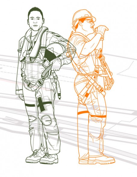
Jameson Simpson - Military

All images © Jameson Simpson. You can find his work at http://www.jamesonsimpson.com/

Kevin Hulsey

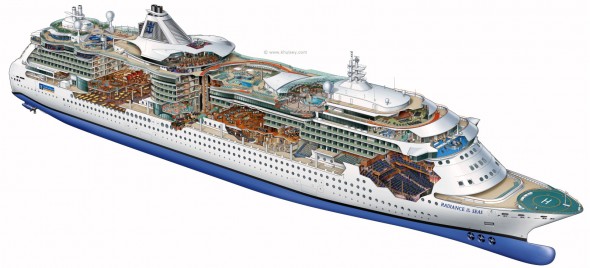
Kevin Hulsey - Radiance of the Seas Cutaway Illustration

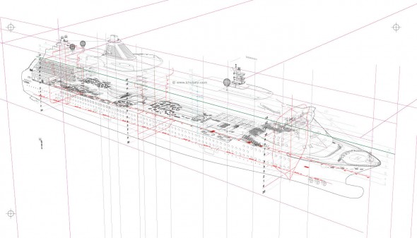
Kevin Hulsey - Radiance of the Sea Process

“Any subject-matter is no more, or less, complicated than any other if you break it into small enough sections. A big, complex object like a car, plane or ship is just 30 or 40 small illustrations that happen to occupy the same space.”

The career of technical illustrator extraordinaire Kevin Hulsey is nothing short of prolific. His client list reads like a roll call of the world’s major transportation, technology, manufacturing and entertainment companies. His work has been recognized with numerous awards from Belding, Best in the West, Communication Arts Magazine, and the Art Directors Club Of Los Angeles. He began his trade with an airbrush in hand, then traded it in for a Wacom tablet and made the leap to digital media. And his website is an abundant source of inspiration, with illustrations of mind-boggling complexity and accuracy and myriad resources, articles and tutorials.

This all keeps Mr. Hulsey rather busy—unfortunately for us too busy for an interview. However, with his permission, I’ve collected some links to images, resources, and an interview he did with another site:

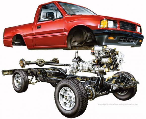
Kevin Hulsey - Pickup Truck Cutaway

Pickup Truck Cutaway – Copyright © 2010 Kevin Hulsey Illustration, Inc. All rights reserved.

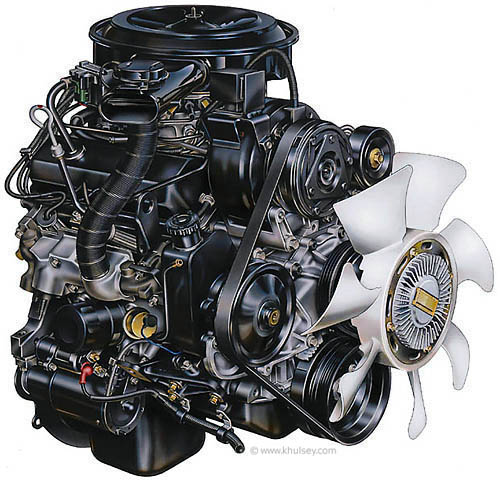
Kevin Hulsey - Automobile Motor Illustration

Motor Illustration – Copyright © 2010 Kevin Hulsey Illustration, Inc. All rights reserved.

“Even after nearly thirty years, and thousands of illustrations, it is still fun to see your work on a billboard or in a magazine, particularly when you aren’t expecting it.”

Big thanks to Mr. Hulsey for sharing his time and work with us, and all the amazing resources on his site!

Update: Wacom case-study on Mr. Hulsey. (now on Internet Archive)

All images copyright © 2010 Kevin Hulsey Illustration, Inc. All rights reserved.

Oil Spill Illustration Roundup

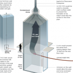
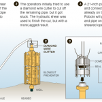
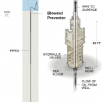
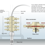
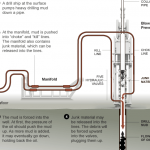
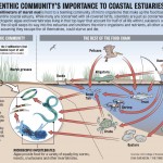
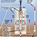
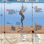
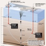
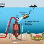
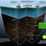
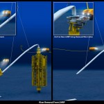
The biggest news story of the past two months is highly technical and happening beneath 5,000 feet of water. These obstacles make technical illustration the obvious medium for telling the story. Collected here are illustrations and graphics from various sources, showing their visual approach to communicating the information. (Mouseover for source, click for larger version)

The New York Times‘ illustrations are well designed and executed in a graphic style typical for newspapers. Black lines delineate the key information, both a visual strategy and a production consideration (black prints well on grainy paper in fast presses, since it’s a single plate). Deep-red lines and arrows call the eye’s attention to important details. Light colour tones provide additional information such as material, dimension/shading, or simply visual separation. A variety of views are used, elevations, isometrics, perspectives, whatever suits the content. Nice stuff here.

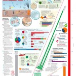
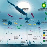
Infographic World‘s ambitious graphic attempts to tell the entire story, relying heavily on text, but ends up feeling cluttered, unfocused and disorganized. The individual illustrations feel underdeveloped.

NOLA/Times-Picayune‘s graphics are similar in style to The Times’, but with a much thicker line weight which makes me think they might have appeared smaller in print. The multitude of arrows really get in the way of the information. A bit heavy handed.

The Economist is a weekly news magazine, but the illustration doesn’t have much to show for the extra time (to be fair, there’s no telling what sort of turnaround time the illustrator was given).

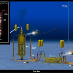
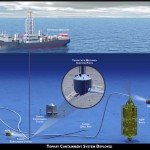
BP employs slick [no pun intended] 3D renderings to communicate the company’s repair efforts and give the impression of openness and transparency. I have two problems with this. First, they feel expensive. I imagine BP already had a 3D model library of all their equipment for planning and presentation purposes, so this may very well be the most cost-effective visual solution for them. But the impression these polished 3D renderings give is that they’re spending a lot on visuals, when they should be devoting all their resources to the repair and cleanup process.

Secondly, 3D renderings feel like constructed illusions rather than explanatory depictions of their efforts. Maybe it’s my bias towards illustration since both are just as artifical (ie. not photographs or videos), but I find The Times’ illustrations more trustworthy than BP’s 3D world.

Sources

The New York Times. “Methods That Have Been Tried to Stop the Leaking Oil”
Infographic World. “Crude Awakening”
NOLA.com. “Oil Spill Graphics”
The Economist. “Mudslinging”
Unified Command for the BP Oil Spill. “Graphics”
BP. “Gulf of Mexico Response”

Have you seen any additional illustrations of the Gulf of Mexico oil spill? Let us know in the comments!

Illustration Podcasts

Illustration Podcasts

Sometimes freelancing can be like solitary confinement. Big projects, tight deadlines, (and if you’re in the Pacific Northwest, terrible weather) can all keep you locked up in the home studio. To ward off cabin fever I like to listen to a small selection of podcasts, some illustration-related, some business-related and others general interest to stay current with the rest of the world.

Sadly, I haven’t found a technical illustration podcast, but here’s my playlist:

Illustration Related:

Escape From Illustration Island: The Podcast
In-depth interviews with illustrators, artists’ representatives and art directors. Companion to Escape From Illustration Island, a resource portal and illustration community.

Big Illustration Party Time
A conversational podcast about the ins and outs of freelance illustration and cartooning.

Hawk and Squirrel
A brand new podcast searching for its voice. As manic and entertaining as its hosts (and friends of mine), Chad Covino, Juan Solon and Nimit Malavia.

Freelance and Business Related:

Freelance Radio
Official podcast of FreelanceSwitch.com covering work and life issues of freelancers.

General Interest:

The Monocle Weekly
A mix of discussions, interviews and field reports on world events and culture.

Stuff You Should Know
Official podcast of HowStuffWorks.com, explains how everyday things and not-so-everyday things work.

Have any podcasts to recommend, illustration-related or otherwise? Let us know in the comments!

Home Appliance Energy Use – Infographics

GE: Home Appliance Energy Use

GE: Home Appliance Energy Use

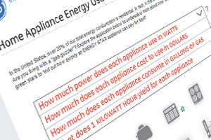
General Electric has posted an interesting infographic that illustrates how much energy certain home appliances use. Leafing through the interactive site yields all sorts of information that the typical consumer may be unaware of.

It’s a good example of an infographic that cleanly communicates a complex and obscure issue – in fact, it’s so simple that I found myself mystified as to why I hadn’t seen something like it sooner. Enigmatic concepts like kilowatt hours can be hard to describe, but putting them into a real world context can firmly solidify their meaning in the audience’s mind.

What might be the most interesting bit of information is that a coffee maker requires roughly an equal amount of energy as a new washing machine…

You can check it out on GE’s site here.

Making the plunge

I’m talking about going from a full time corporate job to going full time freelance.

I want to hear your stories. How did you do it and what were the circumstances?
Were all your ducks lined up perfectly or did you just get to a point where there was so much freelance work coming in that you just went for it? Or did you just say the hell with it and jump in the deep end to see what would happen?  Did you like the job you were in previously, hate it or were you just tired of working for someone else?

If you’ve been doing it for a while how is it going for you? Do you ever miss the corporate 9-5?

Are you making more money now? Are you working less or more?

What do you like and dislike about freelancing full time?

What do you do if you like your full time job but are getting so much work freelancing that you have to turn it down?

Spread some inspiration on those of us working the 9-5. Seriously, we’ve got some of the most talented illustrators on the planet on this site, share some wisdom people.

Thanks!

Making of a Transparent Car

httpvhd://www.youtube.com/watch?v=W3HM1bQzubw

Some Friday morning inspiration. Interesting to see behind-the-scenes and hear about the process and concept.

[Doobybrain via Gizmodo]

Flight’s Aircraft Cutaway Archives

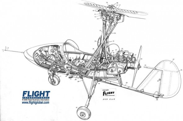
Autogyro Cutaway

Wallis Autogyro Cutaway

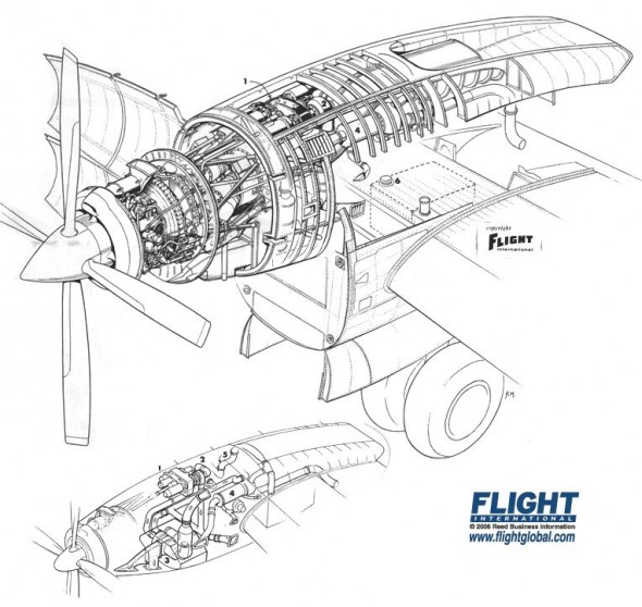
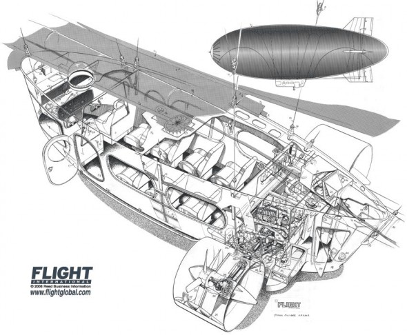
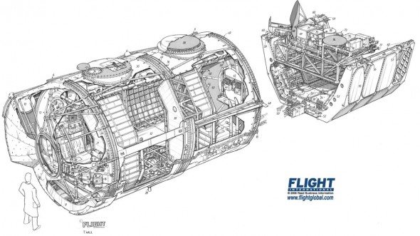
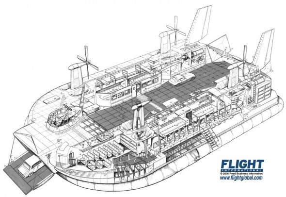
Flightglobal has scanned, digitized and made available every issue of Flight Magazine published between 1909 and 2005 – that’s 100 years of aviation history! Most notably, they have a section of the archives devoted to cutaways, where these images were found.

Some are full-color but most are linear, with exceptional control over line density and overall image balance—keep in mind that these were most likely done traditionally on vellum or illustration board with a technical pen!

Nacelle Cutaway

Rolls Royce Dart Convair Conversion Cutaway

Bell XV 15 Cutaway

Bell XV 15 Cutaway

Airbus Airship Cutaway

Airbus AD300 Airship Cutaway

Spacelab Cutaway

Spacelab Cutaway

Westland Hovercraft Cutaway

Westland Hovercraft Cutaway

Flightglobal’s Cutaway Illustration Archive

Auto Show Eyecandy

Most people go to auto shows to see the latest bunch of cars they’ll never be able to afford. I go for things like this:

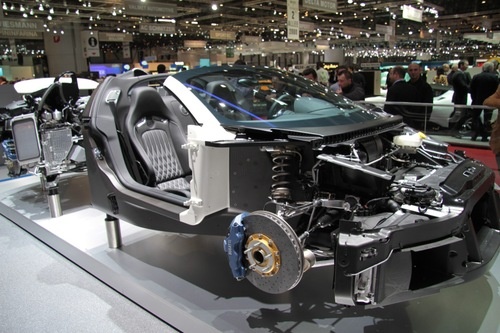
Bugatti Veyron - Máté Petrány

Bugatti Veyron - Máté Petrány

That’s a Bugatti Veyron stripped of it’s panels, and displayed in all it’s glory.

To me, displays like this are the best part of auto shows: the exploded and animated engine, the gutted drive train, the new Mustang that’s been cut in half  so that you can walk between it.  Seeing into everyday objects and learning how they work has always fascinated me.

I’ve also found that auto shows are a great opportunity for photo reference. Not only may you find a gem like this, but you can also observe all the various textures on the car under ideal lighting conditions.

You can see the rest of the pictures over at Jalopnik, here.