Vic Kulihin

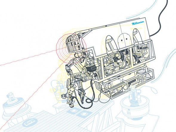
Vic Kulihin - Space Shuttle

The vector illustrations of Vic Kulihin are fresh, bold and contemporary. So you might be surprised to learn that his freelance career began in 1988. Vic was kind enough to answer a few questions about how the industry has changed in that time and give a few tips on having a long and successful career.

What’s your background? How did you find your way into illustration?

I started out as an engineering major at Rutgers University, but graduated with a degree in art education (long story). After college I worked as a paste-up artist for a small ad agency, which folded not long after I started. I then found a position as a technical illustrator for Bell Laboratories. This was back in the day when we used airbrushes, technical pens, straight edges, French curves and typesetting machines. During my stint there these tools were gradually replaced with Macintosh II desktop computers using Adobe Illustrator 88 software.

After a decade I left Bell Labs to start my own freelance business. The timing was right. I was able to combine my work with being a stay-at-home dad for my baby daughter. At that time I focused on colored pencil illustration, but eventually gravitated back to the Mac and vector art.

Earlier in my career I took classes at Parsons, the School of Visual Arts and the Art Students League of New York to make up for my lack of formal art training. I still take classes periodically, but the beauty of it nowadays is that they are readily available online.

Vic Kulihin - Shelves

What is your favorite subject matter or type of project?

Although I’ve had the opportunity to draw a great variety of things, I think my favorite subject matter has always involved mechanical devices…tools, machinery, that kind of thing. I enjoy creating assembly instructions, exploded diagrams, cutaways, schematic drawings (I think I’ve always been an engineer at heart).

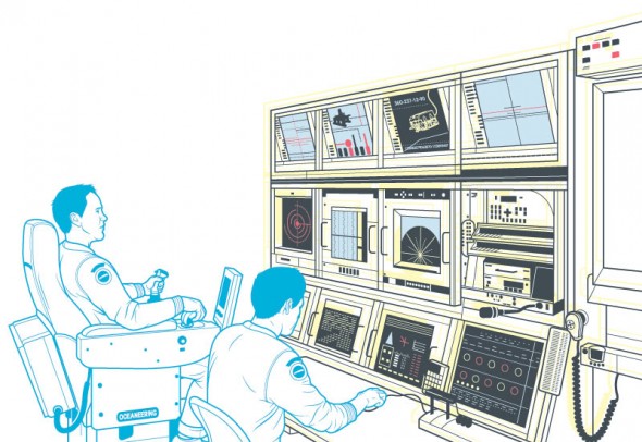
Vic Kulihin - Electronics

What’s your process for a typical project?

I start with a thorough discussion of the project with the client: project specs, style, number of iterations of sketches/final art, timeframe, budget, etc. When the project involves a product I ask the client to supply me with reference photographs and, whenever practical, the actual product itself. For projects involving people I will often photograph live models and/or use software like Poser or DAZ.

I currently work on a Mac Pro with a 30” Apple Cinema Display; I also have a Wacom Intuos3 tablet that I use infrequently (oddly enough I feel most comfortable wielding a mouse). Software of choice is Adobe Illustrator.

Tools like Skype and GoToMeeting have allowed me to work closely and “in person” with clients globally, something I never would have envisioned when I first started out.

You market your services in a number of illustration directories. What has been your experience with that?

I find that of all the portfolio sites I use the majority of my work comes from three directories (theispot, Directory of Illustration, Workbook) and the assignments from these have covered the gamut of illustration. The income that results from these projects generally justifies the expenditure for these sites. I also periodically do a direct mailing campaign. Recently I’ve expanded my online visibility and interactions through social media such as Behance, Twitter, Facebook and LinkedIn.

Vic Kulihin - Dirt Devil

You’ve been illustrating for 27 years, what do you think makes for a long and successful career?

The biggest challenge has been dealing with the “feast or famine” syndrome…drumming up business when things are slow, or trying to deal with the onslaught when things get very busy.

As for the future?… For some years it seemed like photographs and video were “where it’s at”. But I’ve noticed more recently a big increase in the use of illustration across media.

That’s great news for the likes of us!

Chris Philpot

Open any magazine on the newsstand and inside you’ll likely find an illustration by Chris Philpot. He creates humorous how-tos, conceptual illustrations, infographics and animations for some of the biggest and best, including TimeWired, Popular Science, Outside and Men’s Health .

I got in touch with Chris to ask him a few questions about his work, how he got his start in illustration, and what the future may hold.

Chris Philpot - City of the Future

What’s your background? How did you find your way into illustration?

I wanted to be an illustrator in high school but read articles from practicing illustrators predicting the demise of the profession. I decided I should get a degree in design to ensure a more stable income. That lead me to a job as an editorial art director for about 12 years. While I grew to enjoy design, I still really wanted to illustrate so I started freelancing on the side. Five years of moonlighting gave me enough of a base to make the switch. It was a scary transition, but my wife was incredibly supportive. I’ve been illustrating full time for the last six years. It’s been great. I make more money, have more autonomy and am much more fulfilled creatively.

Chris Philpot - Visual Quiz for Esquire

What are your favorite subjects or types of project?

A technical approach is surprisingly versatile. You can add a subtle joke to dry stories. You can take irreverent or taboo stories and make them presentable to polite society. You can take a really funny story and the art can play the role of the straight man. I read a lot of Gary Larson cartoons growing up and would turn every job into a one-panel Far Side cartoon if I could. My favorite types of projects involve subjects that are fun to draw like monsters, robots and octopuses.

Chris Philpot - Oculus Rift for TIME

Your style is really consistent, how important is that? How did you develop your aesthetic?

The consistency comes from a few places. Mostly, I need to produce a lot of work to meet my income requirements each month so the volume dictates a certain formula. I try to improve with each job. If a new technique works, I add it to the list of best practices. I’ve also found that art directors are coming to me for the work they see in my portfolio. If I send something too different they often direct me back to the look and feel of my portfolio (I still send in variations if I think they’re better.) I also use a lot of 3-D models for reference. That definitely adds to the consistency, especially in the proportions of people. I’m pretty lanky so using myself as reference wasn’t working out.

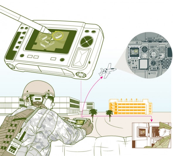
Chris Philpot - Humvee

What’s your process for a typical assignment? What hardware and software do you use?

I take the brief from the client and request any missing information like story details, budget and schedule. I try to get as close as possible to a final draft by the sketch deadline. It puts the art directors and editors at ease and I think everyone is more inclined to approve things. Revisions hurt profits and the end of the time line breeds a revise-happy anxiety. This is sometimes unavoidable of course.

Regarding software, I use a lot of inexpensive models from Daz3d and Turbosquid for reference when I can and trace the renderings out of Poser or Blender with Illustrator. For hardware, I buy a top-of-the-line iMac every 4 years and use a Wacom intuos4. The tablet was the single best addition to my work flow. I’m not sure how I ever drew with a mouse.

Animation started in Flash but is now done exclusively with After Effects.

What challenges have you faced in your career? What opportunities do you see for the future?

Transitioning from a full-time job to full-time freelancer was a challenge. I worked a lot before going to the office, during lunch breaks and after I got home. Now my biggest issue is working from home with three kids. I love being available for them and I need to be productive so it’s a balancing act sometimes.

There are always opportunities for illustrators to pitch or generate their own content. When the iPad came out, everyone in the editorial world started experimenting with video for the app version of their magazines. I’ve always toyed with motion so it was a good opportunity to try something. The business etiquette series for Entrepreneur magazine (written by Esquire Articles Editor Ross McCammon) was supposed to be a simple illustration with some movement. I asked if I could take on the larger sidebar and to their credit they let me try. Once the longer video was approved they agreed to a fee I proposed. I asked a friend and former coworker Tyrrell Cummings if he would help me with the storyboards. It came together nicely and we’ve done a one-to-two minute short video each month for the last three years.

Chris Philpot - Speed Data for Car and Driver

You’ve worked with some of the biggest and best clients. Any tips for illustrators starting out?

It was uncomfortable at first, but I put myself out there with an online portfolio and 4 x 6 postcards. I was turned down by representatives so I had to go it alone. The initial images were primitive. I did jobs for friends and for the in-flight magazine I worked for at the time. That gave me enough of a portfolio on which to build.

If you’re starting out, just keep producing the work you’re excited about and make it visible. Keep updating it. The days add up, and if you stay active you’ll get somewhere. I didn’t enjoy instant gratification but I did get eventual gratification.


Chris’ work can be found at ChrisPhilpot.com

Martin Woodward

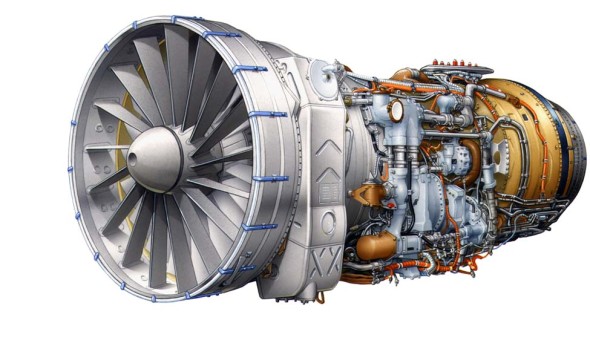
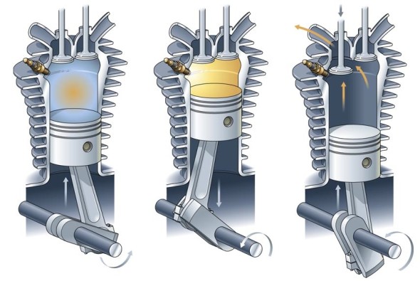
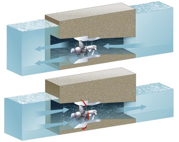
Martin Woodward - Jet Engine Martin Woodward - Engine Martin Woodward - Water Turbine

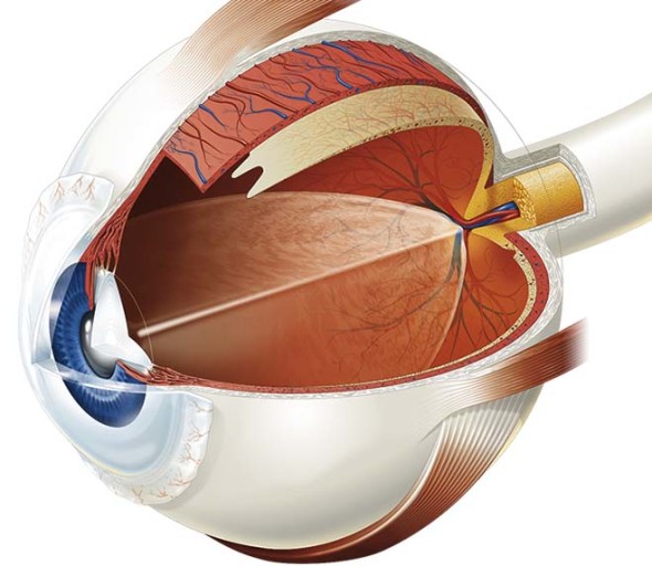
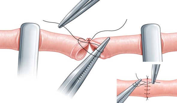
Martin Woodward - Eye Martin Woodward - Vein Repair

Martin Woodward, also known as  tecmedi, is a British technical & medical illustrator. He has been producing illustrations for publishing, manufacturing & advertising clients for over 20 years. His portfolio features a broad range of subjects as well as tutorials and a quite sensible style & pricing guide.

Richard Chasemore

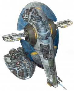
Jango Fett

Traditionally painted cross-section of a space ship from Star Wars Episode II

There are many unique forms of technical illustration out there.  Some illustrators from time to time get to expand the realm of technical illustration by depicting not only what exists in our real world and what makes it work, but get the opportunity to reveal the inner workings of fictional vehicles and worlds.

Richard Chasemore has worked for various clients throughout the years producing detailed work and is well known for his works featured in DK publishing and Lucas Books’ Star Wars: Complete Cross Sections and Star Wars: Complete Locations.  I recently had the opportunity to ask him a few questions:

What is your background? What inspired/got you into the field of technical illustration?

I did a four year course in technical illustration at Bournemouth and Poole College of Art and Design.  I came across the course quite by accident when I jumped on a school bus that took me to the Art College and when I saw the technical illustration department I just said to myself that’s what I want to do.

How did you start working for DK publishing? What were some of the projects that you did for them?

I was working on the See Inside series of books for DK when Hans started work on the Star Wars Project and I was brought in to help out.

What led you to produce the Star Wars Complete Locations and Complete Cross Sections books as well as  later works for Indiana Jones?  What was it like working for Lucas?

The locations books were incredibly hard work, but great fun as was the Indiana Jones arts.  Everyone at Lucas Films were amazingly kind to us, letting Hans and I work in the art department alongside their amazing artists.  We did meet Mr. Lucas and he was a really nice guy.

What is your process like?

Starting with very simple pencil works, building up to a complicated finished pencil which is then inked and painted in gouache.

What was your favorite thing you’ve worked on or best experience you’ve had so far as a technical illustrator?

I am working on Incredible Cross Sections Clone Wars at the moment which is all done in 3D and is looking amazing.

Any advice to technical illustrators just starting out?

Just keep working, day and night!

Richard’s work can be found at RichardChasemore.co.uk

Harry Campbell’s Technical Inspirations

© Harry Campbell

© Harry Campbell

The work of award winning editorial illustrator Harry Campbell is infused with a technical illustration aesthetic. A nod to the highly complex and industrialized world we live in, he makes use of bold structural lineart, axonometric drawing systems, parts explosions, and cutaways to communicate ideas.

For his latest work for The Wall Street Journal, he shares a bit about his process and inspiration:

[…] Just in case anybody is wondering about whether my mechanical objects are traced or taken from other drawings. Generally not, I just start drawing. I do look at reference like vaccum tubes, things like that. During this project I was thinking I need to start gathering a bin of junk to pull from. I do love exploded views of ordinary objects. Here’s one of my favorites.

Harry Campbell's Inspiration

Harry Campbell's Inspiration

See more of Mr. Campbell’s work on Drawger or his rep, Gerald & Cullen Rapp.

Jameson Simpson

Illustrator Jameson Simpson creates colourful lineart illustrations for a broad range of magazines and advertising clients. When appropriate, he infuses humour into his instructional style which makes for a witty, more engaging image.

Jameson Simpson - Clover

Tell us a little about yourself. What’s your background?
I’m currently living in Grass Valley, California. I tend to move a lot. I’ve been here 2 years. I never technically studied Illustration but I did study fine art and both my parents were artists so I grew up with that. I painted professionally for a couple of years before transitioning to Illustration. I’ve been Illustrating for maybe 12 year now.

What’s your work situation? Do you have an agent or are you self-represented?
I’m a freelancer. I have no agent. I’ve considered it a couple times but it always ends up feeling like it’s going to be limiting.

Software of choice?
Adobe Illustrator

Jameson Simpson - Rigamorole

Favourite clients or types of project? Subject matter?
I like larger projects I can sink my teeth into. Agency projects tend to be more like that. Humor is very good also. Because of the nature of Infographics, things can get a bit dry at times. Anything with a bit of lightness and humor poking fun at the genre is good with me, especially when I’m given free reign to throw in a little of the bizarre.

Jameson Simpson - Rigamorole

Jameson Simpson - Rigamorole

Any advice for illustrators just starting out?
Advice? Hm. My experience was that putting together a really nice promo card or promotional package is a good start. Then just put yourself out and see what happens. I’ve seen in myself and others in the field that it can be an overwhelming task promoting oneself. In the end though, it’s preconceptions that make things complicated for us. Better to be a man or woman of action and just throw oneself into it (both the work and the promotion) and magic can happen. I always loved that quote by Goethe (which may or may not historically be his words, nevertheless):

“Until one is committed, there is hesitancy, the chance to draw back, always ineffectiveness concerning all acts of initiative and creation. There is one elementary truth, the ignorance of which kills countless ideas and splendid plans; that the moment one definitely commits oneself, then providence moves too. All sorts of things occur to help one that would never otherwise have occurred. A whole stream of events issues from the decision raising in one’s favor all manner of unforeseen events, meetings and material assistance which no one could have dreamed would have come their way. Whatever you can do or dream you can, begin it. Boldness has genius, power and magic in it. Begin it now!”

Jameson Simpson - Military

All images © Jameson Simpson. You can find his work at http://www.jamesonsimpson.com/

Critique Request!

Steven Howards writes in….

This is my portfolio link, http://www.swhowardillustration.blogspot.com

I’ve been studying illustration at the Academy of Art University in San Francisco and have only recently developed a desire to pursue technical illustration. I know there is much that I need to do and work on, but any comments, critiques, and help is very much appreciated!

Here’s my critique, you do very nice work, keep drawing your butt off. If a chump like me can make it as a Technical Illustrator you surely can. One suggestion, get yourself a real website with a quality domain name, not that blogspot business. If you want to go the free route here are some suggestions.

Thanks for sending that in.

Any advice for Steven?


Kevin Hulsey

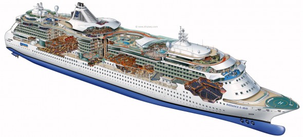
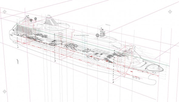
Kevin Hulsey - Radiance of the Seas Cutaway Illustration

Kevin Hulsey - Radiance of the Sea Process

“Any subject-matter is no more, or less, complicated than any other if you break it into small enough sections. A big, complex object like a car, plane or ship is just 30 or 40 small illustrations that happen to occupy the same space.”

The career of technical illustrator extraordinaire Kevin Hulsey is nothing short of prolific. His client list reads like a roll call of the world’s major transportation, technology, manufacturing and entertainment companies. His work has been recognized with numerous awards from Belding, Best in the West, Communication Arts Magazine, and the Art Directors Club Of Los Angeles. He began his trade with an airbrush in hand, then traded it in for a Wacom tablet and made the leap to digital media. And his website is an abundant source of inspiration, with illustrations of mind-boggling complexity and accuracy and myriad resources, articles and tutorials.

This all keeps Mr. Hulsey rather busy—unfortunately for us too busy for an interview. However, with his permission, I’ve collected some links to images, resources, and an interview he did with another site:

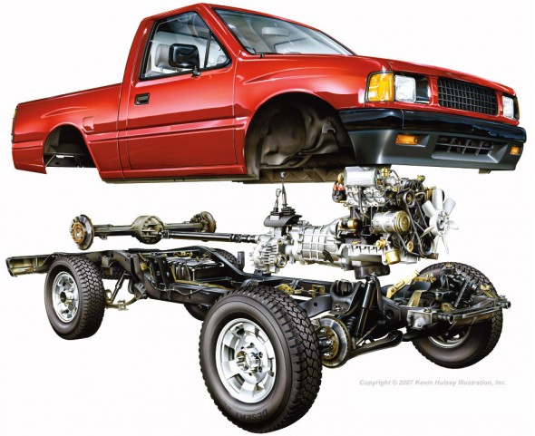
Kevin Hulsey - Pickup Truck Cutaway

Pickup Truck Cutaway – Copyright © 2010 Kevin Hulsey Illustration, Inc. All rights reserved.

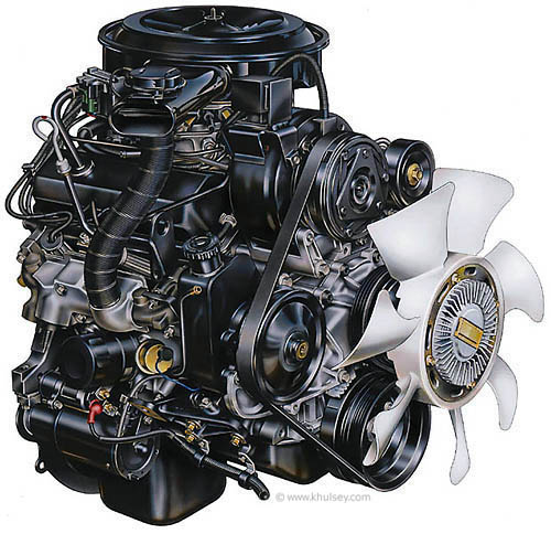
Kevin Hulsey - Automobile Motor Illustration

Motor Illustration – Copyright © 2010 Kevin Hulsey Illustration, Inc. All rights reserved.

“Even after nearly thirty years, and thousands of illustrations, it is still fun to see your work on a billboard or in a magazine, particularly when you aren’t expecting it.”

Big thanks to Mr. Hulsey for sharing his time and work with us, and all the amazing resources on his site!

Update: Wacom case-study on Mr. Hulsey. (now on Internet Archive)

All images copyright © 2010 Kevin Hulsey Illustration, Inc. All rights reserved.

Bill Fehr

Bill Fehr - Equipment Cabinet

Bill Fehr is a technical illustration veteran, with 20 years experience in the field. In this interview, we discuss the technical skills, the ongoing learning of new software and technologies, and the exploration of new business models necessary for a sustainable career in illustration.

What is your background? How did you get into technical illustration?
I have worked and lived in St. Louis my whole life. I graduated in 1982 with an Associate in Applied Science degree in Technical Illustration from Meramec Community College here in St. Louis. I later went back and got my Bachelors in Business Management.

Since I was in High School I knew that I wanted to become a technical illustrator. That idea came to me when I was in drafting class and in the text book we were using was a description of what a technical illustrator does. It was accompanied by a photo of a guy using an airbrush to create a concept rendering of a car. That was it for me.

I was lucky enough to land a job as a technical illustrator before I graduated with my illustration degree. This was in the 80’s mind you so there were no computers. Everything was hand drawn. I was lucky enough back then to work for a small company where I had to learned to wear many hats. It was there that I learned to spec type, create photostats, airbrush, knockout backgrounds in photos, take photos, and paste up documents by hand.

In the eighties we didn’t have the advantages we have today of tracing digital photos or importing CAD data. Illustrations were created by extracting dimensions from blue prints or measuring actual parts. We would draw out the illustration in pencil first on a sheet of velum. We would then lay over that a sheet of mylar and “ink” the illustration using technical pens and templates. Inking was an art all by itself and one that I still miss to this day.

I have seen many changes over the 20-plus years that I have been doing this. The one thing that has never changed is the need for visual communication. The only difference between then and now is how it is created and how it is delivered.

How do you work? Employed, freelance or somewhere in between?
Currently I am employed by American Power Conversion as a technical writing manager. Our department creates installation, operation, maintenance, and service documents, just to name a few.  In the evenings and weekend creating stock illustrations and photographs. I do very little freelance work. It requires much more time than I am willing to give these days.

What’s your favorite kind of project?
I still find black and white line art to be the most fun. Though at first it seems like it would be the easiest I find the opposite can to be true. You don’t have color, transparency, or animation to get you out of tough situations. All that you have to use to communicate is a black line. What you do with that line, now that is what makes all the difference.  To me it’s very Zen-like.

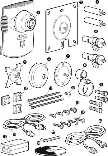
Bill Fehr - Parts Identification

Any advice for technical illustrators just starting out?
Experience with software is secondary to technical knowledge. Anyone can learn software. The ones that can get themselves out of tough situations without using software in as a crutch are the ones that I respect the most. That’s not to say the you don’t need to know how to use Illustrator, or CorelDRAW, or whatever. In fact, the better you know the software the better you can illustrate because the software is not “getting in your way.” I’m just saying that you shouldn’t rely on the software to replace technical knowledge. There were many times where I had to rely on my technical training to get me through projects that had no reference photos or CAD data. All I had was a rough prototype and some napkin sketches.

Bill Fehr - Syringe

What is your software of choice?
Everyone has their favorite software. This is usually the software that they have used the most and are most familiar with. For many years I have used CorelDRAW exclusively.  Once I started getting into stock illustration however I started to migrate over to Adobe Illustrator because stock agencies require an Illustrator version 8 compatible EPS file. It was much easier to make the transition to AI than it was to go through the process of exporting Draw files over to Illustrator, make correction, then export to EPS. I also moved to an iMac recently so that drove my decision to move Illustrator as well.

I have used a few vector illustrations packages over the years, CorelDRAW, Corel Designer, Xara Xtreme, IsoDraw, Deneba Canvas, and Adobe Illustrator. I also have used Solid Edge, SoldWorks, AutoCad, Maya, 3D Studio Max, and Blender for 3D modeling and rendering work.

Most of my experience has been with CorelDRAW. It has, I believe, one of the best toolsets for technical black and white line art. It allows you to draw with much more precision and at a higher rate of speed than other programs. I have also created a custom technical illustration toolbar that I use within DRAW which helps me get through an illustration pretty fast.  I also like that the overall file size is small. CorelDRAW is great for those just starting out because it is inexpensive.

The downside to CorelDRAW is that it is a bit buggy and will crash at the drop of a hat. I have learned to save versions of the file that I am working on just in case of such a crash. CorelDRAW does create backup files and crash recovery files but they are not always usable.

Bill Fehr - Padlock

You sell stock illustration via iStockPhoto, Shutterstock and Dreamstime. What has your experience been with this?
I love the microstock business. It’s kind of the best of both worlds. On one hand I can create what I want when I want and still get paid. Of course the more your work aligns with the needs of the customers the more money you will make.

The stock photography and illustration business can be tough to define. What is going on is your trying to guess what somebody might need. You want to create images that can be incorporated into design pieces, film, advertising, mailers, etc. You can try to communicate concepts or ideas like space travel or a health care. It can be fun and challenging.

I think creating stock images fits my personality and lifestyle better than doing freelance work. I am under no pressure and I can work whenever I want. I have done my share of freelance and I don’t care for having to find the jobs during the day then working evenings, weekends and holidays to get it done.

Bill’s technical illustration work can be found at TekART Technical Illustration, and his fine art and photography at BillFehr.com.