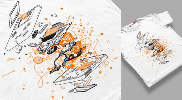
Linch Pin Droid by Kevin Tong
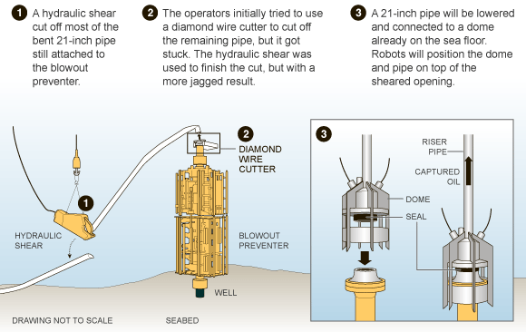
Illustrator Kevin Tong created this great exploded R2-D2 poster for an ongoing Star Wars Art Print series by Mondo Tees. He did a thorough post on his creative process and even made a time-lapse video showing his technique:
httpvhd://www.youtube.com/watch?v=Ta5TBGzqijk&feature=player_embedded
Linch Pin Droid goes on sale Friday.