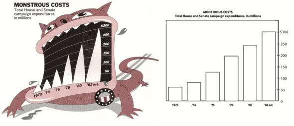
Snap decision: Which chart is better?
The chart on the right is traditionally thought of as better: clearer, less distracting, more honest and true to the data. However, recent research suggests the chart on the left better communicates the topic, the categories and values, and the overall trend of the data—and is more easily recalled:
Guidelines for designing information charts often state that the presentation should reduce chart junk – visual embellishments that are not essential to understanding the data. In contrast, some popular chart designers wrap the presented data in detailed and elaborate imagery, raising the questions of whether this imagery is really as detrimental to understanding as has been proposed, and whether the visual embellishment may have other benefits. To investigate these issues, we conducted an experiment that compared embellished charts with plain ones, and measured both interpretation accuracy and long-term recall. We found that people’s accuracy in describing the embellished charts was no worse than for plain charts, and that their recall after a two-to-three-week gap was significantly better.
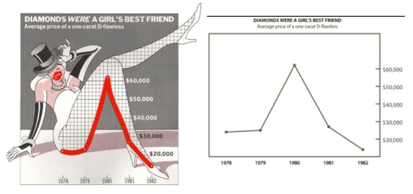
This research challenges popular assumptions among data visualization purists. But it also presents opportunities for us. Technical illustration is all about synthesizing information, facts, data with imagery to give context. This research is evidence that this synthesis is more effective, more appealing and more memorable than data alone.
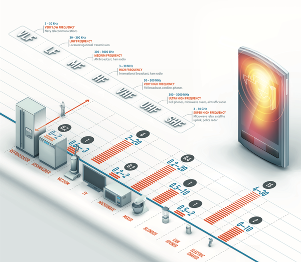
Radiation Infographic by Davvi from our Flickr Pool
Full report: Useful Junk? [via Information Aesthetics, Eager Eyes]
wow, that radiation info graphic is killer. Top notch!