Jameson Simpson

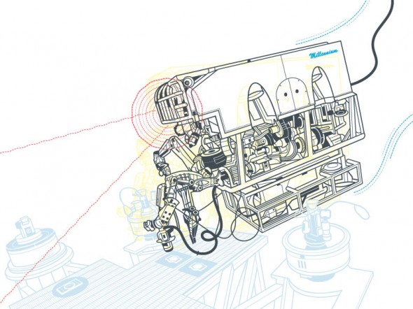
Illustrator Jameson Simpson creates colourful lineart illustrations for a broad range of magazines and advertising clients. When appropriate, he infuses humour into his instructional style which makes for a witty, more engaging image.

Jameson Simpson - Clover

Tell us a little about yourself. What’s your background?
I’m currently living in Grass Valley, California. I tend to move a lot. I’ve been here 2 years. I never technically studied Illustration but I did study fine art and both my parents were artists so I grew up with that. I painted professionally for a couple of years before transitioning to Illustration. I’ve been Illustrating for maybe 12 year now.

What’s your work situation? Do you have an agent or are you self-represented?
I’m a freelancer. I have no agent. I’ve considered it a couple times but it always ends up feeling like it’s going to be limiting.

Software of choice?
Adobe Illustrator

Jameson Simpson - Rigamorole

Favourite clients or types of project? Subject matter?
I like larger projects I can sink my teeth into. Agency projects tend to be more like that. Humor is very good also. Because of the nature of Infographics, things can get a bit dry at times. Anything with a bit of lightness and humor poking fun at the genre is good with me, especially when I’m given free reign to throw in a little of the bizarre.

Jameson Simpson - Rigamorole

Jameson Simpson - Rigamorole

Any advice for illustrators just starting out?
Advice? Hm. My experience was that putting together a really nice promo card or promotional package is a good start. Then just put yourself out and see what happens. I’ve seen in myself and others in the field that it can be an overwhelming task promoting oneself. In the end though, it’s preconceptions that make things complicated for us. Better to be a man or woman of action and just throw oneself into it (both the work and the promotion) and magic can happen. I always loved that quote by Goethe (which may or may not historically be his words, nevertheless):

“Until one is committed, there is hesitancy, the chance to draw back, always ineffectiveness concerning all acts of initiative and creation. There is one elementary truth, the ignorance of which kills countless ideas and splendid plans; that the moment one definitely commits oneself, then providence moves too. All sorts of things occur to help one that would never otherwise have occurred. A whole stream of events issues from the decision raising in one’s favor all manner of unforeseen events, meetings and material assistance which no one could have dreamed would have come their way. Whatever you can do or dream you can, begin it. Boldness has genius, power and magic in it. Begin it now!”

Jameson Simpson - Military

All images © Jameson Simpson. You can find his work at http://www.jamesonsimpson.com/

Oil Spill Illustration Roundup

The biggest news story of the past two months is highly technical and happening beneath 5,000 feet of water. These obstacles make technical illustration the obvious medium for telling the story. Collected here are illustrations and graphics from various sources, showing their visual approach to communicating the information. (Mouseover for source, click for larger version)

The New York Times‘ illustrations are well designed and executed in a graphic style typical for newspapers. Black lines delineate the key information, both a visual strategy and a production consideration (black prints well on grainy paper in fast presses, since it’s a single plate). Deep-red lines and arrows call the eye’s attention to important details. Light colour tones provide additional information such as material, dimension/shading, or simply visual separation. A variety of views are used, elevations, isometrics, perspectives, whatever suits the content. Nice stuff here.

Infographic World‘s ambitious graphic attempts to tell the entire story, relying heavily on text, but ends up feeling cluttered, unfocused and disorganized. The individual illustrations feel underdeveloped.

NOLA/Times-Picayune‘s graphics are similar in style to The Times’, but with a much thicker line weight which makes me think they might have appeared smaller in print. The multitude of arrows really get in the way of the information. A bit heavy handed.

The Economist is a weekly news magazine, but the illustration doesn’t have much to show for the extra time (to be fair, there’s no telling what sort of turnaround time the illustrator was given).

BP employs slick [no pun intended] 3D renderings to communicate the company’s repair efforts and give the impression of openness and transparency. I have two problems with this. First, they feel expensive. I imagine BP already had a 3D model library of all their equipment for planning and presentation purposes, so this may very well be the most cost-effective visual solution for them. But the impression these polished 3D renderings give is that they’re spending a lot on visuals, when they should be devoting all their resources to the repair and cleanup process.

Secondly, 3D renderings feel like constructed illusions rather than explanatory depictions of their efforts. Maybe it’s my bias towards illustration since both are just as artifical (ie. not photographs or videos), but I find The Times’ illustrations more trustworthy than BP’s 3D world.

Sources

The New York Times. “Methods That Have Been Tried to Stop the Leaking Oil”
Infographic World. “Crude Awakening”
NOLA.com. “Oil Spill Graphics”
The Economist. “Mudslinging”
Unified Command for the BP Oil Spill. “Graphics”
BP. “Gulf of Mexico Response”

Have you seen any additional illustrations of the Gulf of Mexico oil spill? Let us know in the comments!

Illustration Podcasts

Illustration Podcasts

Sometimes freelancing can be like solitary confinement. Big projects, tight deadlines, (and if you’re in the Pacific Northwest, terrible weather) can all keep you locked up in the home studio. To ward off cabin fever I like to listen to a small selection of podcasts, some illustration-related, some business-related and others general interest to stay current with the rest of the world.

Sadly, I haven’t found a technical illustration podcast, but here’s my playlist:

Illustration Related:

Escape From Illustration Island: The Podcast
In-depth interviews with illustrators, artists’ representatives and art directors. Companion to Escape From Illustration Island, a resource portal and illustration community.

Big Illustration Party Time
A conversational podcast about the ins and outs of freelance illustration and cartooning.

Hawk and Squirrel
A brand new podcast searching for its voice. As manic and entertaining as its hosts (and friends of mine), Chad Covino, Juan Solon and Nimit Malavia.

Freelance and Business Related:

Freelance Radio
Official podcast of FreelanceSwitch.com covering work and life issues of freelancers.

General Interest:

The Monocle Weekly
A mix of discussions, interviews and field reports on world events and culture.

Stuff You Should Know
Official podcast of HowStuffWorks.com, explains how everyday things and not-so-everyday things work.

Have any podcasts to recommend, illustration-related or otherwise? Let us know in the comments!

The Future of Technical Illustration

Wired Magazine on iPad

For those of us who work with publishers of magazines, newspapers and books, the past few years have been trepidatious. The future of the printed page looks uncertain. There’s much speculation that this business model or that device will save the industry. And as much as we techies may fall in love with each new gadget, they have been looked at as a threat, or at least an unknown variable in our careers.

But through all this, I’ve taken comfort in two facts. First, that we live in a visual society. For this reason, the pixel pushers, the vector tweakers, the pen sketchers, and more importantly the visual thinkers will always be in demand. Secondly, the environment around us grows more complex every day. We specialize in distilling complexity into more comprehensive, communicative forms.

I feel our skillset will remain relevant and in demand, but it is crucial to stay informed about prevailing technologies and mediums, and to constantly update our workflows to be able to deliver our product in whatever packaging consumers demand.

Threats or opportunities? What are your thoughts?

Bill Fehr

Bill Fehr - Equipment Cabinet

Bill Fehr is a technical illustration veteran, with 20 years experience in the field. In this interview, we discuss the technical skills, the ongoing learning of new software and technologies, and the exploration of new business models necessary for a sustainable career in illustration.

What is your background? How did you get into technical illustration?
I have worked and lived in St. Louis my whole life. I graduated in 1982 with an Associate in Applied Science degree in Technical Illustration from Meramec Community College here in St. Louis. I later went back and got my Bachelors in Business Management.

Since I was in High School I knew that I wanted to become a technical illustrator. That idea came to me when I was in drafting class and in the text book we were using was a description of what a technical illustrator does. It was accompanied by a photo of a guy using an airbrush to create a concept rendering of a car. That was it for me.

I was lucky enough to land a job as a technical illustrator before I graduated with my illustration degree. This was in the 80’s mind you so there were no computers. Everything was hand drawn. I was lucky enough back then to work for a small company where I had to learned to wear many hats. It was there that I learned to spec type, create photostats, airbrush, knockout backgrounds in photos, take photos, and paste up documents by hand.

In the eighties we didn’t have the advantages we have today of tracing digital photos or importing CAD data. Illustrations were created by extracting dimensions from blue prints or measuring actual parts. We would draw out the illustration in pencil first on a sheet of velum. We would then lay over that a sheet of mylar and “ink” the illustration using technical pens and templates. Inking was an art all by itself and one that I still miss to this day.

I have seen many changes over the 20-plus years that I have been doing this. The one thing that has never changed is the need for visual communication. The only difference between then and now is how it is created and how it is delivered.

How do you work? Employed, freelance or somewhere in between?
Currently I am employed by American Power Conversion as a technical writing manager. Our department creates installation, operation, maintenance, and service documents, just to name a few.  In the evenings and weekend creating stock illustrations and photographs. I do very little freelance work. It requires much more time than I am willing to give these days.

What’s your favorite kind of project?
I still find black and white line art to be the most fun. Though at first it seems like it would be the easiest I find the opposite can to be true. You don’t have color, transparency, or animation to get you out of tough situations. All that you have to use to communicate is a black line. What you do with that line, now that is what makes all the difference.  To me it’s very Zen-like.

Bill Fehr - Parts Identification

Any advice for technical illustrators just starting out?
Experience with software is secondary to technical knowledge. Anyone can learn software. The ones that can get themselves out of tough situations without using software in as a crutch are the ones that I respect the most. That’s not to say the you don’t need to know how to use Illustrator, or CorelDRAW, or whatever. In fact, the better you know the software the better you can illustrate because the software is not “getting in your way.” I’m just saying that you shouldn’t rely on the software to replace technical knowledge. There were many times where I had to rely on my technical training to get me through projects that had no reference photos or CAD data. All I had was a rough prototype and some napkin sketches.

Bill Fehr - Syringe

What is your software of choice?
Everyone has their favorite software. This is usually the software that they have used the most and are most familiar with. For many years I have used CorelDRAW exclusively.  Once I started getting into stock illustration however I started to migrate over to Adobe Illustrator because stock agencies require an Illustrator version 8 compatible EPS file. It was much easier to make the transition to AI than it was to go through the process of exporting Draw files over to Illustrator, make correction, then export to EPS. I also moved to an iMac recently so that drove my decision to move Illustrator as well.

I have used a few vector illustrations packages over the years, CorelDRAW, Corel Designer, Xara Xtreme, IsoDraw, Deneba Canvas, and Adobe Illustrator. I also have used Solid Edge, SoldWorks, AutoCad, Maya, 3D Studio Max, and Blender for 3D modeling and rendering work.

Most of my experience has been with CorelDRAW. It has, I believe, one of the best toolsets for technical black and white line art. It allows you to draw with much more precision and at a higher rate of speed than other programs. I have also created a custom technical illustration toolbar that I use within DRAW which helps me get through an illustration pretty fast.  I also like that the overall file size is small. CorelDRAW is great for those just starting out because it is inexpensive.

The downside to CorelDRAW is that it is a bit buggy and will crash at the drop of a hat. I have learned to save versions of the file that I am working on just in case of such a crash. CorelDRAW does create backup files and crash recovery files but they are not always usable.

Bill Fehr - Padlock

You sell stock illustration via iStockPhoto, Shutterstock and Dreamstime. What has your experience been with this?
I love the microstock business. It’s kind of the best of both worlds. On one hand I can create what I want when I want and still get paid. Of course the more your work aligns with the needs of the customers the more money you will make.

The stock photography and illustration business can be tough to define. What is going on is your trying to guess what somebody might need. You want to create images that can be incorporated into design pieces, film, advertising, mailers, etc. You can try to communicate concepts or ideas like space travel or a health care. It can be fun and challenging.

I think creating stock images fits my personality and lifestyle better than doing freelance work. I am under no pressure and I can work whenever I want. I have done my share of freelance and I don’t care for having to find the jobs during the day then working evenings, weekends and holidays to get it done.

Bill’s technical illustration work can be found at TekART Technical Illustration, and his fine art and photography at BillFehr.com.

Making the plunge

I’m talking about going from a full time corporate job to going full time freelance.

I want to hear your stories. How did you do it and what were the circumstances?
Were all your ducks lined up perfectly or did you just get to a point where there was so much freelance work coming in that you just went for it? Or did you just say the hell with it and jump in the deep end to see what would happen?  Did you like the job you were in previously, hate it or were you just tired of working for someone else?

If you’ve been doing it for a while how is it going for you? Do you ever miss the corporate 9-5?

Are you making more money now? Are you working less or more?

What do you like and dislike about freelancing full time?

What do you do if you like your full time job but are getting so much work freelancing that you have to turn it down?

Spread some inspiration on those of us working the 9-5. Seriously, we’ve got some of the most talented illustrators on the planet on this site, share some wisdom people.

Thanks!

Nate Williams’ Illustration Career Advice

“Technical” may be the last word you’d use to describe illustrator and illustration community leader Nate Williams’ work. But his advice on a career in illustration is relevant to just about anyone with a career in image making.

I first read it shortly after graduating college, and since then I’ve revisited it every few months to re-evaluate my career and hone my efforts. It’s an all-encompassing checklist, covering the subjects of technical skills, style, online and offline marketing, customer service, workflow, creativity and attitude. I think this is a great resource for any illustrator, at any stage in their career.

Illustration Career Advice from Nate Williams

Chart Junk Beneficial?

Snap decision: Which chart is better?

Snap decision: Which chart is better?

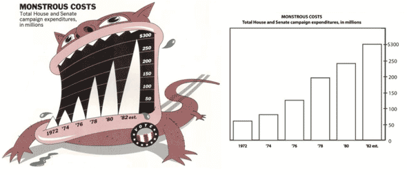
The chart on the right is traditionally thought of as better: clearer, less distracting, more honest and true to the data. However, recent research suggests the chart on the left better communicates the topic, the categories and values, and the overall trend of the data—and is more easily recalled:

Guidelines for designing information charts often state that the presentation should reduce chart junk – visual embellishments that are not essential to understanding the data. In contrast, some popular chart designers wrap the presented data in detailed and elaborate imagery, raising the questions of whether this imagery is really as detrimental to understanding as has been proposed, and whether the visual embellishment may have other benefits. To investigate these issues, we conducted an experiment that compared embellished charts with plain ones, and measured both interpretation accuracy and long-term recall. We found that people’s accuracy in describing the embellished charts was no worse than for plain charts, and that their recall after a two-to-three-week gap was significantly better.

Junk chart vs Minimalist chart

This research challenges popular assumptions among data visualization purists. But it also presents opportunities for us. Technical illustration is all about synthesizing information, facts, data with imagery to give context. This research is evidence that this synthesis is more effective, more appealing and more memorable than data alone.

Radiation Infographic by Davvi from our Flickr Pool

Radiation Infographic by Davvi from our Flickr Pool

Full report: Useful Junk? [via Information Aesthetics, Eager Eyes]

Flight’s Aircraft Cutaway Archives

Autogyro Cutaway

Wallis Autogyro Cutaway

Flightglobal has scanned, digitized and made available every issue of Flight Magazine published between 1909 and 2005 – that’s 100 years of aviation history! Most notably, they have a section of the archives devoted to cutaways, where these images were found.

Some are full-color but most are linear, with exceptional control over line density and overall image balance—keep in mind that these were most likely done traditionally on vellum or illustration board with a technical pen!

Nacelle Cutaway

Rolls Royce Dart Convair Conversion Cutaway

Bell XV 15 Cutaway

Bell XV 15 Cutaway

Airbus Airship Cutaway

Airbus AD300 Airship Cutaway

Spacelab Cutaway

Spacelab Cutaway

Westland Hovercraft Cutaway

Westland Hovercraft Cutaway

Flightglobal’s Cutaway Illustration Archive

Information and Decision Making

A recent research paper on organizational behavior and human decision processes looked at how people give and get advice, and how likely that advice is to affect their decisions.

The four types of advice explored were:

  • Advice for were recommendations for a particular option
  • Advice against were recommendations against a particular option
  • Decision support was suggestions on how to make the decision
  • Information was facts about the options that the decision maker didn’t know

In general, decision makers found all types of advice useful. However, the one type of advice that decision makers found most useful, and had the most impact on their decisions was information.

Participants felt that advice for, advice against and decision support robbed them of some independence in their decision. Information allowed them to make an informed decision, and would most likely influence future decisions. Furthermore, participants felt more confident about the decisions they made when advice came in the form of information.

Technical illustration is a highly informational medium, and this research is objective support to the power of information in the decision making process. Let your clients know that technical illustration deserves a place on the front lines of their sales efforts!

Full story via Psychology Today