Illustrator CS5 – Perspective Grid

Adobe Illustrator CS5 - Perspective Grid

Adobe Illustrator CS5 - Perspective Grid

It’s that time of the year when we’re blessed/cursed with another release of Adobe’s Creative Suite software and the inevitable question of whether or not to upgrade. For those of you teetering on the edge, here’s the push you may need to break out the credit card.

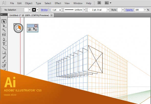
Brand new to  Illustrator CS5 is an embedded perspective grid and all the accompanying tools you’ll need to streamline your perspective drawing work flow. I was lucky to be part of the beta testing for this tool, along with fellow TechnicalIllustrators.org contributor Cody Walker, and I have to say I’m really pleased with how it turned out.

Anil Ahuja of Adobe has posted a tutorial that shows most of the features of the perspective grid. Have a look at it here. Check out the PDF at the bottom – it goes into more detail regarding how the tools are used. A sample of the file is there as well, but you’ll need a copy of CS5 to open it.

The grids come in default one-point, two-point and three-point perspectives, but you can tweak everything – vanishing points, origin, grid size, the height of the horizon and much more. When the grid is active, the shape tools all conform to a plane (chosen by you with the 1, 2 and 3 keys). Once objects are on the grid they can be copied and moved perpendicularly through the space as well.

However, for me the true power of this tools comes from the ability to transfer flat orthographic drawings directly to the grid. The only drawback is that raster images are not supported – only vector shapes can be applied to the grid.

The new tools will not obsolete or undermine our abilities as technical illustrators. Rather, as Anil states:

“…please understand that Perspective Drawing in Adobe Illustrator CS5 is NOT a 3-D environment. It is an extension of traditional perspective drawing technique. An artist will have a capability to define a perspective grid (one-point, two-point or three point), define a relative scale, move the grid planes and draw objects directly in perspective or attach flat art onto them by dragging with the new Perspective Selection tool.”

Also, all the old quirks of working with a grid are still there – so don’t throw out your techie toolkit just yet!

I highly recommend downloading and trying out the new version of Adobe Illustrator cs5. A 30-day trial is available on Adobe’s site.
Super Quick 2d Rendering Tutorial

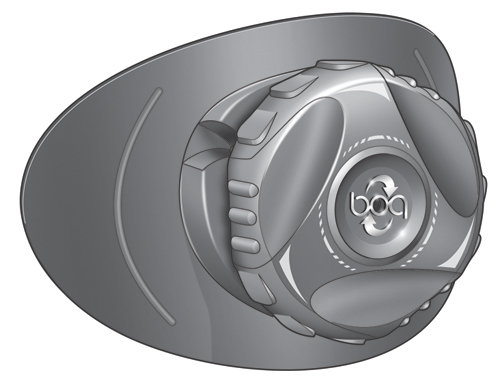
I’ve been asked once or twice how I create some of my images. Here’s a quick rundown on how I did this illustration.

This tutorial is not aimed at making something look great but really to get the job done with a quick deadline. I’m not a great illustrator but I can get shit done fast and still make them look reasonably good. Sometimes that’s all the job requires.

m3a

It’s not overly detailed or even that good but it only took an hour and it’s going to be pretty small in the final image.

MidPowerM3Boot

So here we go!

Read More

Things you wish you would have learned long ago

I’ve been using illustrator now since oh version 1.4 or something and I think it’s crazy how I’m still always learning on it. For example, for some silly ass reason I never bothered to really get used to setting up symbol libraries and custom user profiles. Finally after all this time I set up a user profile with custom swatches and symbols that I use every time I start up a new document. What a time saver.

symbols

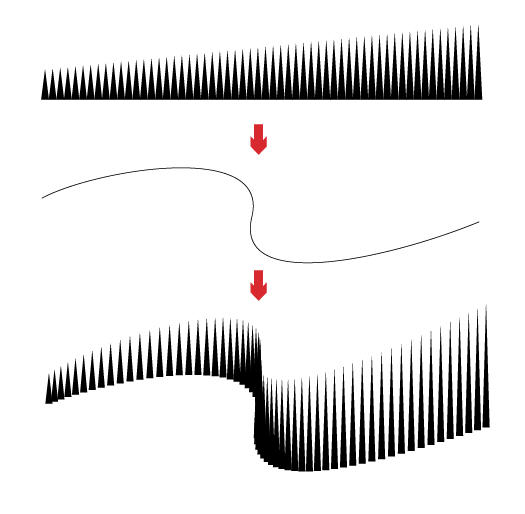
And then I find this gem in Computer Arts latest edition. Here’s a tip from Luke O’Neil on blending paths. Now I’ve used blending paths quite a bit but I had no idea you could shape them to a custom spline.

tip

05___ Creating blends between two objects is easy in illustrator. You draw 2 objects and go to Object>Blend>Make or, alternatively, specify the number of steps you’d like in the options box. It’s also possible to change the direction of the blend by simply drawing a path and, with the blend and path selected, going to Object>Blend>Replace Spine.

How about you, anything you recently discovered that you are kicking yourself in the ass for not using earlier?

Texture Tutorials

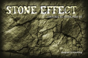
While working on a recent freelance job, I stumbled upon a great website,  MY Ink BLOG, with some realistic texture tutorials for grass, wood, stone and water.  Andrew Houle, the creator of the site uses various filters in each of these tutorials to achieve the desired results.

Specifically, the following are the texture tutorials:

Creating a Realistic Water Texture in Photoshop

Water Tutorial

Creating a Realistic Wood Texture Using Photoshop

wood-effect

Creating a Realistic Stone Texture Using Photoshop

stone-texture

Create an Awesome Grass Texture in Photoshop

grass-texture

The site has a great selection of Photoshop tutorials as well as so many other resources for Illustrators and Designers, that could be valuable in future.  Make sure you check it out!

Do you know any good websites for creating textures or have any “tricks” you use to save time on your illustrations?

Kevin Hulsey

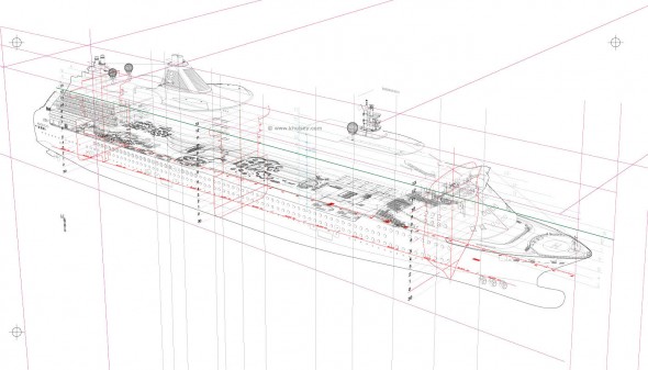
Kevin Hulsey - Radiance of the Seas Cutaway Illustration

Kevin Hulsey - Radiance of the Sea Process

“Any subject-matter is no more, or less, complicated than any other if you break it into small enough sections. A big, complex object like a car, plane or ship is just 30 or 40 small illustrations that happen to occupy the same space.”

The career of technical illustrator extraordinaire Kevin Hulsey is nothing short of prolific. His client list reads like a roll call of the world’s major transportation, technology, manufacturing and entertainment companies. His work has been recognized with numerous awards from Belding, Best in the West, Communication Arts Magazine, and the Art Directors Club Of Los Angeles. He began his trade with an airbrush in hand, then traded it in for a Wacom tablet and made the leap to digital media. And his website is an abundant source of inspiration, with illustrations of mind-boggling complexity and accuracy and myriad resources, articles and tutorials.

This all keeps Mr. Hulsey rather busy—unfortunately for us too busy for an interview. However, with his permission, I’ve collected some links to images, resources, and an interview he did with another site:

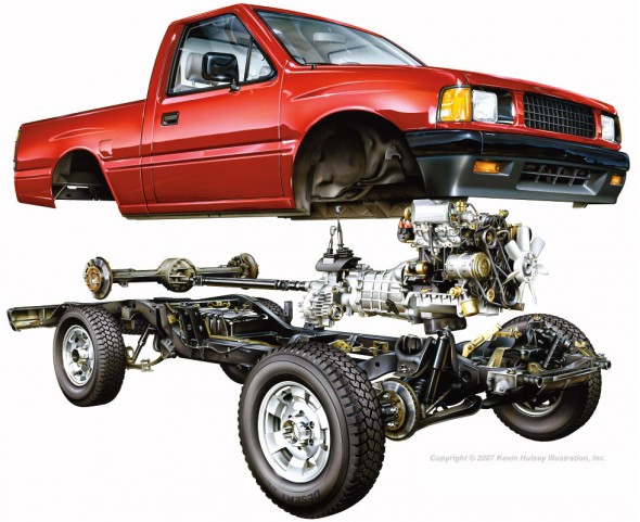
Kevin Hulsey - Pickup Truck Cutaway

Pickup Truck Cutaway – Copyright © 2010 Kevin Hulsey Illustration, Inc. All rights reserved.

Kevin Hulsey - Automobile Motor Illustration

Motor Illustration – Copyright © 2010 Kevin Hulsey Illustration, Inc. All rights reserved.

“Even after nearly thirty years, and thousands of illustrations, it is still fun to see your work on a billboard or in a magazine, particularly when you aren’t expecting it.”

Big thanks to Mr. Hulsey for sharing his time and work with us, and all the amazing resources on his site!

Update: Wacom case-study on Mr. Hulsey. (now on Internet Archive)

All images copyright © 2010 Kevin Hulsey Illustration, Inc. All rights reserved.

Tutorial – Advanced Isometrics

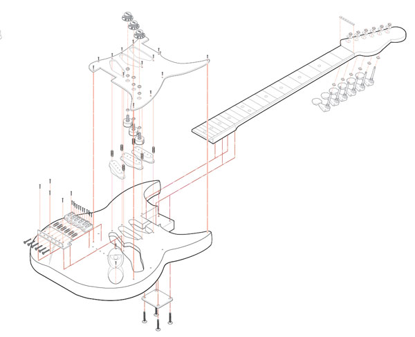
Stratocaster Exploded Isometric

In the last tutorial I covered how to make an isomeric grid and build simple blocky shapes on it. In this tutorial I’m going to talk about another method of creating isometric shapes that doesn’t require a grid and is much more useful if your objects are complex or curvy.

When creating a complicated isometric illustration it’s best to begin by breaking down your object into its simplest parts. This will help to make the project more approachable. It is possible to make the most complex objects entirely on an isometric grid using the method I discussed in the last tutorial. There is another method that is much more useful for creating curvy or complex isometric objects in Adobe Illustrator. I’m going to call this method scale, shear, rotate or SSR.

The basic idea behind the SSR method is by using tools in adobe illustrator you can place an object onto an isometric plane without using a grid. This method is most useful for curvy or complex objects but it will work for anything. I’ll begin simply by making an isometric cube.
Read More

Pricing Technical Illustration

Pricing Technical Illustration

When freelancing as a technical illustrator, deciding what to charge clients can be as delicate and precise an art as technical illustration itself.

Here are three key factors to consider when quoting on a project:

  • How much of my time & resources will the project take, and what is that worth?
  • What is the ‘going rate’? What do other illustrators charge?
  • What will the market bear?

Read More

Tutorial – Orthographic Projections & Basic Isometrics

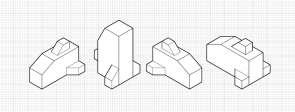
Basic Isometrics

Basic isometrics

This is the first part in a series of tutorials about Isometrics. Isometric projections are a system of drawing that allows an artist to quickly and accurately draw an object without using perspective. I will go into more depth about isometrics later in this tutorial. I’m going to begin by talking about a system that is commonly used with isometrics.
Read More