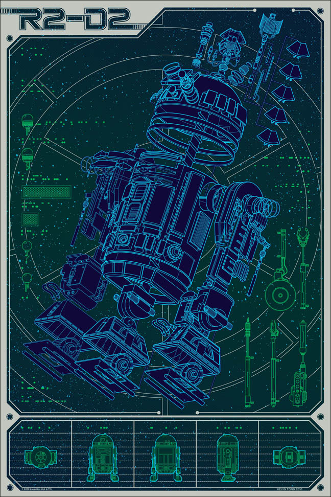
Linch Pin Droid by Kevin Tong
Illustrator Kevin Tong created this great exploded R2-D2 poster for an ongoing Star Wars Art Print series by Mondo Tees. He did a thorough post on his creative process and even made a time-lapse video showing his technique:
httpvhd://www.youtube.com/watch?v=Ta5TBGzqijk&feature=player_embedded
Linch Pin Droid goes on sale Friday.
Very cool, but am I the only one shaking his head when he was getting his thick and thin lines around the wrong way?….
The guy is talented for sure but yea, what’s with the reverse thick and thin?
I think this is cool as hell. There is no right or wrong for anything you guys need to stop reading books by failed artists and do more art! Items closer to your eye are always more intense in all respects so I think that is what he is doing.
I’m glad Mark and Clint pointed out the line-weight, I spotted it myself and thought it a bit odd. Jim, it’s a convention for a reason: it works—and I didn’t get that out of a textbook before you start.
I think it’s cool too, you are right Jim, no need to stay in the box all the time.
Simon, Can we see your work, oh great keeper of the great line weight convention?
Even though I found it odd as well- it is only a small part of the finished illustration and is not all that distracting.
…spoken like a true cynic, Jim.
and the man inside?
;)