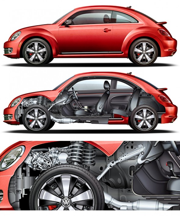
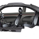
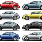
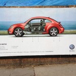
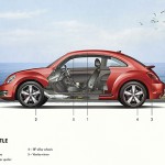
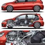
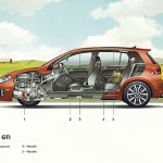
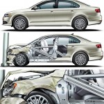
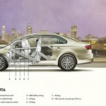
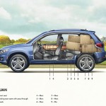
Jim Hatch recently completed this great project for Volkswagen, featuring finely detailed and rendered cutaway illustrations of their entire vehicle lineup. After the break, he shares some insight on working on a project of this scale, some process work, and lots of beautiful final illustrations.


This is a huge project. How long did it take?
First I would like to say assignments like this are fairly rare and I feel fortunate I was part of this very creative ad campaign with a terrific agency team [Red Urban]. The job took just over 4 months.
What hardware & software did you use?
I use Photoshop CS6 on a Mac tower with 32GB of Ram with a Wacom Intuos tablet on a 30″ Mac monitor. I use PS to draw all my paths but I will occasionally bring the paths over to illustrator when I need more line control. The illustrations were large, at 43″ x 17″ @ 300dpi, 185MB/7G, running max layers really pushed my mac to the limit and sometimes over.
How did you create the illustrations? What reference material did you work from?
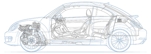
The job started out with photos and progressed into some very nice CAD (reference) but in image only, no useable paths were available. On a lot of the interior spaces little was available other than press photos so I had to construct a bit. I created all the cars and spots while another artist created the cool backgrounds on the posters.
What part of this project did you enjoy most?
Once you get into the zone and start delivering the art that is the part I love. I really enjoyed the painting portion especially the metals that I created for this job.
What challenges did you face?
The biggest challenge was the huge amount of work due each week, starting with line art of every aspect. In fact I had to reach out to friend and fellow contributor Clint Ford who stepped in supplying absolutely fantastic line work in Illustrator on many elements. Once I nailed down a rendering look I used that as a guide and it worked out very well.
Gallery
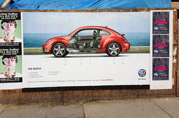
You can see Jim Hatch‘s work in use at Volkswagen Canada’s The Drive site, as well as posters, billboards, newspaper and magazine ads. Awesome work.

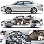
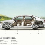
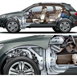
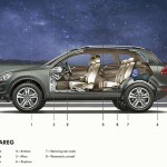

Awesome work indeed and a huge inspiration! Great write up.
It was a great opportunity to help out with the line art and I appreciate it, really forced me to tighten up my work. I love the crumple zone, I can imagine the work it took to make that. Beautiful work, thanks for putting it on here.
Nice work as always. Still can’t get over trying to do all that vector work in PS….gives me the willies… I can barely figure out how to draw a circle in PS. But makes it easier to do all the airbrush work I suppose.
Makes me want to run out and test drive a VW. FABULOUS ART!
FANTASTIC work!!!! Always impressed.
Jim! You and Kevin Hulsey definitely set the bar. Your work is always an inspiration and the quality and level I aim to achieve in my own work. Maybe you could do a demo for us sometime. Keep up the excellent work!
Thanks everyone for checking out my work! I would love to do a demo but need to figure out the best way to do that.
Jim
A demo would be great. I love to see a master at work.
I too would be interested in seeing some of your techniques being done.
Maybe a Tutorial on creating a Tyre? The available options on the web are very basic in comparison.