Todd Detwiler is the Design Director at Popular Science magazine and an accomplished illustrator in his own right. At PopSci he is responsible for fusing design, photography and illustration with stories of science and technology’s bleeding edge. As an illustrator he brings his technical aesthetic to the pages of TIME, ESPN and Washingtonian.
What’s your background? How did you get started in editorial design?
My junior year of college I secured an internship with Maxim magazine. It was the result of a funny letter I wrote to the then-art director David Hilton – who got a kick out of the flippant humor and gave me a call. I had interviews at Details and Rolling Stone as well, but Maxim offered me the internship and I moved from rural PA to New York the next week.
I was really at Maxim at the right time. Felix Dennis had brought his lad-mag over from the UK and it was lighting the magazine world on fire. It was there that I met people who would shape my career in magazines and illustration. I graduated a year later from Kutztown University and started working for Maxim full-time. Along with some junior design work, I was the resident icon artist and occasional spot illustrator. I was cheap (free) for the company, and I was just happy to have some work in print. It was a win-win really.
In 2005 I left Maxim and started working at Rolling Stone before being offered an attractive Art Director position with Hearst working on the development of a new Men’s Magazine. The project didn’t pan out and I started a freelance design career which took me around the publishing houses of New York and abroad until I settled down with Popular Science in 2011.

What do you do as Design Director at Popular Science?
As the DD of Popular Science, I led the team responsible for the 2014 redesign, along with an overhaul of the logo and brand guidelines. On a day to day basis, I do all the typical art department work loads – hire illustrators, design pages for features and front of book, brainstorm photo concepts, etc. It’s a small but talented art team at Popular Science – and I give them a lot of credit for making the magazine smart and efficient.

What makes for a good illustration? What can illustration do that photography can’t?
The best illustration communicates an idea quickly and clearly with some personality. I would also add that the process of commissioning the illustration makes it a “good” illustration. If deadlines are met and the work matches what is expected – that makes everyone’s life easier.
Photography can be expensive. With an illustration you can build a world that is immersive at a fraction of the cost. You can also build uniformity with illustration that can be a struggle with photography if you are using pick-up art from multiple sources. Both have a place in Popular Science, and we are very conscience of the balance in every issue.

What do you think makes the technical illustration aesthetic so popular in magazines?
Well, it’s been around for awhile, hasn’t it?! I was just looking at an instruction manual from the 60s the other day that was amazingly drawn. My hat goes off to the illustrators that were so meticulous with ink and pen. It’s a lot easier with a mouse and “command+z”..
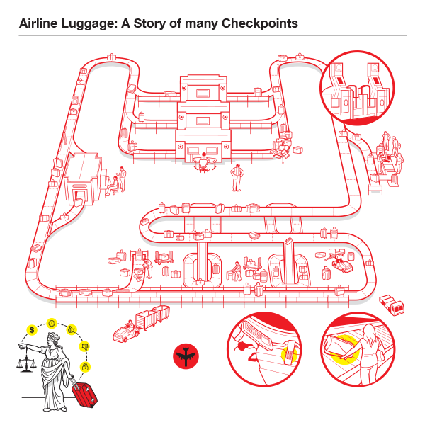
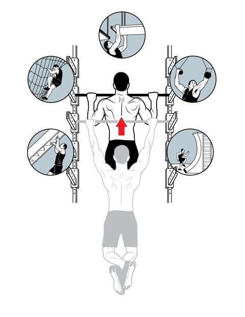
Regarding the aesthetic, I think the thick rules on the outside give the objects separation and weight, and the thin lines detail and clarity. People love exploded views because they can see what’s happening on the inside – something the PopSci reader loves. Ultimately, I think the style of illustration removes clutter and anything unnecessary to reveal the essence of the subject. It circles back to direct communication, free of any additional interpretation for the viewer.

In addition to your role at PopSci, you also moonlight as an illustrator. What drives you to illustrate?
I love illustration as much or if not more than editorial design. But what actually drives me to create illustrations is seeing the work of others. I’m constantly impressed with the level of design being generated by artists, and I can’t help but be inspired to create and learn.

What do you see for the future of publishing or illustration? Any advice for new illustrators or students?
The future of publishing is digital with print declining over the next 5 to 10 years. Illustrators need to be quick and consistent. I see enormous opportunity for illustrators in the digital News sphere. When breaking news happens, how fast can you turn out an editorial perspective, or even better – a comprehensive breakdown of what has happened or is happening. The world demands answers immediately and if you can act quickly, you’ll be very successful. Also, take your phone out of your pocket – that’s your new canvas – get used to it!

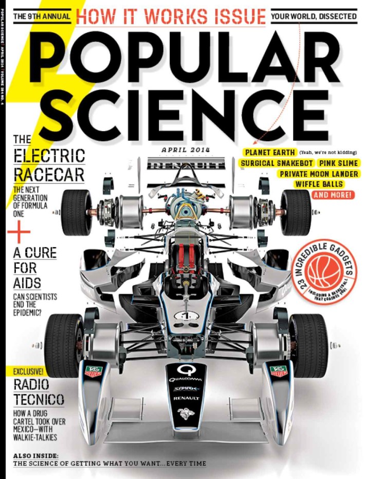
You worked with Graham Murdoch on the Electric Racecar project for PopSci. What was that like?
He’s just the best. I’ve been working with him since the Maxim days and he has always made me look good. For the Formula E assignment I sent him a bunch of scrap art and he was able to build out the entire car based on the reference I sent along with his own research. When it came to “exploding” everything apart, I know he spent a lot of time meticulously unscrewing every bolt and washer. The result was amazing, and it set the bar high for everyone in the magazine.
Big thanks to Todd for his time. You can find his work at ToddDetwiler.com and on newsstands everywhere.
