Twitter for Technical Illustrators

Twitter for Technical Illustrators

Greg Maxson, freelance technical illustrator and co-author of The Complete Technical Illustrator, recently wrote to share his experiences using Twitter as a marketing tool:

I saw Twitter as a sales tool with an immediate and pointed delivery, to be aimed at current and prospective clients. Free, direct, and uncluttered advertising to an audience with a common interest.

Using Twitter he reconnected with Popular Science magazine, a client he worked with regularly between 1994 and 2001. He had tried with hard-copy promos, emails and even voicemails with little response. Then he started following @PopSciGuy, art director Matthew Cokeley:

Each morning Matt would Tweet, “Morning tweeps! Let’s get to work!” After following PopSciGuy on Twitter for a few weeks, I decided to make a bold move. While having lunch at a local restaurant, I replied to one of these morning salutations with “Matt, put me to work in the next issue!”

Now, I certainly wouldn’t recommend this approach to everyone! But my gut told me that this direct, outside-the-norm tactic might just garner a favorable response from the A.D. of a leading science and technology magazine. This approach was destined to go either of two ways: bold, yet smart or, the dumbest move ever.

…and it worked—within two hours, Matthew got in touch with a project for Greg.

For those of you on the fence about it, this is what Twitter is for; Connecting with people with shared interests & goals, in a casual, personable way.

To get you started, you should follow Greg @gregdraws, the hilarious Matthew Cokeley @PopSciGuy, me @jamesprovost, the TechnicalIllustrators.org feed @technicilly and everyone on the the Technical Illustrators list!


 

2010 Graphic Artist’s Guild Handbook

2010 Graphic Artist's Guild Handbook

The 13th edition of The Graphic Artist’s Guild Handbook of Pricing and Ethical Guidelines is now available [Amazon]. The 2010 edition includes an updated pricing survey, legal information and sample forms & contracts. As in previous versions, there is a section dedicated to standard trade practices and rates for technical illustration.

If this book isn’t on your shelf now is a great time to get it. If your copy, like mine, is out of date it might be time to update.

Adobe Illustrator Gripes & Feature Wishlist

I’m going to have the ear of 3-4 developers from Adobe’s Illustrator team sometime in the next few days. They want to know what makes our life difficult, and what would make it easier. What are your gripes, pain points, repetitive stress injuries? What is your dream feature? What are you accomplishing with plug-ins that should really be built in?

Let me know in the comments, or by editing the fancy Google Doc after the jump.

Read More

Toyota Safety Ads

We all know that Toyota in the passed year has had many issues with the safety of their vehicles.  I came across the following advertisement (among others) that they now have playing to help get back consumer confidence in their vehicles.

httpvhd://www.youtube.com/watch?v=M3PBQEKc4w4

If you would like to see a full version of the advertisement, visit http://www.toyota.com/safety/videos/safety-features.html#

It’s great to see the use of technical illustrations in any media form and for large corporations as it brings exposure to our specialized art form.  BUT, does the use of the exploded views in this advertisement work?

I think not.  There are so many other ways that I could think of to utilize a tech illustration to show how Toyota has improved their vehicles to ensure safety.  Perhaps showing the specific mechanical technologies (ie. braking system) that have been improved and how they affect vehicle performance when stopping.

In the longer version of the ad they address the 5 accident avoidance technologies with an exploded view of each (ie. anti-lock brake system). Unfortunately, I find the use of the technical illustrations in this advertisement reflect a more “wallpaper” effect than being useful in supporting Toyota’s case for change in safety measures.

What do you think?  Do you have other ideas of how Toyota could win back consumer confidence by using technical illustrations?

ICON6 Illustration Conference Wrap Up

Icon6 Logo

It has been two weeks since the ICON Illustration Conference in Pasadena (previously), and it was a blast. I’ve been so busy catching up on work that I haven’t had the time for a debriefing. Sooo:

The Future of Publishing

With the majority of attendees dependent on work from magazines and newspapers, the unofficial theme of the conference was The Future of Publishing. The opening keynote set the tone (video in two parts, here and here). In short, publishing isn’t dead, it’s just changing and paying customers are demanding richer experiences.

By now, all newspapers and magazines have websites, and some release editions for Apple’s iPad. While a static image looks just as beautiful onscreen as it does in print, animation and interactivity unlock the full potential of these technologies and deliver more immersive experiences for readers. Every illustrator doesn’t need to become a classical animator, but new opportunities will certainly open up for those with the skills to bring some motion or interactivity to their images.

This was cause for much trepidation.

Business Practices

There were some great presentations on contract literacy, price negotiation, branding, marketing and the Orphan Works Act. The showstopper though, was the introduction of a rights management system called PLUS (Picture Licensing Universal System).

PLUS is a non-profit coalition of publishers and industry associations. The system combines metadata embedded invisibly into images with a third party database that would keep track of the copyrights associated with each image. This plugs into a publisher’s asset management system and informs them of the printing rights they own for a particular image, the duration of these rights, and how to contact the creator for additional rights. The system also includes a reverse image search (similar to TinEye) to locate the origin of an image without metadata. Neat stuff.

Social

ICON went beyond social drinking; Social media, viral videos, blogging, microblogging, linking in, flickring, tumbling, buzzwords abound. I’m not sure that anyone’s made any sense of it all, but it’s nice that illustrators can finally be solitary and isolated and social at the same time.

In Conclusion

Though not specifically for technical illustrators, I had a great time at ICON. I met some great people (hey Troy, Jude, Gary, Edel, Carl, Brian, Jennifer, Jeremy, Rod, Topher, Chloé, Jeehyun, Chris, Chris & Chris and anyone I’ve forgotten) and learned a thing or two. But mostly, got really excited about what I do and the possibilities out there.

Check out Escape From Illustration Island for extended coverage, interviews and videos!

Oil Spill Illustration Roundup

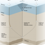
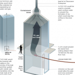
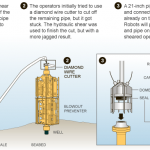
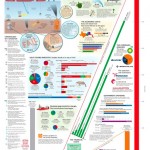
The biggest news story of the past two months is highly technical and happening beneath 5,000 feet of water. These obstacles make technical illustration the obvious medium for telling the story. Collected here are illustrations and graphics from various sources, showing their visual approach to communicating the information. (Mouseover for source, click for larger version)

The New York Times‘ illustrations are well designed and executed in a graphic style typical for newspapers. Black lines delineate the key information, both a visual strategy and a production consideration (black prints well on grainy paper in fast presses, since it’s a single plate). Deep-red lines and arrows call the eye’s attention to important details. Light colour tones provide additional information such as material, dimension/shading, or simply visual separation. A variety of views are used, elevations, isometrics, perspectives, whatever suits the content. Nice stuff here.

Infographic World‘s ambitious graphic attempts to tell the entire story, relying heavily on text, but ends up feeling cluttered, unfocused and disorganized. The individual illustrations feel underdeveloped.

NOLA/Times-Picayune‘s graphics are similar in style to The Times’, but with a much thicker line weight which makes me think they might have appeared smaller in print. The multitude of arrows really get in the way of the information. A bit heavy handed.

The Economist is a weekly news magazine, but the illustration doesn’t have much to show for the extra time (to be fair, there’s no telling what sort of turnaround time the illustrator was given).

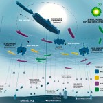
BP employs slick [no pun intended] 3D renderings to communicate the company’s repair efforts and give the impression of openness and transparency. I have two problems with this. First, they feel expensive. I imagine BP already had a 3D model library of all their equipment for planning and presentation purposes, so this may very well be the most cost-effective visual solution for them. But the impression these polished 3D renderings give is that they’re spending a lot on visuals, when they should be devoting all their resources to the repair and cleanup process.

Secondly, 3D renderings feel like constructed illusions rather than explanatory depictions of their efforts. Maybe it’s my bias towards illustration since both are just as artifical (ie. not photographs or videos), but I find The Times’ illustrations more trustworthy than BP’s 3D world.

Sources

The New York Times. “Methods That Have Been Tried to Stop the Leaking Oil”
Infographic World. “Crude Awakening”
NOLA.com. “Oil Spill Graphics”
The Economist. “Mudslinging”
Unified Command for the BP Oil Spill. “Graphics”
BP. “Gulf of Mexico Response”

Have you seen any additional illustrations of the Gulf of Mexico oil spill? Let us know in the comments!

The Future of Technical Illustration

Wired Magazine on iPad

For those of us who work with publishers of magazines, newspapers and books, the past few years have been trepidatious. The future of the printed page looks uncertain. There’s much speculation that this business model or that device will save the industry. And as much as we techies may fall in love with each new gadget, they have been looked at as a threat, or at least an unknown variable in our careers.

But through all this, I’ve taken comfort in two facts. First, that we live in a visual society. For this reason, the pixel pushers, the vector tweakers, the pen sketchers, and more importantly the visual thinkers will always be in demand. Secondly, the environment around us grows more complex every day. We specialize in distilling complexity into more comprehensive, communicative forms.

I feel our skillset will remain relevant and in demand, but it is crucial to stay informed about prevailing technologies and mediums, and to constantly update our workflows to be able to deliver our product in whatever packaging consumers demand.

Threats or opportunities? What are your thoughts?

Bill Fehr

Bill Fehr - Equipment Cabinet

Bill Fehr is a technical illustration veteran, with 20 years experience in the field. In this interview, we discuss the technical skills, the ongoing learning of new software and technologies, and the exploration of new business models necessary for a sustainable career in illustration.

What is your background? How did you get into technical illustration?
I have worked and lived in St. Louis my whole life. I graduated in 1982 with an Associate in Applied Science degree in Technical Illustration from Meramec Community College here in St. Louis. I later went back and got my Bachelors in Business Management.

Since I was in High School I knew that I wanted to become a technical illustrator. That idea came to me when I was in drafting class and in the text book we were using was a description of what a technical illustrator does. It was accompanied by a photo of a guy using an airbrush to create a concept rendering of a car. That was it for me.

I was lucky enough to land a job as a technical illustrator before I graduated with my illustration degree. This was in the 80’s mind you so there were no computers. Everything was hand drawn. I was lucky enough back then to work for a small company where I had to learned to wear many hats. It was there that I learned to spec type, create photostats, airbrush, knockout backgrounds in photos, take photos, and paste up documents by hand.

In the eighties we didn’t have the advantages we have today of tracing digital photos or importing CAD data. Illustrations were created by extracting dimensions from blue prints or measuring actual parts. We would draw out the illustration in pencil first on a sheet of velum. We would then lay over that a sheet of mylar and “ink” the illustration using technical pens and templates. Inking was an art all by itself and one that I still miss to this day.

I have seen many changes over the 20-plus years that I have been doing this. The one thing that has never changed is the need for visual communication. The only difference between then and now is how it is created and how it is delivered.

How do you work? Employed, freelance or somewhere in between?
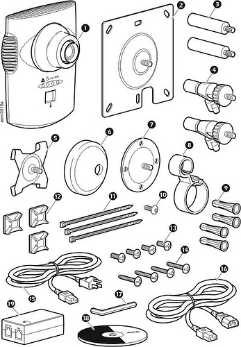
Currently I am employed by American Power Conversion as a technical writing manager. Our department creates installation, operation, maintenance, and service documents, just to name a few.  In the evenings and weekend creating stock illustrations and photographs. I do very little freelance work. It requires much more time than I am willing to give these days.

What’s your favorite kind of project?
I still find black and white line art to be the most fun. Though at first it seems like it would be the easiest I find the opposite can to be true. You don’t have color, transparency, or animation to get you out of tough situations. All that you have to use to communicate is a black line. What you do with that line, now that is what makes all the difference.  To me it’s very Zen-like.

Bill Fehr - Parts Identification

Any advice for technical illustrators just starting out?
Experience with software is secondary to technical knowledge. Anyone can learn software. The ones that can get themselves out of tough situations without using software in as a crutch are the ones that I respect the most. That’s not to say the you don’t need to know how to use Illustrator, or CorelDRAW, or whatever. In fact, the better you know the software the better you can illustrate because the software is not “getting in your way.” I’m just saying that you shouldn’t rely on the software to replace technical knowledge. There were many times where I had to rely on my technical training to get me through projects that had no reference photos or CAD data. All I had was a rough prototype and some napkin sketches.

Bill Fehr - Syringe

What is your software of choice?
Everyone has their favorite software. This is usually the software that they have used the most and are most familiar with. For many years I have used CorelDRAW exclusively.  Once I started getting into stock illustration however I started to migrate over to Adobe Illustrator because stock agencies require an Illustrator version 8 compatible EPS file. It was much easier to make the transition to AI than it was to go through the process of exporting Draw files over to Illustrator, make correction, then export to EPS. I also moved to an iMac recently so that drove my decision to move Illustrator as well.

I have used a few vector illustrations packages over the years, CorelDRAW, Corel Designer, Xara Xtreme, IsoDraw, Deneba Canvas, and Adobe Illustrator. I also have used Solid Edge, SoldWorks, AutoCad, Maya, 3D Studio Max, and Blender for 3D modeling and rendering work.

Most of my experience has been with CorelDRAW. It has, I believe, one of the best toolsets for technical black and white line art. It allows you to draw with much more precision and at a higher rate of speed than other programs. I have also created a custom technical illustration toolbar that I use within DRAW which helps me get through an illustration pretty fast.  I also like that the overall file size is small. CorelDRAW is great for those just starting out because it is inexpensive.

The downside to CorelDRAW is that it is a bit buggy and will crash at the drop of a hat. I have learned to save versions of the file that I am working on just in case of such a crash. CorelDRAW does create backup files and crash recovery files but they are not always usable.

Bill Fehr - Padlock

You sell stock illustration via iStockPhoto, Shutterstock and Dreamstime. What has your experience been with this?
I love the microstock business. It’s kind of the best of both worlds. On one hand I can create what I want when I want and still get paid. Of course the more your work aligns with the needs of the customers the more money you will make.

The stock photography and illustration business can be tough to define. What is going on is your trying to guess what somebody might need. You want to create images that can be incorporated into design pieces, film, advertising, mailers, etc. You can try to communicate concepts or ideas like space travel or a health care. It can be fun and challenging.

I think creating stock images fits my personality and lifestyle better than doing freelance work. I am under no pressure and I can work whenever I want. I have done my share of freelance and I don’t care for having to find the jobs during the day then working evenings, weekends and holidays to get it done.

Bill’s technical illustration work can be found at TekART Technical Illustration, and his fine art and photography at BillFehr.com.

Nate Williams’ Illustration Career Advice

“Technical” may be the last word you’d use to describe illustrator and illustration community leader Nate Williams’ work. But his advice on a career in illustration is relevant to just about anyone with a career in image making.

I first read it shortly after graduating college, and since then I’ve revisited it every few months to re-evaluate my career and hone my efforts. It’s an all-encompassing checklist, covering the subjects of technical skills, style, online and offline marketing, customer service, workflow, creativity and attitude. I think this is a great resource for any illustrator, at any stage in their career.

Illustration Career Advice from Nate Williams