Remie Geoffroi

Freelance illustrator Remie Geoffroi creates a wide range of work—from portraits, lifestyle, sports and business editorials to infographics, exploded diagrams, instructional illustrations and architectural drawings. What unites it all is his clean, technical use of vector artwork and a mastery of line quality.

It’s probably this combination of versatility and consistency that keeps art directors calling. Remie has worked with clients including AARP, Sports Illustrated, TIME, ESPN, Men’s Health, Martha Stewart Living and Bon Appétit, and advertising clients including American Airlines, Coca-Cola, McDonald’s, Microsoft and Volkswagen.

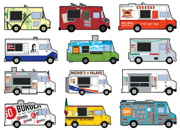
Remie Geoffroi - Food Trucks

How did you get started in illustration?

Drawing was all I ever wanted to do. Through high school I took part time jobs at an animation studio, a screen printer’s art department, etc. I went to college for graphic design because I was pretty hazy on what a career as an illustrator would look like. I ended up being hired as a clip art illustrator right out of college, and set out as a freelancer shortly afterwards.

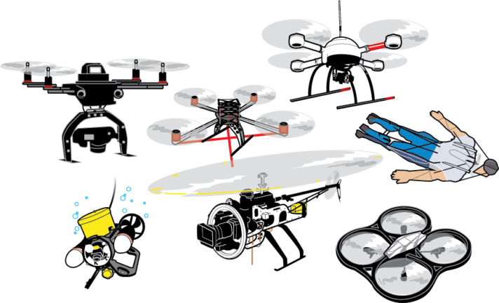
Remie Geoffroi - Drones

What is a typical day for you as a freelance illustrator?

I regularly work with magazines (Billboard, ESPN, etc.), and occasionally advertising agencies, Sid Lee, DDB, etc. I recently illustrated “Tools of Titans” the new book from Tim Ferriss, and a book for Gold’s Gym, coming out later this year.

I have a shared studio space where I work from, or I’ll sometimes choose to work out of my home office if the weather is bad or my workload is light.

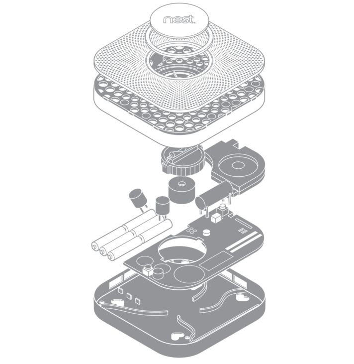
Remie Geoffroi - Nest

How do you create your illustrations?

I work almost exclusively in Adobe Illustrator. Many of my illustrations that people have assumed are raster (Photoshop) are actually vector. I like the versatility of being able to tweak the lines. I’ve developed a very streamlined, comfortable process for creating vector artwork. I appreciate being able to revisit files years later to harvest and reuse elements.

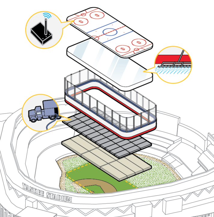
Remie Geoffroi - Stadium

You work in a range of styles, how do you choose the style for a particular project?

The assignment usually dictates the style. Art directors usually point to one example or another from my site that they’d like to see. Repeat clients don’t usually request a particular style, as they usually trust where I’ll take a particular project.

Remie Geoffroi - Retail

What challenges have you faced in your career? What opportunities do you see for the future?

Like most freelancers, workflow can ebb from time to time, and those can be nerve-wracking periods. I’ve been fortunate enough to avoid any true work droughts in my 17 years of freelancing.

I’m optimistic new opportunities will continue to appear. App development wasn’t even a thing a few years ago, and it’s become a major place for illustrators to create and find work.

Magazines were supposed to be dead years ago, and yet they continue. That said, I’ve been sad to see a few fall away recently.

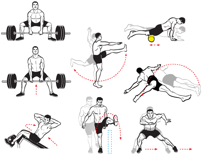
Remie Geoffroi - Exercise

Any tips for illustrators starting their careers?

A successful career as a freelance illustrator is built upon relationships. Recognize that you’re building relationships with your clients, primarily art directors. Be ready and willing to accept their criticism and make changes. Be professional and on time with your work. Be courteous and understand that there are many other illustrators out there, so your attitude can be a big factor in who wants to work with you.
Big thanks to Remie Geoffroi for his time!

John Hartman

John Hartman is a technical and scientific illustrator who seamlessly blends traditional media with 3D and digital techniques to create  images that are fresh and contemporary, yet warm and inviting. His work can be seen regularly in Fine Woodworking, Woodcraft, Fine Home Building and more. John agreed to answer a few questions about his work and career.

John Hartman - Paslode Nail Gun

What’s your background? How did you get started in technical illustration?

It’s a long story but here it is in a nut-shell. I have always been interested in drawing and painting. My early education was in fine art. I also found technical illustrations like those in Scientific American, Popular Mechanics and Fine Woodworking inspiring and they appealed to my interest in art, science and technology. Since my school days predated the personal computer, technical illustration was being created strictly by hand. As a student I was impatient, rebellious and seeing how fastidious hand drafting and airbrush painting was I decided to go another route and become a fine artist.

I found myself living in Brooklyn, working odd jobs to pay the rent. Being a starving artist wasn’t for me so I decided to learn a trade. I also had an interest in music as well as art so I re-educated myself as a piano technician. Fast forward a few decades and I am running my own business rebuilding grand pianos. Knowing of my art background the editor of the Piano Technician’s Journal, the trade magazine for people who tune and repair pianos, asked me to come on board as their illustrator. I spent the next six years teaching myself technical illustration. Starting with traditional hand methods and eventually developing digital techniques that emulate the handmade artwork I loved in my youth.

The pianos are now gone and I am working full time as a freelance illustrator. I’ve converted part of the piano shop into my studio, and have kept the woodworking shop as my man cave. I love this work and wish I would have started earlier. There’s a lesson in this somewhere.

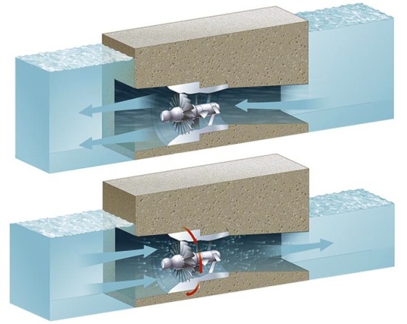
John Hartman - Water Tank

You work in a range of styles and subject matter. How do you choose the right aesthetic for a project?

Well I think the right aesthetic is the one that gets the job done and also appeals to me personally. I have never hidden the fact that I work digitally but my personal taste in art and illustration is rooted in traditional analog techniques. So generally I don’t want my work to look like it popped out of a computer program. I think in my case what comes off as different styles is really a result of my penchant for experimenting with a wide range of tools and methods. Typically I may blend together 3D rendering with hand drawing and a little vector work as well. I love learning new software and trying to come up with different ways to create illustrations. Sometimes I attempt to emulate a particular analogue drawing style, the results vary but I always learn something new. For me, it’s more of a challenge to stay consistent and on track. Except for my personal taste, experience, and craftsmanship the style chooses me rather than the other way around.

As you noted, I enjoy working on different subjects as well; there is nothing better than being handed a unique assignment, and doing the research can be fun as well. But I have never consciously linked a style to a particular subject except in the case of my work with Fine Woodworking Magazine where there is an established style. I do try to be consistent within a project and if the art director points me in a particular direction stylistically I make every effort to accommodate. In addition, with art directors I know well I will often discuss style issues to better integrate the illustration with the page design or create something a little different than usual. Some of my most successful work stems from collaboration with a talented art director.

John Hartman - Bench

What challenges have you faced in your career? What opportunities do you see for the future?

Projects that are complex or those that require a new skill to pull off, or have a very tight deadline have kept me awake at night. Over time I have learned to expect these sorts of challenges and I find myself looking forward to difficult projects. One challenge we technical illustrators face is keeping up with ever evolving technology, requiring practice and self education. I think learning new software is vital to staying competitive. Also I find I need to brush up on core software I already know like Photoshop and Illustrator. Since software is doing more of the heavy lifting I find I need to practice my analog skills and foundation knowledge like perspective just to keep from losing this valuable tool set.

What I see on the horizon for technical illustrators is the increased use of 3D animation. On-line video is becoming the leading media for news, education and entertainment. It may take some time but eventually publishers, advertizing agencies and businesses will seek out talented illustrators to create information based animations.

Do you have any advice for new illustrators or students?

Technical illustration is a broad field of study. It covers any illustration assignment that needs to show the viewer how something functions or how parts are interrelated. At its heart is clarity and precision, and consequently it requires more discipline and knowledge. I believe students need to work longer and harder to gain the skills needed. New illustrators and students need to know it’s going to take passion and dedication to be successful in this field.

Technical illustrators need to be able to draw well. This means being able to accurately depict the world around us with line, tone and color. Don’t expect to gain this by attending a few classes in school, it will take a lifetime of learning, and continued practice to maintain. You need to study perspective, how to render light and shade as well as color theory. Don’t expect computer programs to do this for you. If you wish to include the figure in your work you will need to study artistic anatomy as well.
Working as a technical illustrator is not a passive act, you are expected to research and understand the topics you are given. In addition you will need to solve the many technical and design issues that arise with each assignment. The artistic quality of your work is up to you. Hopefully you have a passion for fine art and can bring flair to your work that is attractive. I believe that technical illustration should be beautiful as well as useful.
John Hartman - Air-Conditioning-System


See more at Hartman Illustration.

Mark Franklin

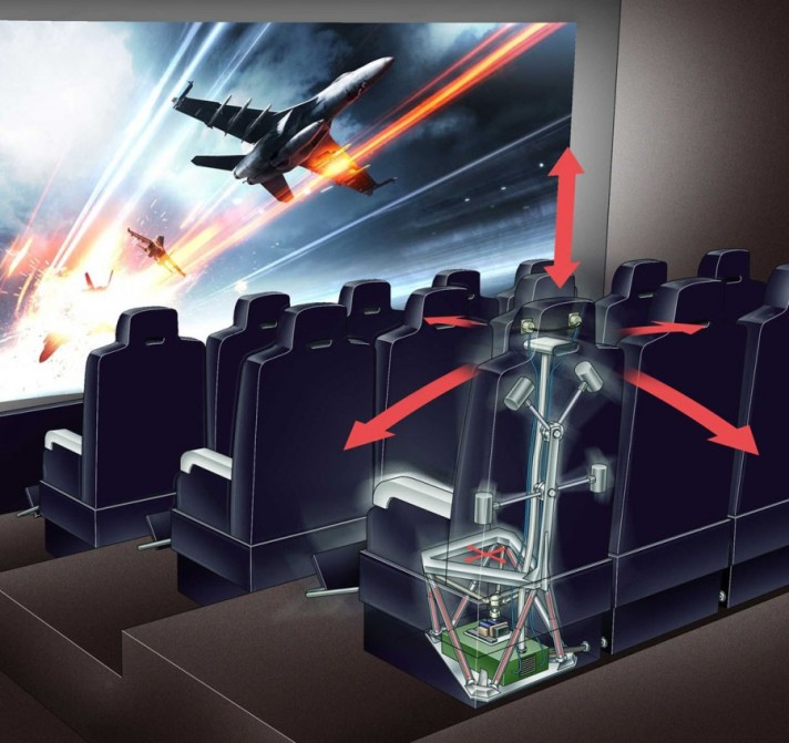
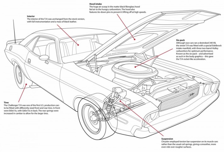
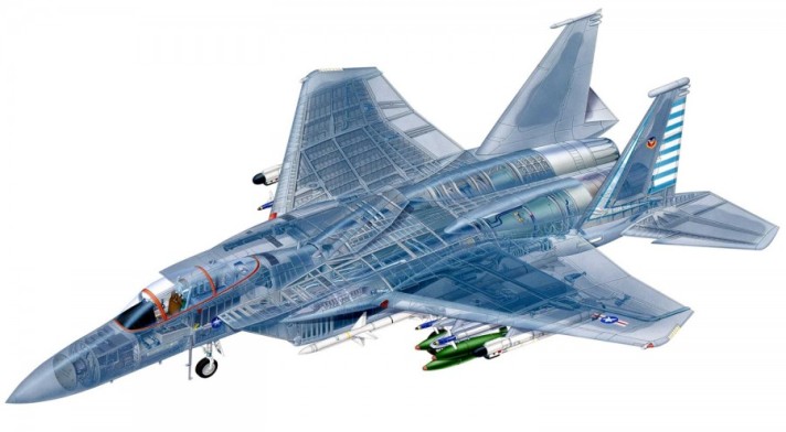
Mark Franklin is a London-based freelance technical illustrator. During his 30-year career, he has illustrated a wide variety of subject matter for clients including Airfix, McDonalds, Tekmats, Rowe Hankins Ltd. and some of UK’s largest publishing houses.

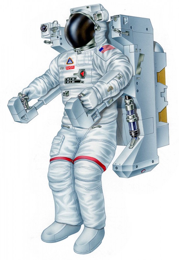
Mark Franklin - Manned Manoevering Unit

Mark Franklin - 4D Cinema Mark Franklin - Dodge Challenger Mark Franklin - Dryer Mark Franklin - F-15 Eagle

Check out Mark’s portfolio to see the breadth of his work: Mark Franklin Arts

Ryan Kirby

Ryan Kirby - Snakebot

Ryan Kirby’s career as both an illustrator/designer and wildlife artist is a balancing act. He finds stability somewhere in between solving problems for clients like Popular Science, Outdoor Life and Field and Stream, and defining his own challenges through his fine art. Ryan took the time to answer a few questions for us about his work, education and life.

What’s your background? How did you get your start in illustration?

I’ve been drawing and painting since I was in elementary school, and my goal has always been to one day paint full time. But I also knew that once I graduated college, I would need some marketable skills to buy some time before I could paint. So I studied Graphic Design and Multimedia at Bradley University in Peoria, IL and graduated in 2005. I was a farm kid, and we didn’t have access to the software and Mac computers growing up, so college was my first experience with Photoshop, Illustrator, and any real form of print and digital media. I learned to apply my drawing and fine art skills to these programs, and did fairly well in school.

Upon graduation, I headed south of the Mason Dixon to Edgefield, SC to work for the National Wild Turkey Federation as a graphic artist and illustrator. I spent roughly seven years there learning print design, magazine production and editorial illustration. Those were good years, and I learned a lot. Eventually I started freelancing and painting on the side, always pushing myself and trying to learn new programs and techniques. Soon the freelance workload became heavy, and I had to make a decision whether to launch out on my own or stay an employee of someone else. I chose the former.

I’ve been on my own for three years now, and it’s been the best decision I’ve ever made. It’s not always easy, and as a one man show you wear a lot of hats initially, but I thrive on challenge and love learning new things. Most of my clients are in the outdoor industry, and I primarily focus on print ad design, photography post-production work, illustration and wildlife art.

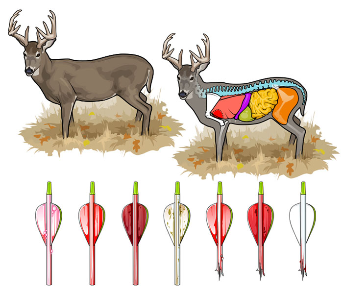
Ryan Kirby - Deer Anatomy

What’s your favorite subject matter or type of illustration?

The how-to hunting pieces are my favorite. I have a passion for the outdoors and really enjoy hunting and fishing. So to illustrate a hunting scenario that I’ve lived out in real life and help a magazine better communicate that concept with a reader, that’s something I enjoy tremendously. It’s one thing to enjoy the technical side and the creative process of illustrating or painting, but to actually care about the subject matter, that’s a whole new level of job fulfillment. And I feel it shows up in my work, which is why I’ve been successful in the outdoor arena.

Ryan Kirby - Target Shooting

What’s your process for a typical assignment?

Even with good scrap material and reference photos from a client, I always like to do some more research on my own. Most of my work starts the old fashioned way with pencil and paper. Once I get a rough sketch with potential, I’ll take a cell phone pic, email it to myself and from then on, it’s all digital. If I’m working in Illustrator on a technical piece, I’ll create vector art over the top of the sketch. My humorous work though is done 100% on paper and scanned in to create a digital file for the client. In this day and age, everything has to turn into a digital file at some point to send over to the client.

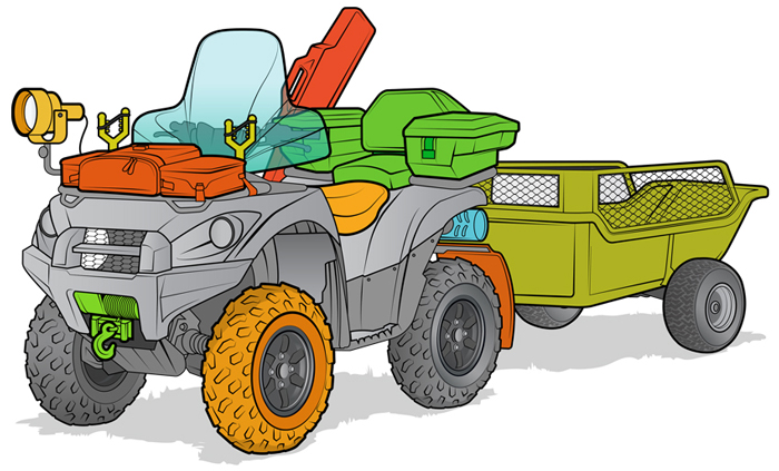
Ryan Kirby - ATV

What’s the relationship between your illustration work and your fine art?

There’s a dramatic difference in the way an illustration is created vs. a fine art piece, and the business side of things is run differently as well. But artistic principles like contrast, edges, focal points, composition, color, etc. apply to both fields. For example, when I want a hard edge on my subject matter in a painting, I paint a clean, hard line with contrasting values. When I want a hard edge on a vector illustration, I simply bump up the stroke width in Illustrator and choose contrasting colors. Same concept, two different ways of accomplishing it. And as with any great fine art piece or technical illustration, the more you can refine a subject down to it’s core essence, the more you simplify it, the more powerful the resulting image.

There are differences though. My illustration and graphic design work is done on a sketchpad and an iMac in my office. It’s clean, precise, orderly. My paintings are done in a separate painting studio. It’s messy, more chaotic, a little more of a mad-scientist atmosphere. In addition, the illustration and graphic design is a service industry, where I solve a client’s problems for a fee. The painting, on the other hand, is a hard good. It’s my own creation, and after I create it I have to find a way to market and sell the piece. It’s more of an entrepreneurial venture than sitting back and handling client requests.

I’ll always do a balanced workload of graphic design, illustration and fine art. But these days I’m shifting that balance to more fine art. There’s no client revising my work or limiting what I can and can’t do. I have more ownership of the creative process, and that’s important to me.

Ryan Kirby - Outdoor Life Cover Painting
Do you have any advice for illustrators just starting out?

Absolutely. As an illustrator or designer, you are in the business of solving problems. Your clients have problems that they need solutions to, and the level of problem you can solve for them will determine your level of success. For example, I’ve taken it upon myself to learn product photography and new illustration techniques, to understand branding and retail settings, and to craft powerful messages with copy and images. If something is beyond my reach, I seek advice or hire it out. The more problems you can solve effectively for your clients, the more valuable you are to them.

Also, be great to work with. Under-promise and over-deliver. Hit deadlines. Go over the top, not because someone asked you to, but simply because you wanted to see if you could do it. You can be the most talented illustrator in the world, but if you can’t hit a deadline or you’re a jerk to work with, clients will find somebody else. And always remember: emails are forwarded and what you put on Facebook lives forever.

Ryan’s illustration work can be found at RyanKirbyIllustration.com and his wildlife fine art at RyanKirbyArt.com

Vic Kulihin

Vic Kulihin - Space Shuttle

The vector illustrations of Vic Kulihin are fresh, bold and contemporary. So you might be surprised to learn that his freelance career began in 1988. Vic was kind enough to answer a few questions about how the industry has changed in that time and give a few tips on having a long and successful career.

What’s your background? How did you find your way into illustration?

I started out as an engineering major at Rutgers University, but graduated with a degree in art education (long story). After college I worked as a paste-up artist for a small ad agency, which folded not long after I started. I then found a position as a technical illustrator for Bell Laboratories. This was back in the day when we used airbrushes, technical pens, straight edges, French curves and typesetting machines. During my stint there these tools were gradually replaced with Macintosh II desktop computers using Adobe Illustrator 88 software.

After a decade I left Bell Labs to start my own freelance business. The timing was right. I was able to combine my work with being a stay-at-home dad for my baby daughter. At that time I focused on colored pencil illustration, but eventually gravitated back to the Mac and vector art.

Earlier in my career I took classes at Parsons, the School of Visual Arts and the Art Students League of New York to make up for my lack of formal art training. I still take classes periodically, but the beauty of it nowadays is that they are readily available online.

Vic Kulihin - Shelves

What is your favorite subject matter or type of project?

Although I’ve had the opportunity to draw a great variety of things, I think my favorite subject matter has always involved mechanical devices…tools, machinery, that kind of thing. I enjoy creating assembly instructions, exploded diagrams, cutaways, schematic drawings (I think I’ve always been an engineer at heart).

Vic Kulihin - Electronics

What’s your process for a typical project?

I start with a thorough discussion of the project with the client: project specs, style, number of iterations of sketches/final art, timeframe, budget, etc. When the project involves a product I ask the client to supply me with reference photographs and, whenever practical, the actual product itself. For projects involving people I will often photograph live models and/or use software like Poser or DAZ.

I currently work on a Mac Pro with a 30” Apple Cinema Display; I also have a Wacom Intuos3 tablet that I use infrequently (oddly enough I feel most comfortable wielding a mouse). Software of choice is Adobe Illustrator.

Tools like Skype and GoToMeeting have allowed me to work closely and “in person” with clients globally, something I never would have envisioned when I first started out.

You market your services in a number of illustration directories. What has been your experience with that?

I find that of all the portfolio sites I use the majority of my work comes from three directories (theispot, Directory of Illustration, Workbook) and the assignments from these have covered the gamut of illustration. The income that results from these projects generally justifies the expenditure for these sites. I also periodically do a direct mailing campaign. Recently I’ve expanded my online visibility and interactions through social media such as Behance, Twitter, Facebook and LinkedIn.

Vic Kulihin - Dirt Devil

You’ve been illustrating for 27 years, what do you think makes for a long and successful career?

The biggest challenge has been dealing with the “feast or famine” syndrome…drumming up business when things are slow, or trying to deal with the onslaught when things get very busy.

As for the future?… For some years it seemed like photographs and video were “where it’s at”. But I’ve noticed more recently a big increase in the use of illustration across media.

That’s great news for the likes of us!

Chris Philpot

Open any magazine on the newsstand and inside you’ll likely find an illustration by Chris Philpot. He creates humorous how-tos, conceptual illustrations, infographics and animations for some of the biggest and best, including TimeWired, Popular Science, Outside and Men’s Health .

I got in touch with Chris to ask him a few questions about his work, how he got his start in illustration, and what the future may hold.

Chris Philpot - City of the Future

What’s your background? How did you find your way into illustration?

I wanted to be an illustrator in high school but read articles from practicing illustrators predicting the demise of the profession. I decided I should get a degree in design to ensure a more stable income. That lead me to a job as an editorial art director for about 12 years. While I grew to enjoy design, I still really wanted to illustrate so I started freelancing on the side. Five years of moonlighting gave me enough of a base to make the switch. It was a scary transition, but my wife was incredibly supportive. I’ve been illustrating full time for the last six years. It’s been great. I make more money, have more autonomy and am much more fulfilled creatively.

Chris Philpot - Visual Quiz for Esquire

What are your favorite subjects or types of project?

A technical approach is surprisingly versatile. You can add a subtle joke to dry stories. You can take irreverent or taboo stories and make them presentable to polite society. You can take a really funny story and the art can play the role of the straight man. I read a lot of Gary Larson cartoons growing up and would turn every job into a one-panel Far Side cartoon if I could. My favorite types of projects involve subjects that are fun to draw like monsters, robots and octopuses.

Chris Philpot - Oculus Rift for TIME

Your style is really consistent, how important is that? How did you develop your aesthetic?

The consistency comes from a few places. Mostly, I need to produce a lot of work to meet my income requirements each month so the volume dictates a certain formula. I try to improve with each job. If a new technique works, I add it to the list of best practices. I’ve also found that art directors are coming to me for the work they see in my portfolio. If I send something too different they often direct me back to the look and feel of my portfolio (I still send in variations if I think they’re better.) I also use a lot of 3-D models for reference. That definitely adds to the consistency, especially in the proportions of people. I’m pretty lanky so using myself as reference wasn’t working out.

Chris Philpot - Humvee

What’s your process for a typical assignment? What hardware and software do you use?

I take the brief from the client and request any missing information like story details, budget and schedule. I try to get as close as possible to a final draft by the sketch deadline. It puts the art directors and editors at ease and I think everyone is more inclined to approve things. Revisions hurt profits and the end of the time line breeds a revise-happy anxiety. This is sometimes unavoidable of course.

Regarding software, I use a lot of inexpensive models from Daz3d and Turbosquid for reference when I can and trace the renderings out of Poser or Blender with Illustrator. For hardware, I buy a top-of-the-line iMac every 4 years and use a Wacom intuos4. The tablet was the single best addition to my work flow. I’m not sure how I ever drew with a mouse.

Animation started in Flash but is now done exclusively with After Effects.

What challenges have you faced in your career? What opportunities do you see for the future?

Transitioning from a full-time job to full-time freelancer was a challenge. I worked a lot before going to the office, during lunch breaks and after I got home. Now my biggest issue is working from home with three kids. I love being available for them and I need to be productive so it’s a balancing act sometimes.

There are always opportunities for illustrators to pitch or generate their own content. When the iPad came out, everyone in the editorial world started experimenting with video for the app version of their magazines. I’ve always toyed with motion so it was a good opportunity to try something. The business etiquette series for Entrepreneur magazine (written by Esquire Articles Editor Ross McCammon) was supposed to be a simple illustration with some movement. I asked if I could take on the larger sidebar and to their credit they let me try. Once the longer video was approved they agreed to a fee I proposed. I asked a friend and former coworker Tyrrell Cummings if he would help me with the storyboards. It came together nicely and we’ve done a one-to-two minute short video each month for the last three years.

Chris Philpot - Speed Data for Car and Driver

You’ve worked with some of the biggest and best clients. Any tips for illustrators starting out?

It was uncomfortable at first, but I put myself out there with an online portfolio and 4 x 6 postcards. I was turned down by representatives so I had to go it alone. The initial images were primitive. I did jobs for friends and for the in-flight magazine I worked for at the time. That gave me enough of a portfolio on which to build.

If you’re starting out, just keep producing the work you’re excited about and make it visible. Keep updating it. The days add up, and if you stay active you’ll get somewhere. I didn’t enjoy instant gratification but I did get eventual gratification.


Chris’ work can be found at ChrisPhilpot.com

Business of Illustration

Business of Illustration

Business of Illustration is dedicated to educating new and aspiring artists to the field of illustration from a business perspective. Its primary focus is on the nuts and bolts of being an illustrator and what it takes to create a sustainable career in this challenging, creative field.

Subjects covered include finance, promotion, contracts, rights, and general knowledge for a career in illustration. Updated every Monday (work-permitting) it should be a great resource for anyone interested in working in the field.


Choosing a Niche

Technical Illustration by James Provost

Flaunt My Design interviewed me about specializing as a creative freelancer. Here’s an excerpt:

There are many reasons to specialize as a creative freelancer: Clients trust experts, word of mouth works better, and your marketing becomes more straightforward. For your inspiration, and to give you a little push to specialize, I interview graphic designers, illustrators and web designers who already have chosen their niche.

What’s your niche?

I specialize in technical illustration, the visual communication of technical information. I work with magazines, advertising firms and corporations with projects in the automotive, aerospace, architecture, engineering, energy, science and robotics fields.

How did you originally break into technical illustration?

My first job in technical illustration was an internship with Toronto’s Transit Commission where I produced instructional illustrations for their training department. During my final year of school I started receiving freelance work which enabled me to continue freelancing fulltime after graduation.

Nowadays, how do you find new clients in this niche?

My marketing strategy is simply to do the best work I can and get it in front of the right people by sharing it as widely as possible online. Personal projects, where I’m pursuing my curiosity or exploring new techniques, tend to get the best response and bring in the kind of work I like to do.

What advice would you give a fellow illustrator/graphic designer about to choose a niche?

Be the best at what you do. Define your niche narrowly enough that you are among the best providers of your specific service. This may limit your job prospects, but clients who need your specific service will find you, and you will be prepared to provide exactly what they’re looking for.

You should compete on quality, not price. In a global economy you will lose a price war. But if you provide the highest quality service to your niche, they will receive the best value for their money and keep coming back to you.
Read the full interview.


Martin Woodward

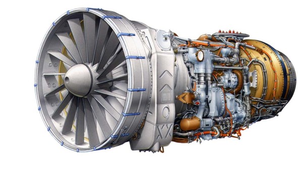
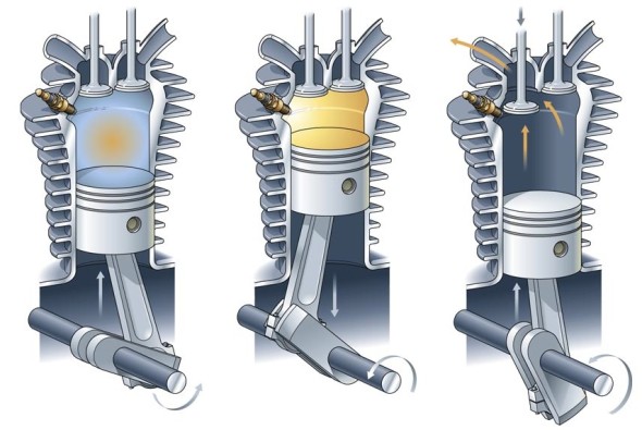
Martin Woodward - Jet Engine Martin Woodward - Engine Martin Woodward - Water Turbine

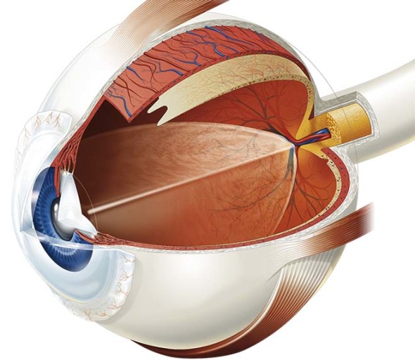
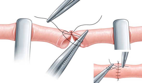
Martin Woodward - Eye Martin Woodward - Vein Repair

Martin Woodward, also known as  tecmedi, is a British technical & medical illustrator. He has been producing illustrations for publishing, manufacturing & advertising clients for over 20 years. His portfolio features a broad range of subjects as well as tutorials and a quite sensible style & pricing guide.

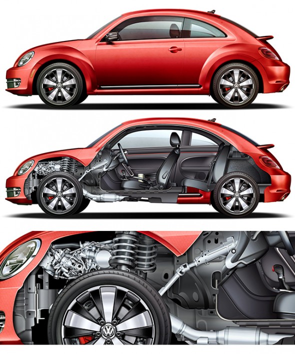
Jim Hatch for Volkswagen

Jim Hatch - VW Beetle Cutaway Illustration

Jim Hatch recently completed this great project for Volkswagen, featuring finely detailed and rendered cutaway illustrations of their entire vehicle lineup. After the break, he shares some insight on working on a project of this scale, some process work, and lots of beautiful final illustrations.

Read More