How to Illustrate a Building in Isometric

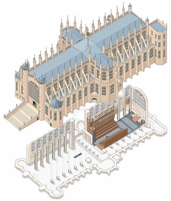
Infographic artist Ninian Carter, who previously shared with us his process for illustrating a smartphone, an ancient tomb, and a water bomber, has posted 100+ screenshots showing his process for illustrating St George’s Chapel on the grounds of Windsor Castle in Adobe Illustrator.

To create it, he relied on satellite imagery, copies of old plans, 360° panoramic photos and various tourist photos.

Check it out here.

Great work, Ninian!

Uniqlo HeatTech Fabric Video

This Uniqlo promo video is a great example of combining technical information with beautiful and engaging visuals, highlighting otherwise invisible features and demonstrating their benefits to the customer.

In a market where branding is often just a graphic silkscreened on a generic garment, Uniqlo places the emphasis on the comfort, performance, sophistication and simplicity of the product itself. Armed with that information, the customer’s decision is made easier.

Remie Geoffroi

Freelance illustrator Remie Geoffroi creates a wide range of work—from portraits, lifestyle, sports and business editorials to infographics, exploded diagrams, instructional illustrations and architectural drawings. What unites it all is his clean, technical use of vector artwork and a mastery of line quality.

It’s probably this combination of versatility and consistency that keeps art directors calling. Remie has worked with clients including AARP, Sports Illustrated, TIME, ESPN, Men’s Health, Martha Stewart Living and Bon Appétit, and advertising clients including American Airlines, Coca-Cola, McDonald’s, Microsoft and Volkswagen.

Remie Geoffroi - Food Trucks

How did you get started in illustration?

Drawing was all I ever wanted to do. Through high school I took part time jobs at an animation studio, a screen printer’s art department, etc. I went to college for graphic design because I was pretty hazy on what a career as an illustrator would look like. I ended up being hired as a clip art illustrator right out of college, and set out as a freelancer shortly afterwards.

Remie Geoffroi - Drones

What is a typical day for you as a freelance illustrator?

I regularly work with magazines (Billboard, ESPN, etc.), and occasionally advertising agencies, Sid Lee, DDB, etc. I recently illustrated “Tools of Titans” the new book from Tim Ferriss, and a book for Gold’s Gym, coming out later this year.

I have a shared studio space where I work from, or I’ll sometimes choose to work out of my home office if the weather is bad or my workload is light.

Remie Geoffroi - Nest

How do you create your illustrations?

I work almost exclusively in Adobe Illustrator. Many of my illustrations that people have assumed are raster (Photoshop) are actually vector. I like the versatility of being able to tweak the lines. I’ve developed a very streamlined, comfortable process for creating vector artwork. I appreciate being able to revisit files years later to harvest and reuse elements.

Remie Geoffroi - Stadium

You work in a range of styles, how do you choose the style for a particular project?

The assignment usually dictates the style. Art directors usually point to one example or another from my site that they’d like to see. Repeat clients don’t usually request a particular style, as they usually trust where I’ll take a particular project.

Remie Geoffroi - Retail

What challenges have you faced in your career? What opportunities do you see for the future?

Like most freelancers, workflow can ebb from time to time, and those can be nerve-wracking periods. I’ve been fortunate enough to avoid any true work droughts in my 17 years of freelancing.

I’m optimistic new opportunities will continue to appear. App development wasn’t even a thing a few years ago, and it’s become a major place for illustrators to create and find work.

Magazines were supposed to be dead years ago, and yet they continue. That said, I’ve been sad to see a few fall away recently.

Remie Geoffroi - Exercise

Any tips for illustrators starting their careers?

A successful career as a freelance illustrator is built upon relationships. Recognize that you’re building relationships with your clients, primarily art directors. Be ready and willing to accept their criticism and make changes. Be professional and on time with your work. Be courteous and understand that there are many other illustrators out there, so your attitude can be a big factor in who wants to work with you.

Big thanks to Remie Geoffroi for his time!

Chris Philpot

Open any magazine on the newsstand and inside you’ll likely find an illustration by Chris Philpot. He creates humorous how-tos, conceptual illustrations, infographics and animations for some of the biggest and best, including TimeWired, Popular Science, Outside and Men’s Health .

I got in touch with Chris to ask him a few questions about his work, how he got his start in illustration, and what the future may hold.

Chris Philpot - City of the Future

What’s your background? How did you find your way into illustration?

I wanted to be an illustrator in high school but read articles from practicing illustrators predicting the demise of the profession. I decided I should get a degree in design to ensure a more stable income. That lead me to a job as an editorial art director for about 12 years. While I grew to enjoy design, I still really wanted to illustrate so I started freelancing on the side. Five years of moonlighting gave me enough of a base to make the switch. It was a scary transition, but my wife was incredibly supportive. I’ve been illustrating full time for the last six years. It’s been great. I make more money, have more autonomy and am much more fulfilled creatively.

Chris Philpot - Visual Quiz for Esquire

What are your favorite subjects or types of project?

A technical approach is surprisingly versatile. You can add a subtle joke to dry stories. You can take irreverent or taboo stories and make them presentable to polite society. You can take a really funny story and the art can play the role of the straight man. I read a lot of Gary Larson cartoons growing up and would turn every job into a one-panel Far Side cartoon if I could. My favorite types of projects involve subjects that are fun to draw like monsters, robots and octopuses.

Chris Philpot - Oculus Rift for TIME

Your style is really consistent, how important is that? How did you develop your aesthetic?

The consistency comes from a few places. Mostly, I need to produce a lot of work to meet my income requirements each month so the volume dictates a certain formula. I try to improve with each job. If a new technique works, I add it to the list of best practices. I’ve also found that art directors are coming to me for the work they see in my portfolio. If I send something too different they often direct me back to the look and feel of my portfolio (I still send in variations if I think they’re better.) I also use a lot of 3-D models for reference. That definitely adds to the consistency, especially in the proportions of people. I’m pretty lanky so using myself as reference wasn’t working out.

Chris Philpot - Humvee

What’s your process for a typical assignment? What hardware and software do you use?

I take the brief from the client and request any missing information like story details, budget and schedule. I try to get as close as possible to a final draft by the sketch deadline. It puts the art directors and editors at ease and I think everyone is more inclined to approve things. Revisions hurt profits and the end of the time line breeds a revise-happy anxiety. This is sometimes unavoidable of course.

Regarding software, I use a lot of inexpensive models from Daz3d and Turbosquid for reference when I can and trace the renderings out of Poser or Blender with Illustrator. For hardware, I buy a top-of-the-line iMac every 4 years and use a Wacom intuos4. The tablet was the single best addition to my work flow. I’m not sure how I ever drew with a mouse.

Animation started in Flash but is now done exclusively with After Effects.

What challenges have you faced in your career? What opportunities do you see for the future?

Transitioning from a full-time job to full-time freelancer was a challenge. I worked a lot before going to the office, during lunch breaks and after I got home. Now my biggest issue is working from home with three kids. I love being available for them and I need to be productive so it’s a balancing act sometimes.

There are always opportunities for illustrators to pitch or generate their own content. When the iPad came out, everyone in the editorial world started experimenting with video for the app version of their magazines. I’ve always toyed with motion so it was a good opportunity to try something. The business etiquette series for Entrepreneur magazine (written by Esquire Articles Editor Ross McCammon) was supposed to be a simple illustration with some movement. I asked if I could take on the larger sidebar and to their credit they let me try. Once the longer video was approved they agreed to a fee I proposed. I asked a friend and former coworker Tyrrell Cummings if he would help me with the storyboards. It came together nicely and we’ve done a one-to-two minute short video each month for the last three years.

Chris Philpot - Speed Data for Car and Driver

You’ve worked with some of the biggest and best clients. Any tips for illustrators starting out?

It was uncomfortable at first, but I put myself out there with an online portfolio and 4 x 6 postcards. I was turned down by representatives so I had to go it alone. The initial images were primitive. I did jobs for friends and for the in-flight magazine I worked for at the time. That gave me enough of a portfolio on which to build.

If you’re starting out, just keep producing the work you’re excited about and make it visible. Keep updating it. The days add up, and if you stay active you’ll get somewhere. I didn’t enjoy instant gratification but I did get eventual gratification.


Chris’ work can be found at ChrisPhilpot.com

Style versus Communication

Style vs Visual Communication

I’ve been meaning to write about style — the design and arrangement of visual elements that creates a tone or voice in an illustration, throughout a project, or across an illustrator’s entire body of work. More specifically, how style conflicts and complements with a technical illustrator’s role of visual communication.

This critique of dozens of newspapers’ adaptations of an Associated Press graphic serves as a great introduction to the topic. News graphics veteran Charles Apple dissects the minute decisions made by the various papers’ editors in the name of visual appeal, visual communication, story telling and branding.

Is technical illustration more about visual communication or style?
How do you compromise between the two?

[A Look at Tuesday’s Graphics-Heavy bin Laden Presentations]

Oil Spill Illustration Roundup

The biggest news story of the past two months is highly technical and happening beneath 5,000 feet of water. These obstacles make technical illustration the obvious medium for telling the story. Collected here are illustrations and graphics from various sources, showing their visual approach to communicating the information. (Mouseover for source, click for larger version)

The New York Times‘ illustrations are well designed and executed in a graphic style typical for newspapers. Black lines delineate the key information, both a visual strategy and a production consideration (black prints well on grainy paper in fast presses, since it’s a single plate). Deep-red lines and arrows call the eye’s attention to important details. Light colour tones provide additional information such as material, dimension/shading, or simply visual separation. A variety of views are used, elevations, isometrics, perspectives, whatever suits the content. Nice stuff here.

Infographic World‘s ambitious graphic attempts to tell the entire story, relying heavily on text, but ends up feeling cluttered, unfocused and disorganized. The individual illustrations feel underdeveloped.

NOLA/Times-Picayune‘s graphics are similar in style to The Times’, but with a much thicker line weight which makes me think they might have appeared smaller in print. The multitude of arrows really get in the way of the information. A bit heavy handed.

The Economist is a weekly news magazine, but the illustration doesn’t have much to show for the extra time (to be fair, there’s no telling what sort of turnaround time the illustrator was given).

BP employs slick [no pun intended] 3D renderings to communicate the company’s repair efforts and give the impression of openness and transparency. I have two problems with this. First, they feel expensive. I imagine BP already had a 3D model library of all their equipment for planning and presentation purposes, so this may very well be the most cost-effective visual solution for them. But the impression these polished 3D renderings give is that they’re spending a lot on visuals, when they should be devoting all their resources to the repair and cleanup process.

Secondly, 3D renderings feel like constructed illusions rather than explanatory depictions of their efforts. Maybe it’s my bias towards illustration since both are just as artifical (ie. not photographs or videos), but I find The Times’ illustrations more trustworthy than BP’s 3D world.

Sources

The New York Times. “Methods That Have Been Tried to Stop the Leaking Oil”
Infographic World. “Crude Awakening”
NOLA.com. “Oil Spill Graphics”
The Economist. “Mudslinging”
Unified Command for the BP Oil Spill. “Graphics”
BP. “Gulf of Mexico Response”

Have you seen any additional illustrations of the Gulf of Mexico oil spill? Let us know in the comments!

Home Appliance Energy Use – Infographics

GE: Home Appliance Energy Use

GE: Home Appliance Energy Use

General Electric has posted an interesting infographic that illustrates how much energy certain home appliances use. Leafing through the interactive site yields all sorts of information that the typical consumer may be unaware of.

It’s a good example of an infographic that cleanly communicates a complex and obscure issue – in fact, it’s so simple that I found myself mystified as to why I hadn’t seen something like it sooner. Enigmatic concepts like kilowatt hours can be hard to describe, but putting them into a real world context can firmly solidify their meaning in the audience’s mind.

What might be the most interesting bit of information is that a coffee maker requires roughly an equal amount of energy as a new washing machine…

You can check it out on GE’s site here.

Exploring the 10th Dimension

httpvhd://www.youtube.com/watch?v=JkxieS-6WuA

Let’s dive right in with the heavy stuff, shall we?

I’ve always liked this simple animation as an example of what a good infographic should be. Clean and clear, it reinforces the the information visually, providing easy stepping stones that build to a ultimately complex idea.

And you know anything that can crunch theoretical physics into digestible pieces has done it’s job well.