Monterey Motorsports Reunion Poster by Jim Hatch

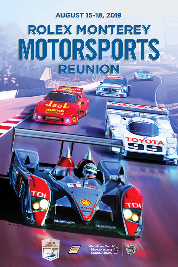
Technical illustrator Jim Hatch [previously featured] had the honor of illustrating the official poster for the 2019 Rolex Monterey Motorsports Reunion.

This annual event, started in 1974, is hosted at Laguna Seca Raceway in Monterey, California and is a celebration of motorsports history, featuring races between priceless legendary race cars in a variety of classes.

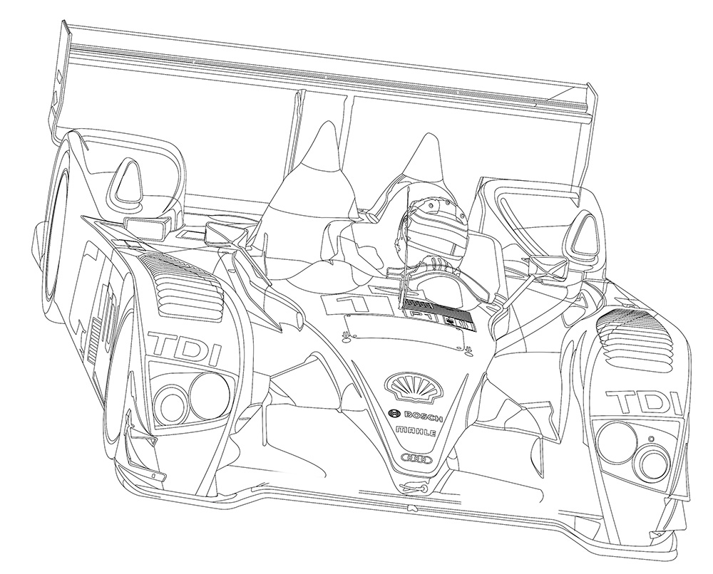
Hatch created the illustration in Photoshop, painting the background freehand with a Wacom tablet, building the cars using paths over a rough sketch and then rendering each piece on a large number of layers.

This is Jim’s fourth poster for the event, now in its 44th year.

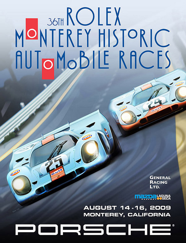
Jim Hatch’s poster for the 36th Rolex Monterey Historic Automobile Races (2009)

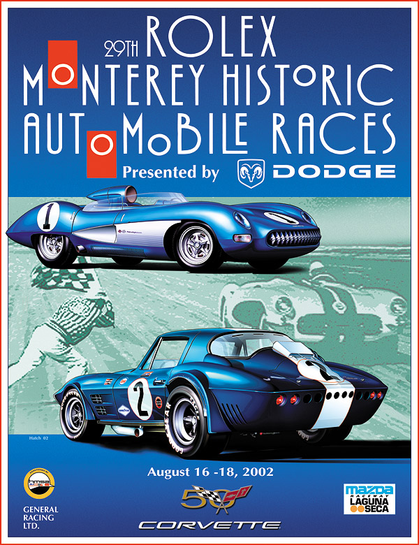
Jim Hatch’s poster for the 29th Rolex Monterey Historic Automobile Races (2002)

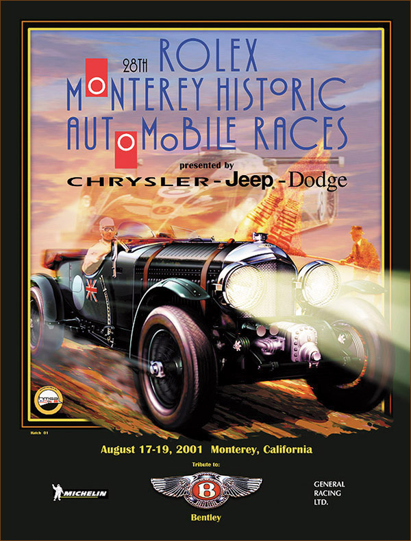
Jim Hatch’s poster for the 28th Rolex Monterey Historic Automobile Races (2001)

How to Illustrate a Building in Isometric

Infographic artist Ninian Carter, who previously shared with us his process for illustrating a smartphone, an ancient tomb, and a water bomber, has posted 100+ screenshots showing his process for illustrating St George’s Chapel on the grounds of Windsor Castle in Adobe Illustrator.

To create it, he relied on satellite imagery, copies of old plans, 360° panoramic photos and various tourist photos.

Check it out here.

Great work, Ninian!

George Retseck

George Retseck is a Philadelphia-based technical illustrator with nearly 40 years of experience. He works with magazines such as Scientific American, Popular Mechanics, The Scientist, Bicycle Quarterly, as well as companies in the science, medicine and technology fields.

He works in a variety of styles, but I especially enjoy the line quality and attention to detail in his retro pen-and-ink style. It almost makes me want to dig out my old, stubborn, finicky technical fountain pens.

Read More

Learn Engineering on YouTube

YouTube channel Learn Engineering is a great series of videos explaining how everyday objects work. The 3D animations of different gears, motors, coils and fields are clear and really help illustrate the easy-to-understand script.

Uniqlo HeatTech Fabric Video

This Uniqlo promo video is a great example of combining technical information with beautiful and engaging visuals, highlighting otherwise invisible features and demonstrating their benefits to the customer.

In a market where branding is often just a graphic silkscreened on a generic garment, Uniqlo places the emphasis on the comfort, performance, sophistication and simplicity of the product itself. Armed with that information, the customer’s decision is made easier.

John Grimwade: Infographics for the People

Illustrator, designer, and educator John Grimwade has started a great blog on information design and data visualization called Infographics for the People.

For his posts, Grimwade pulls together contemporary infographics, historical examples and samples from his prolific career working with newspapers, magazines, books and corporate clients. From his mission statement:

I’m trying to promote infographics that engage the general public. There is a trend towards elitist visualizations, that seem like they might be designed for data geeks. Of course, visual communication is a powerful way to help people understand, but first we have to get people on our side. Be inclusive, not exclusive. And never forget that a sense of fun is an important component in getting our message across. Infographics for the People!

He critiques his old work with self-deprecating humour and encourages readers to learn from his mistakes and to think critically when creating our own work.

Infographics for the People by John Grimwade

SpaceX

SpaceX has some great technical illustrations on their website, showcasing the design and features of their current and future spacecraft.

SpaceX Falcon 9

SpaceX Falcon Heavy

SpaceX Dragon

I especially like the use of scrolling animation on the Dragon page. It’s so simple and intuitive, using static artwork and a little bit code to create subtle movement that grabs the eye and really helps tell the story.

MacBook Redesign Video

Yesterday’s post reminded me of this video about the redesign of the Apple MacBook released last year. This one is a bit more informative in tone and has some great visualizations of otherwise invisible features, the pressure-sensitive trackpad, for example.

This really shows the selling power of information.

Microsoft Surface Studio Commercial

This promo video for the just-announced Microsoft Surface Studio really caught my eye, beyond the hardware itself and what it could do in the hands of a tech illustrator. Watch starting at 0:25 at 0.25x speed. It’s not the most informational example of technical communication, but it certainly makes you marvel at the precision and sophistication of the product’s design and assembly beyond what the consumer would normally see.